Book review: Disrupted: Dan Lyons v the startup bubble (at Hubspot)


Hubspot! Oh man. Photo by Steve Garfield on Flickr.

Dan Lyons book Disrupted: cover showing a startled unicorn
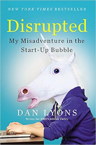
Lord knows technology journalism needs Dan Lyons, who is – as one of his managers at the bizarre cult-like CRM-spam company Hubspot observed – “acerbic”. (Could have been worse: could have been “caustic”.)

For years, before and during and since his most famous creation, the Fake Steve Jobs blog, Lyons has been lampooning and criticising and generally getting up the noses of people who are too pompous about all this stuff. He sees that tech is important, but also that the people who bring it to us, who sell it to us, too often are hucksters who a century or so earlier would have literally been selling snake oil. He sees it, and he calls bullshit. (Here he was calling bullshit on a metric tonne of “tech journalism” back in 2012.)

You’re fired, hired, rewired

So when Newsweek fired him, out of the blue, as he was hitting his 50s, with a wife and two young children to support, journalism’s loss was going to be marketing’s gain. Wasn’t it? Lyons found a job at Hubspot, a company which basically legitimises email spam mixed with content farming, and where it feels – he feels – dammit, everyone feels – as though he was hired in order to pimp the company’s reputation as it prepared to ramp up towards a stock market flotation. Look, they hired Fake Steve! Wait, though – can you be in marketing if you’re acerbic? Aren’t they a kinda chalky-cheesy sorta thing? That nobody in Hubspot quite engaged with this question is a clue to the sort of company it is.

Lyons’s account of his experiences is by turns hilarious, scary, thoughtful, and insightful. It begins with his first day where literally nobody seems to be expecting him, through the dysfunctional middle management, to the dysfunctional upper management (two top people greenlight one of his ideas, which is then completely denied by everyone below; Lyons made the fatal error of not having a fourth person in the room to witness the greenlighting). There’s the ridiculous language (when someone is fired or quits, the company says they’ve “graduated”) and yippy-yi-yay upbeat jargon. The ultimate irony, or contradiction, or paradox – pick all that apply – is that a company which allegedly sells software that means you don’t have to chase sales leads (because with their blog software, the sales leads come to you!) has a huge boiler room of just-graduated recruits hammering the phone lines to small businesses, trying to sell them exactly that software.

Sometimes it’s just the little details that are best. I was literally gasping for breath and crying tears of laughter when reading about the idiocy of the Blog Topic Generator, where you put in three nouns and get inspirational ideas for blog post topics, created by someone who thought Miley Cyrus was the shiznizz. Of course, it’s only as inspirational as your nouns; the nurse who used it early on to try to create topics for Cervical Cancer Awareness Month got
WHY WE LOVE CERVICAL CANCER (AND YOU SHOULD TOO!)
and
MILEY CYRUS AND CERVICAL CANCER: 10 THINGS THEY HAVE IN COMMON

As Lyons recalls:

“These headlines are so good I want to print them out in 72-point headline face and paste them on the wall. The BTG is never spoken of again. But it remains online because, as one manager tells me, if they take it down that might hurt [BTG creator] Ashley’s feelings. Six months later Ashley gets a promotion.”

The BTG is indeed still online. I started with “flatulence”, “fisting”, “Miley Cyrus” and discovered it also accepts quite long phrases – I tried “the guy who is shagging his secretary”, “the woman who had the breast augmentation” and “Fuckwit McFuckface from Sales”. You’re welcome.


Hubspot suggestions
“Why we love crack cocaine (and you should, too!)” deserves some sort of prize, no?


(And just pause a moment to consider the idiocy of those templates. “What Will X Be Like In 100 Years?” Who cares? Isn’t it obvious that we’ll all be dead?) For Lyons, the divide is thus irrevocably drawn between the old, acerbic journalist who has seen ships go down with all hands, and the new-to-work marketing drones who must be protected from criticism because, apparently, their egos are so fragile. It’s a Rubicon of sorts.

It’s the stupid culture, stupid

It’s not all fun and games, though. After a while the corporate culture starts to turn against Lyons – who at 52 is twice the age of the average Hubspot employee. And then he starts to discover the subtle thing about discrimination (in his case, age):

Yet I know what I feel. I know that when I look around, there are not many people like me. Sure, I’m not being picked on or actively persecuted. And these tiny slights and offhand remarks are not very significant when taken in isolation. But when you put them together they add up to… something.

That sounds like a portrayal of how it feels to be in a discriminated minority – whatever flavour that minority might be. Lyons points out how the hire-easy-fire-easy practices, and remarkable youth of so many of these disposable recruits, means that the culture is reinforced. And, in passing, he notes how so many people who find themselves washed up once they’re past 50 – can’t get a job, can’t seem to get back on the ladder – must feel. (Though Lyons isn’t a Trumpista by any means, you get an insight into the cause of that displaced group’s howling across the darkening waters.)

There are four other important themes that the book highlights. First is how tech companies dress up the trivial benefits they offer their staff. A wall of candy! “I’d rather have the money,” Lyons says, to astonished silence from the other staff, who don’t feel that way at all. And no limits on vacation time! But as Lyons points out, that means that they don’t have to compensate you for untaken vacation time when they fi– I mean, when you “graduate”.

Second, there’s no job security. These are companies with huge amounts of funding, but they’re not what you’d really call “businesses”. The venture capital flood, pumped by quantitative easing (which has lowered bond yields, and so pushed people with money to seek better returns), has created a raft of companies which have no sustainable business model, and whose owner/managers are far from experienced. It’s a world away from the paternalistic model of companies in the 1950s/60s/70s, where if you worked for them, they’d stand by you.

Third, the allocation of shares means that the people at the top of the company are disproportionately rewarded – sometimes ahead of the company itself. (After its IPO, a tranche of Hubspot shares were sold in the market; most came from insiders, while the lossmaking company’s balance sheet was barely propped up.)

Fourth, these companies are spectacularly unprofitable. Lyons goes to Salesforce’s Dreamforce conference, which seems to occupy all of downtown San Francisco. Salesforce is a company that’s terrific at not making a profit. Yet each time it loses money, as Lyons observes, founder Marc Benioff seems to get richer. Hubspot has never made a profit as a public company, and never did as a private one. So who’s bearing that cost? Not the VCs: they got their money back, and more, at the flotation.

Losers finish first

No, the people bearing the cost now are banks which extend lines of credit and shareholders who put their money in. Where does that money come from? The people who actually work at businesses and put their money into banks, or who have pension plans.

In other words, the price of these bubble companies is borne not by the venture capitalists, but by the ordinary public – the same people who bore the price of the bank crash back in 2008-9. I realise that in looking at the piffling losses of smartphone OEMs I’ve been looking in the wrong direction. It’s the losses of these stupid software companies – the Salesforces, the LinkedIns, the Groupons – which is more relevant. They’re not going to change the world, but their internal culture and self-assured idiocy is changing the world of work – and not in a good way.

Hacking the graduate

There’s a wonderful epilogue. Hubspot prides itself on its culture, which says it is HEART – “humble, effective, adaptable, remarkable and transparent”. Except.. in July 2015 Hubspot’s board fired Mike Volpe, its chief marketing officer, “in connection with attempts to procure a draft manuscript of a book”. Guess which one.

What exactly did Volpe do? Cofounder Dharmesh Shah and CEO Brian Halligan won’t say, despite all that “transparency” guff. Here’s the quote from Betaboston:

Shah and Halligan said they have promoted an open and transparent corporate culture, which includes the motto “Sunlight is the best disinfectant.” The book incident was “a failure in one specific situation,” Shah said, not “a failure of HubSpot’s culture.”

You don’t think you might be failing a teensy bit at the “transparency” part? The FBI, at least, is better at that game: an FOI request by Lyons and the Boston Globe elicited the following from the FBI after its investigation:

The FBI memos say that Lyons’ book was seen by some at HubSpot as not only a potential embarrassment but “a financial threat to HubSpot, its share price, and the company’s future potential.”

The documents also say there was an effort “to obtain sensitive information on individuals with access to the book’s transcript, or control of the publishing deal. The information found was then used as leverage in an attempt to prevent the book from reaching the market place.”

The report also mentions “tactics such as email hacking and extortion” in the attempt “to railroad the book.”

HubSpot, a marketing software company in Cambridge, announced in late July that it had fired Volpe “in connection with attempts to procure a draft manuscript of a book involving the company.”

HubSpot also said a vice president, Joe Chernov, resigned before the company could determine whether he also should be fired.

(If you look at the question on Quora of why Volpe was fired, its “followers” – those watching to see what comes up – include Shah, who is on Hubspot’s board. He knows why they fired him. Interesting meta-question: why is he watching the question?) Shah has written a more-in-sorrow-than-in-anger-style response to the book. It neatly avoids a lot of the deeper points Lyons makes. There’s also another ex-Hubspotter, who unintentionally does nothing to dispel Lyons’s assertion that Hubspot is essentially a cult with shares.

As Lyons points out, that extortion/hacking stuff adds an extra condiment of concern to this recipe of intrigue. What data did they get, or try to get from him? What did they have about him at Hubspot? Lots of these startup companies have “god” passwords that let any bozo access any account – Facebook used to, Uber did/does, who knows who else does? (This is why, by the way, you should enable two-factor authentication on important accounts. And then watch your world go to hell when your phone is stolen, of course.) So besides being cultish, inequitable, and money-sucking, we now have to add “potentially data-sucking” to the list of Things We Really Find A Bit Questionable About Hubspot (And You Should Too!)

Silicon Valley is just a dream away

Acerbic? That’s insufficient to describe this take on the modern world. You should damn well read this book. It might not take you long – I was through it in a day, because I couldn’t put it down – but it will stay with you if you’ve ever wanted the insider’s view of job security, pay inequality, the idiocy and self-delusion of internet marketers, and tech non-diversity. Or even if you just want to have a good laugh. Don’t worry, you’ll get both.

And now? Lyons is a writer for HBO’s Silicon Valley TV series, which thoroughly lampoons the startup bubble, and also back to doing journalism. Good. In a world where so many sites think that rewriting corporate blogposts about a new ad format around search results counts as “journalism”, we need him to train his acerbic eye, or mouth, or pen, on it.

iOS 9 review: longer battery life, more storage, and adblocking. What more could an iOS – or Android user – want?


Apple called this year’s WWDC “the epicentre of change”. So what did its iOS update bring? Photo by karmadude on Flickr.

iOS 9! It comes down the intertubes today! I’ve been testing iOS 9 on an iPhone 5C (equivalent to an iPhone 5) since the first beta, using a Three PAYG SIM so that it would have to connect to the mobile network (to test such things), and an iPad Air 2, and also an iPad 2.

My takeaways: Apple’s given you more battery life and more storage for free. Plus some other nice things. Definitely worth any hassle in upgrading.

More phone storage, for free

iOS 9 is reputed to require less storage than iOS 8 – a feat that I think may be done by removing some unneeded resources from the packages, so that you only get what you need. Ars Technica’s review suggests that the savings once installed are minimal – a few hundred megabytes – in a comprehensive testg. (Joanna Stern at the WSJ says it needs less free space to install too – 1.3GB v 4.58GB for iOS 8.)

“App thinning” (officially it’s “App Slicing”, apparently) means that apps only download the resources that they need for the device you’re using. Put like that, it’s amazing that they didn’t to begin with, isn’t it? Still, given the proliferation of screen sizes, this should avoid games in particular from bloating up and taking over your preeeecious storage. (There’s also a method called “On Demand Resources” where games in particular can download just stuff needed for a particular level, which can then be deleted when it’s not needed. Apple’s taking the same approach with its Apple TV tvOS.) This means that you want developers to update their apps, so they take advantage of this: your phone should actually get emptier. Apart from those photos you take.

And also, for its next trick, iOS 9 updates will be able to work in chunks – so that you won’t need a colossal amount of storage free to do the incremental updates. (The iOS 8 ➡️ 9 update, less clear.)

A battery upgrade, for free

Android has had a “low power” mode since forever, but it isn’t on by default; you have to hunt it out and turn it on.

Low Power mode on iOS 9

The battery icon goes yellow but the phone goes on and on. Found through the new “Battery” mode in Settings.

iOS 9’s Low Power mode (found in a new Settings er, setting called “Battery”) isn’t on by default either, but when you hit 20% and 10% battery and the “20% battery” dialog comes up, you’ll get an option to activate it. And of course you can turn it on any time you like. When you recharge, it automatically turns off at 70% of charge. (Note: it’s only available on iPhones – not iPads.)

I’ve run my test phone on Low Power from 100% and got huge lifespans – around two and a half days, which included a fair bit of use. This is a big improvement. Note though that it will seriously slow down a lot of apps, and kills background refresh. But if you’re not using the phone for anything for a while, it’s great for extending the life. You’ll know it’s on: the battery icon turns an anaemic yellow. The screen brightness goes down, but I didn’t notice this particularly.

There’s also another battery-saving feature: if the phone is face-down (on a table, say), notifications don’t light the screen. Subtle, but worthwhile.

Even without using Low Power, I was getting good lifespans from both the iPhone 5C and iPad Air 2 I tested iOS 9 on: pretty much always better than iOS 8. This is unusual in a beta.

A poke in the eye for battery/storage upgrades

Low Power and the storage saving together represent something clever: Apple saying that battery life on its own and storage on its own aren’t enough to merit a device upgrade. After last week’s iPhone/iPad event, there was no shortage of people moaning that they’d rather have a thicker phone with a longer battery life, or more storage for the base model.

Actually: that wouldn’t drive new device sales, which is what Apple wants. A slightly thicker device wouldn’t suddenly last two days – you’d have to roughly double the thickness to get that. Furthermore, people would say “I’ll buy a battery add-on thanks – it’s cheaper.” This would Not Be Good for iPhone sales.

And storage: well, of course Apple upsells you from the low-end phone to the mid-range one. If you’re surprised by this… would it shock you to know that companies actually try to make profit? I find the argument about storage slightly tired; there’s more cloud storage available through Dropbox et al (though – shocker! – they will charge you too). But taking out unnecessary content from apps and the OS is a great way to reclaim some of that phone storage.

Parsimony in the cloud

Certainly, it’s annoying as hell that Apple only offers 5GB of iCloud storage – an amount that hasn’t changed since its introduction in 2011, although the prices for the larger storage amounts has fallen. 5GB isn’t enough for most people, but they equally can’t be bothered to update their storage, and certainly not pay for it.

Since 2011, the cost of storage has gone through two Moore’s Law cycles (halving in cost), so on that basis Apple ought to be offering 20GB for free. Then again, Dropbox only offers 2GB for free to begin with; it’s pretty easy though to upgrade that to 10GB through a few encouraging tweets, or used to be – I’m somehow at 10GB without paying anything.

iCloud backups don’t have to include your photos – iCloud Photo Library is a great way to get your photos into the cloud and out of the “iCloud backup” space. You can also get Dropbox to suck them up, or Livedrive, or of course Google Photos. iCloud backups remain terrific, though, and better than Android’s current offerings, because they back up all the app data, as well as most settings (excepting some mail and other important passwords). Some more would be nice, though.

Settings are now searchable

iOS 9: Settings are searchable

The Settings app is so giant that it needs its own search bar, and has done for a while. Go straight to Mobile Data, for example. At last.

Oh God I’ve been asking for this since forev… well, for a few years (iOS 6?) because Settings have become gigantic. Where does the passcode live? App Store restrictions? And so on. Now you just search (pull down in the main part of the Settings menu).

Keyboard: now in lower case

iOS 9 keyboard shows upper/lower case dynamically

iOS 9’s keyboard shows upper/lower case: end a sentence and it offers capitals. Don’t like it? You can turn it off.


Everyone else seems to be delighted that the keyboard now has upper/lower case – so that when you type, the keys Go Up And Down With Capitals. Personally, I find it distracting, even though I understand that for a lot of people this eases a frustration they’ve felt for ages. (Android users of course have had this since forever). If like me you don’t like it you can turn it off in Settings ➡️ Accessibility ➡️ Keyboard ➡️ “Show Lowercase Keys”.

A Back button? Sort of

Again, Android has had a “Back” button since forever. But it has UI/UX gotchas: if you pressed it, where would it take you? If you had jumped from one app into another (say from an email into the browser), would the Back button take you to the canonical place in the browser app – say, the last thing you had been looking at in the browser before that – or back to the email app? Usually it would be the email app, of course, but this wasn’t explicit.

The thing about the Back button is that it can be a user puzzle, but for a power user it’s great; if you’re the sort of person who keeps a mental stack of what you’ve been doing on the way through the phone, the ability to go back and back in time appeals. Windows Phone has had the same feature from its inception, so there’s clearly a perceived need.

iOS 9 gets its own "back" button system

Which app did you come from? Want to get back there? Here you go – as long as you don’t lock the screen.

Apple has bowed to the (perhaps) inevitable, but done it in its own way. The “Back” instruction isn’t a button; instead it’s a tab at the top left of the screen telling you how to get back, and which app it’ll take you back to.

It’s generated when you follow a notification that pops into the top of the screen (and haven’t we all prodded one of those by accident?), or when you follow a link such as “Show in Calendar” from apps such as Mail or Messages.

I see this as having a dual purpose. First is a user frustration/behaviour thing. Watch people using an iPhone, and you’ll often see them follow a link from an app to another app, where they do something; then to return to the previous app, they press the Home button and then launch the previous app. That’s evidently wasteful, and though you can say “people should use the app switcher” (double-tap on the Home button) it’s clear that they don’t.

Second, implementing the “Back tab” helps with what I see as Apple’s intention to get rid of the Home button.

The Back tab is some distance from perfect. It obscures network settings such as mobile signal strength or Wi-Fi connectivity, and knowing about those is often more important to me than figuring out which app to go back to. It doesn’t persist across screen on/off (so if your screen locks and you unlock it, the signpost back is gone). It’s also in the most inaccessible part of the screen if you usually hold your phone in your right hand.

San where?

iOS 9 uses a new font – San Francisco. I’ll be honest: I never noticed. I’m not generally a font person, unless you try to replace a serif face with a sans-serif one, in which case I’ll punch you. It’s the same as that on the Watch, which in my experience is more legible than that on iOS 8. But I’ll leave the dissection of the curve on the “6” and the length of the descender on the “p” to others.

Proactive

Proactive aims to fulfil search before you search

Maybe these are the apps you’re looking for? How about some news? Location-aware apps also come into play when you’re out and about.


Swipe left or downwards from the main screen, and you’ll get the phone-wide search that was there in iOS 7 and taken out (eyeroll) in iOS 8. But you also get “suggestions” – apps you might like, or if you’re out and about, things you might be looking for (food and petrol often came up). Proactive is hard to evaluate until you’re using something as your main phone for quite some time; I was using iOS 9 on a secondary phone. Like Siri, this may be one of those things that improves quite substantially once more people are using it.

The “Proactive” pane also now contains your recent contacts, with fast access to phone/messaging. Discussion is below in the “odds and sods” section.

Hey, Siri, how did you get better?

There’s no mystery in why Siri is better now than it used to be; more people are using it. Apple artificially restricted it to the 4S upwards on its introduction in 2011 (it had worked fine as a third-party app on lots of earlier phones, because it’s a network-connected service; Apple wanted to make it a reason to upgrade). Since then, hundreds of millions of people have been using it and processors have got faster, so there’s a huge corpus of data to work with. It’s great on the Watch; it’s getting used a lot now.

In iOS 8, a charging phone would respond to “Hey Siri” plus your query (eg “what’s this song” – always nice). In iOS 9, it’s available when not charging too. This could be problematic (news reports about Syria are often a cause), but there is training to your voice. We’ll see how this goes. And yes, Motorola did have this a couple of years ago. Apple, though, has been cautious about the potential battery hit. Plus, of course, it’s a temptation to upgrade.

Content blocking, and Safari everywhere

Content blocking in iOS 9

You enable content blockers in Safari’s settings. Some – such as 1Blocker, on the right, offer a lot of tweaking


Unmentioned in the WWDC keynote, but a “wow!” moment for those who twigged it, is the ability to block content – including websites and scripts – from Safari in iOS 9. On its own, that wouldn’t be so dramatic, but iOS 9 also lets any app that shows a web view, such as when you click a web link in a tweet (which usually brings up a proto-web browser inside the app) use Safari to do it, still inside the app.

This has a couple of benefits: if you’re viewing a page that needs a username/password (say, a subscription paper such as the FT or WSJ or Economist) then Safari’s iCloud Keychain can fill it in for you automatically; second, the aforesaid content blocks come into play.

And wow indeed – content blocking, aka adblocking, makes a big difference. Pages are cleaner, less annoying, load tons faster. There are going to be lots of people making good money from adblockers in the App Store very soon. Installation is straightforward: you download the “app”, and then in Settings ➡️ Safari ➡️ Content Blockers, and it will appear there as an option. As it says, none can send any information back about what they’ve seen or blocked. You can also configure particular things about the blocking within the apps themselves.

I tried three – Crystal, 1Blocker and Blockr. Crystal is simplest; Blockr the next; and 1Blocker has a huge list of options, making it super-tweaky configurable. Crystal and Blockr have already been approved for sale through the App Store.

Noticeable among 1Blocker’s blocking groups is “adult sites” – which suggests another use for content blockers inside enterprises, where IT departments, not to mention management, don’t want staff viewing Teh Pr0n on company phones. Locking them down and installing a content blocker is going to be popular, I think.

Note though that Content Blocking doesn’t work inside apps that use their own layouts – so Facebook is protected from this incursion. And as we’ll see, Apple’s own ad-served app is safe too.

Content Blocking will only work on 64-bit devices, which means the 5S upwards. This is due to compiler limitations (according to an Apple staffer.) This is frustrating, since they worked fine on my 32-bit 5C. Even so, I think Content Blocking is going to have a huge impact.

Public transport directions

Public transport in iOS 9 is back.. sort of

It’s fine if you want to go from Brighton to London to Edinburgh – just don’t try going any further.


Apple made much of how iOS 9 has public transport directions – something that had been missing ever since the ejection of Google as the mapping default in iOS 6 which left a huge gap for Google Maps and Citymapper and various others to work back in to. (Citymapper seems to get the usability vote.)

While it seems to be great if you live in China (300 cities!) or the US, it’s not that stunning in the UK. Major cities are covered (London, obviously) and major train routes (London to Brighton, for example, and Birmingham) but it’s far from comprehensive: no public transport data for Edinburgh or Glasgow, for instance.

Apple is updating these all the time, though, so this may be more of a stealth improvement, rather as has happened with Maps – which are unrecognisably better than when they launched in 2012.

Multi-window multitasking

On the iPad Air 2, and any other device with a large-enough screen and 2GB of RAM (the iPad mini 4, iPad Pro.. and 6S Plus? Not sure about the latter) you can bring in other apps by sliding in from the side (charming, you can hear Microsoft saying), and then scroll them simultaneously, and resize them – to half-and-half, or 3:2. No other sizing is allowed.

iOS 9 multitasking: browse in one, pick another app..

With one app running, pull in from the right and then swipe down for available apps..


Choose an app, and both run at once

By default, the second app runs in a window two-fifths of the screen. But you can resize it..


iOS 9 multiwindow resized

Two apps side by side on an iPad! Lap it up, folks.

Multitasking is one of those things where you need a specific use case; watching a video while you read something, perhaps, or (the one I found) copying data from a web page into a spreadsheet. Clearly it’s Apple chasing after business users who will have more uses like that than the average person sitting at home drifting through Facebook.

All the news that’s fit to.. something

Apple News: broad

Rather like Apple Music, there’s “For You”, and then “Favourites”, “Explore” and Search. (I hadn’t saved anything).

Remember all the excitement over the new top-level domains, things like “.amazon” and “.balloons” and “.weboughtthisforbraggingrights”? Well, someone bought “.news” and now Apple (which didn’t buy it) is making use of it.

The Apple News app has a ton of sources, though in the beta I could only get access by changing my region to the US; once it’s live, it should be available in the US, UK and Australia.

I had mixed results; News only appeared in beta 3. I chose to get news about technology, science and business; I was nonplussed then to get CNN stories about celebrities. But more recently it has improved somewhat. I think that pressing the “Love” button at the bottom of a (read) story will improve the results you get.

You can share stories you read on Twitter or Facebook, and this is where the “apple.news” bit comes in – links you share begin “http://apple.news/”. This presumably means Apple can see what stories are getting the most traction and have been read.

For those who like a good conspiracy, note that Apple is offering its own publishing service into Apple News, and that this will be monetised via its iAd service (ie advertisers buy space on iAd, rather than just showing the publisher’s ads).

And guess what? Content blocking (aka adblocking) doesn’t work in Apple News. So if you follow a link to a story inside News, you see ads; if you open the same story in Safari when you have adblocking running, you don’t see ads. I predict this will have some publishers furious. I don’t see Apple retreating from having content blocking enablers on Safari, though. Get some popcorn.

Odds and sods

The app switcher (double click on the home button) is changed: rather than a side-by-side set of frames of the apps, it’s now an overlapping fan of the apps, which you pull to the right. Same method to kill apps (swipe them upwards).

The app switcher change also means that the “recent contacts” and “favourite contacts” that used to appear above the app switcher in iOS 8 are now in the Proactive search screen. Clearly, too few people used the app switcher, and too few used those contacts via the app switcher, for them to merit that space. (I can’t recall a time that I contacted someone via that above-the-app-switcher method.)

Notes have been updated so that they can do to-do lists, and alaso take your crude finger drawings, and you can stuff things into them from Safari via the share sheet. I didn’t test this, as if you update the format it’s not back-compatible with iOS 8 or earlier. (You get a suitably big warning.)

More camera folders. Selfies and screenshots get their own default folders, along with (deep breath) Favourites, Panoramas, Videos, Slo-mo, Bursts, and Recently Deleted.

Quick replies in all apps, not just Messages. When Notifications come down from the top of the screen, you could respond quickly in messages; now you can do it for all apps where replies are possible.

Folders can now contain other folders. So if you want to hide those Apple apps you can’t (yet) delete really thoroughly, here’s how.

Health

Health app: now with menstruation

All these are focussed on women. Good.


Look! It now recognises that some humans menstruate and ovulate. Amazing, sure. This was well overdue; it should have been in last year’s release, and would it have killed Apple to include it in a point release some time in the past 12 months?

There must be a load of other things that I’ve overlooked. Let me know what they are in the comments.

Adoption

iOS 7 and iOS 8 adoption after release

Apple’s data shows rapid takeup of iOS 8 and 9; other sources such as Mixpanel and Fiksu confirm it

All these things – the longer battery life, the extra storage, the public transport directions, the content blockers (particularly those) – are going to be available from about 1700 GMT, if Apple’s servers can bear the crush. (There’s also a 9.1 beta available if you want to live in the future.) iOS 9 will run on every phone since the iPhone 4S, and iPads since the iPad 2. If you’re running iOS 8 on any of those, it should be an improvement in speed, battery life and storage.

We can predict that within a month or so, iOS 9 will have at least 50% adoption, based on previous experience: in the past two releases, it has hit 50% or more after five weeks.

That’s about 200 million or more iPhones, iPads and iPod Touches running it. All the changes in this – especially those four picked out above – are going to get a lot of discussion. Apple has been very canny. iOS 9 takes some ideas from Android – upper/lower keyboard, back button, low power – and made them slightly more usable. But then it’s gone to places that Android hasn’t, and made them a reason to stick with iOS. Content blocking in particular is tricky on Android – you have to download a specific browser and make it your default, or sideload an app; neither is a big pursuit. With mobile viewing so big, it might be a cold Christmas for some publishers. (Read my views on adblocking, if you haven’t already.)

Android fans will mutter about the things Apple has finally caught up with. But that misses the point. Apple is playing its own game: and this one is about keeping its existing iOS users loyal, and tempting non-users aboard with things that are both familiar and unavailable.

Should you upgrade? Yes. Back up first to iCloud (if you can – dammit) or iTunes. And then enjoy it.


Other stuff you might also like to read here:
Review: this is the worst Apple Watch ever. (Think about it.)
Analysis: Q2 2015: Premium Android hits the wall
Analysis: the adblocking revolution is months away in iOS 9 – with trouble for publishers, advertisers and Google

What Apple’s 3D Touch aims to do: replace the physical iPhone home button


Buttons: who needs ’em? Photo by H is for Home on Flickr.

Apple is a very measured company. It tends not to rush into things. It lays down the foundations, and then it builds on them.

Take the example of Apple Pay. Clearly, executives could years ago see the potential of NFC-based payments; any company in the smartphone business could. But how to implement it so that people would love using it, rather than tolerate it? As things stood three years ago, putting NFC into iPhones would be easy enough. However then you’d have to have an app or interface, and then the user would have to enter a PIN, and we all know that people are terrible both at remembering PINs, and at using long-enough ones for security. Google Wallet used an app+PIN method, and you had to be pretty determined to use it much.

For Apple, that’s too much work to impose on users, because if you’re trying to replace cash or card swiping (in the US) then you don’t replace it with something that’s more difficult and fiddly. It’s also part of why, despite there being millions of NFC-capable Android phones in the US, Google Wallet made no impact. The lack of NFC-capable tills in the US also played a big part – but Google Wallet never went outside the US, even though NFC-capable tills are plentiful in Europe. Clearly, Google’s heart wasn’t in it.

Make it simpler, stupid

So what’s a simpler yet more secure way to do payments? Biometrics, obviously, get around the “remember a password or PIN and enter it” hassle. Which biometric? Retina prints? Bit fussy. Fingerprints? Sure, because you’re already holding the phone. But that means having a reliable fingerprint reader. And NFC.

You see the elements: fingerprint reading, and NFC. Apple clearly saw the potential, so in mid-2012 bought a fingerprint reader company (the best on the market, apparently). It then integrated that into the iPhone 5S for September 2013.

But not NFC. Apple clearly could have put both fingerprint reading and NFC into its new phones at once. But it didn’t.

“Touch ID” laid the foundation for getting people used to using their fingerprints to unlock the phone – and an API meant the fingerprint reader could be used in other apps (Dropbox, etc) and to pay for stuff in the App Store or iTunes Store.

The plan, obviously, was to introduce NFC+fingerprint reading in the iPhone 6, when people would be used to the idea of the fingerprint as a “means to pay”. It also helped that it would be part of an upgrade path: 5S has fingerprint but no NFC; iPhone 6 has fingerprint and NFC. Clear differentiation, but also careful laying of foundations. By looking back, the path forward is obvious.

The path forward from 3D Touch

Now on to 3D Touch. It’s available under different names but the same concept on the new iPhones, some Macs (MacBook and some Retina Pros) and the Watch.

It’s clever – though as Chris Lacy and Ben Sandofsky discussed in The Blerg podcast just after the announcement, apps that are 3D Touch-enabled don’t seem to have any way to make that evident; only by pressing them do you discover whether they have that capability.

You can say that 3D Touch is just Android’s “long press”. It sort of is, and isn’t. The key difference is that long press didn’t have haptic feedback. It just happened: you pressed for longer than usual, and you got a laundry list of options. Google has deprecated “long press” in favour of “hamburger menus”, which are visible all the time on screen. This speaks to the point Lacy and Sandofsky make: user interface affordances that aren’t visibly signposted on a screen can be really hard to find. Apple should add some sort of edging or 3D effect to the icons to make this clear; perhaps app designers will find some common method of doing so.

With 3D Touch, you learn how much harder to press because you get a little pushback when you succeed; if you try pressing on something that doesn’t offer it (I tried the Settings app, hoping for a giant menu of settings – ha) then you get three quick low-intensity taps back, a sort of “nothing here” signal.

3D Touch can also invoke the app switcher: press on the left-hand side of the screen and you get the fan of available apps. (I found this tricky; press-and-roll the thumb inwards seemed to work best for me. Again, practice would improve it; the fingerprint reader used to be “hard” to use at first but is now second nature.)

So fast forward a bit, and in the near future you’ll have all sorts of apps offering 3D Touch capability right from the home screen. It has an API, so developers will surely be spending the next few weeks feverishly aiming for app releases on or around September 25 that use it.

What happens a year from now? Apple introduces new phones, and they of course incorporate 3D Touch. The iPhone 6 becomes the “low-end” model, and thus the only one without it.

But what this new interaction really enables is movement between apps, and quick jumps into apps, that don’t rely on your pressing the home button at all.

Note also how iOS 9 includes a “Back” button of sorts (in the top left corner, if you’ve come from one app to another, you can go straight back – rather than using the home button to invoke the app switcher).

(Screenshot from Jeff Brynes’s thoughts on iOS 9 beta 5)

What’s all that – the “back” button, the 3D Touch capability – about? It’s about not using the Home button.

You should never go Home

To date, the iPhone has been built around the Home button, yet it is increasingly an encumbrance: if you want to go to the icon screen, you have to press it. To get the app switcher, you have to press it. To switch between apps (unless you’re invoking something like “Create event” in Calendar from Mail) you have to press it.

That’s a lot of pressing, and I bet that mechanical failure of Home buttons is one thing that keeps showing up in Apple’s fault reports. Broken screens are easily replaced (and people can get by with broken screens for a looong time), but broken home buttons not so. Grit can get in. Water can get in. Constant movement isn’t ideal in electronics. You might say that it’s just tough if peoples’ Home buttons break, but compared to Android phones which don’t have them, it’s an obvious point of weakness – and customer dissatisfaction.

However, the Home button is needed as the place where your fingerprint is read. But that doesn’t need a moving home button; it just needs a circle of sapphire glass through which your print is read.

Are the foundations that have been laid becoming clear yet? In the new Macbooks and the Force Touch-enabled Retina Pros, the keypad seems to click when you press it. Seems to. Yet in fact it doesn’t move, as Matt Panzarino noted back in March:

The new trackpad does not move, at all.

When you ‘click’ it, it ‘clicks’, but it doesn’t actually click. There is an audible ‘click’ sound (that’s what the silly picture below is, me listening) and it does in fact feel like it clicks, but that is merely an illusion.

There is a set of vibrating motors underneath that provides ‘force feedback’, also known as haptics in some applications. This feedback fools your finger into believing that you’ve pressed down on a hinged button, the way your current trackpad works. This feedback relies on phenomenon called lateral force fields (LFFs), which can cause humans to experience vibrations as haptic ‘textures’. This can give you the feel of a ‘clickable’ surface or even depth. The Force Touch feature of the new trackpad allows you to press ‘deeper’, giving you additional levels of tapping feedback. The effect is done so well that you actually feel like you’re pressing down deeper into a trackpad that still isn’t moving at all. It’s so good it’s eerie.

What if – and it’s just speculation, you know, but what if – you were to put that “seems to move but doesn’t” technology into a phone? Yes, you’d have 3D Touch. That’s happened. But what if you put it into an iPhone home button? You could have something that seemed to move, and felt like it moved, but didn’t. You can double-click the Macbook trackpad; you could double-click a 3D Touch home button. But nothing moves. There’s just a piece of glass, and a sapphire circle for reading, and that’s it.

Think: when do you press the home button? When the phone is off and you’re enabling it, or to switch apps, or to get back to the home screen (so you can switch between app screens).

Most of the time – that is, time when you’re in apps – the Home button serves no purpose at all, except to be a grit-attracting water-allowing problem. Replacing it with a not-moving solid piece of glass would be a design and fault-resistance win.

Here’s how 3D Touch works. In the pictures below, I’ve force-pressed on the relevant icons that you see highlighted from the main screen:

3D Touch brings up contacts

No need to enter the app – 3D Touch brings up recent or favourite contacts in Phone and Messages


Force.. er, 3D-touch on the phone or messages icon and you get your three most recent interactions (or possibly three top favourites for the phone – this may change)

Music and News are 3D Touch-enabled

3D Touch lets you jump straight into elements of apps such as Music and News


Want some Apple Music without opening the app? Or to go straight to News? It’s just a forceful touch away

3D Touch on Dropbox and Instagram

3D Touch on Dropbox and Instagram


Third-party apps can incorporate it too

And as I said, you can also use 3D Touch to invoke the app switcher (I had a picture, but it just looks like the app switcher). So you could, if you were determined, spend entire sessions and never touch the home button – except if you needed Siri (except that would be available via “Hey Siri”) or to make a payment. Only one of those needs a moving home button, and is replaceable too. (You can get to the main icon screen by invoking the app switcher then choosing the icon screen, so no home button needed there either.)

Is this reasonable? Quite separately, Neil Cybart has had the same idea:

Apple’s new 3D Touch feature not only brings an additional user interface to iPhone, but should be thought of as the missing piece for allowing iPhone screens to become even larger without increasing the iPhone’s form factor. 3D Touch begins to reduce the need for the home button, which has turned into a type of reset button used to switch between apps. By removing the iPhone home button and filling the additional space with screen real estate, the iPhone will only gain more power and capabilities when compared to devices like the iPad mini and Air.

His piece appeared after I’d drafted this. Cybart is smart, so I’m glad to find we’re thinking the same way.

Which means that…

Getting 3D/Force Touch into the Home button requires the technology to improve somewhat, and become dependable, and people have to get used to the idea. But after that, what becomes possible?

• The Home button stops being a separate physical element, and just becomes an area on the screen

• You can have a larger screen in the same form factor: you don’t need the black band at the bottom of the device where the home button lives (notice how Android OEMs have been able to enlarge the screen because they don’t have to have a physical button). Weird to think, but Apple could offer a smaller device with the same size screen, thus answering people who don’t like the physical size of the iPhone 6 but do like a bigger screen

• You don’t have the mechanical problems of a moving button

• You can provide clearer haptic feedback when people press the button – the difference between a long press (for Siri) and a double-press becomes evident to the user.

It all makes sense (as these things so often do). So, when will it happen? Only two choices really: next year, with the “iPhone 7”, or after that. Or, OK, third choice, never. I mean, perhaps Jony Ive is really wedded to having a moving home button. But I bet he isn’t. Getting rid of moving trackpads in the MacBook seems to me just the start; the first brick of the building. The Watch was the second part, and iPhones the next. Now wait for next year.

This is the worst Apple Watch ever. (Think about it.)


Watches could get smaller yet. Photo by JonChanLon on Flickr.

Late in September 2001, Apple invited some American journalists to a little event on its campus. The invite said “Hint: it’s not a Mac.”

The original iPod invite in 2001

Not a Mac? Maybe a printer?

The product turned out to be the iPod – a music player that, as Slashdot’s editor Cmdr Taco famously remarked of its specifications that it had “No wireless. Less space than a [Creative Labs] Nomad” and hence was “Lame”.

We all know how the story turned out; the iPod trampled all the rivals in the space, capturing interest in music players at the time when phones weren’t quite capable of doing all the things one might want from a music player on the move. At the very least, an iPod was easier and faster to load up and navigate than even the phones that were around then.

But look at what the original iPod looked like. If you come across one now, it seems a giant hulking thing. 5GB of storage on a spinning hard drive! It weighed 184g, and had a volume of 124.9 cubic centimetres. It didn’t sell that well either.

Talking ’bout a second generation

Then in July 2002 the second-generation iPod came out: this had a touch-sensitive wheel, double the storage capacity (for an extra 3g in weight) in a package with a volume of 118.7 cubic centimetres – very slightly less volume, you’ll notice.

Fast forward four years from the original, to September 2005, and you had the iPod nano – 4GB of storage, 42.5g (that’s a quarter of the weight), in a volume of 24.9 cubic centimetres (that’s one-fifth of the original’s volume).

iPod evolution visualised

It started big and got smaller (and bigger)

It’s pretty obvious what happens: Apple optimises along certain hardware improvement axes. Screens got larger and added colour while the body got smaller and the controls remained largely the same (even the screenless iPod shuffle has similar controls to its parent, though without the moving scroll wheel).

So the first generation is just the beginning. The hardware will improve in various ways. The question is, which?

Experience: a perfect teacher, if you’re willing to learn

And so we come to the Apple Watch. I’ve been testing one loaned to me by Apple for about four months now. It’s a classic case where a hurried verdict won’t work. Reviewers who tried to decide on its usefulness in a weekend of testing missed the point, I think. There are two things to bear in mind about the Apple Watch (and arguably any smartwatch):
• the products you see now are version one. Everything about them is going to get better
• these are products which have to find a place in your life: every person only understands them in the context that they fit into their own life

The first point is the one that’s easiest to overlook. I’ll lay out the easy criticisms first, because it’s staringly obvious if you look at the iPod data above that lots of these are just hardware issues that will vanish as time goes by.

So here are easy criticisms of the Apple Watch:
• the display doesn’t always detect when you’ve rotated your wrist to view it, so doesn’t always light. This is definitely my biggest bugbear; so sometimes I have to tap the display. Is this a software/gyroscope thing? Definitely. Can it be improved by an update? I’d bet on it.
• the display isn’t lit all the time, so you can’t always see the time. Is this a technology thing? Yup – Android Wear watches have solved this already, so this is not out of reach. (Implementing this would also solve the first problem.)
• the battery doesn’t last for 50 years. In fact, the question people have asked me most often about it is “does the battery last all day?” to which I honestly can answer “Yup”. I often find I can get up to two days or so. If I’m wearing a watch, I don’t like taking it off at night; I like to be able to see the time. So I tend to put the Watch on “power reserve” overnight, which uses about 1% of battery during my typical sleeps, and then charge it first thing in the morning. You can pretty easily get two days of use if you don’t do a lot of exercise. Ben Wood of CCS Insight makes the excellent point about wearables in general: every time you have to take them off to charge them increases the chance you won’t put them back on, perhaps ever.
• third-party apps are slow to load. Uh, yeah. They’re running off the phone, which is talking back and forth with them via Bluetooth. This is going to be solved to a large extent by Watch OS2, due for release imminently. In fact Watch OS2 might fix a number of these things, at least to some extent.

All these things – battery life, display technology, processor speed – are works-in-progress. They haven’t reached an endpoint. You can bet that they will get better, and possibly quite quickly. Think about that in the context of those annoyances listed above.

Now here are the things where it seems to me the Watch is a huge advance on just having an iPhone:
• maps and directions. On the very first day I started using the Watch, I had to walk to another venue. I put the destination in on my phone, started the directions, put the phone in my pocket, and the watch took over – with the Taptic Engine tapping my wrist to indicate it was time to turn left or right (two for left, three for right). Walking along and looking occasionally at your watch is a lot more comfortable than gazing into your phone, or taking out your phone anxiously to see what you should do. (This is the first use that I cite to anyone who asks what it’s useful for; and when I tell them, they get an “ooh, useful” look.)

The same applies when driving – getting direct tactile feedback when a turn is coming up is a hell of a lot more useful than having to glance back and forth from the road to a screen. (The husband of a friend apparently likes the direction system so much he attaches his to his steering wheel. I don’t recommend this.)

• The Taptic Engine is a hell of a useful thing: together with the sounds, it lets you distinguish between an incoming message, a phone call, a calendar event coming due, a notification from another app (I find Dark Sky’s rain warnings helpful), and so on. Again, it’s something you just don’t get elsewhere.

• not having to be tethered to my phone. Of course, your phone still has to be in range (though once Watch OS 2 comes out, only on a Wi-Fi network that both your Watch and phone recognise). I’ve had the experience of being one floor up doing some DIY and having a phone call coming in to my phone a floor below. I took the call on the watch.

• quick responses to (or ignoring) messages. When a message comes in, you can see what it is and ignore it, use a pre-filled response, or dictate a reply. Siri is darned good on the dictation.

• the exercise measurement. I know that this is like Skinner boxes (pretty much the first thing I did was to turn off the “stand at 10 minutes before the hour” notification), but having something passively measuring how much activity you’re doing makes you consider it. Jim Dalrymple’s post on the huge effect that small but cumulative actions can have is inspiring; to that extent, I don’t care if the heart monitor is 100% accurate, as long as it’s consistent. And it seems to have a pretty clear idea of how much physical activity I’ve done in a day. Again, you don’t get that psychological benefit by testing for a weekend.

• it’s personal. Everyone sets their Watch up differently. I like having the “multiple” face, on which I have sunset/sunrise (this matters to me, for domestic reasons); exercise rings; time; day and night temperature highs and lows (this also matters, for domestic reasons; and the charge. There are tons of other things I like – being able to advance songs on the phone, or to like/hate songs on Apple Music, and so on.

The hardest part of using an Apple Watch is definitely getting the notifications under control. It would be easy to have everything on it; but you don’t need email, or tweets, or Instagram, or a ton of other things. The value is in having only the things that are very important to you; in that sense the Watch becomes a sort of proxy assistant (though one you have to set up yourself) which filters most of the crap out. You decide what of the crap you want to have.

Do you believe in the future?

I thought the reaction of the fashion industry to the Watch might be indicative. Apple courted it intensely ahead of and after its launch. There’s not much sign of how much penetration it has achieved there.

But those who would like to call the Watch a flop are, as usual, premature. If you’d seen the first six quarters’ sales of the iPod, you’d have concluded that that was a flop too. Here’s how they looked:

iPod sales - first six quarters

The pattern for iPod sales at the start isn’t encouraging.

Pretty terrible, right? The sixth quarter is below the very first quarter, for a product that was only on sale for part its first quarter. And yet the iPod went on to define an industry.

What happened after those six quarters? Here’s the view over 13 quarters, with the sudden growth coming after the introduction of the iPod mini – which, let’s note, had a capacity of 4GB (less than the original, or the “classic” iPods then available, which started at 15GB) but a weight of only 104g (compared to 158g for the larger “classic” version) and a volume of 58.7 cubic centimetres, compared to 99.6 cubic centimetres for the “classic” version then on sale.

iPod sales over first 13 quarters

That looks healthier.

Clearly, people like lighter and smaller – a trend that Apple has been happy to fulfil with its phones. I can’t see it not doing exactly the same with its Watches as time progresses. Will they be as useful?

Put it this way: do you really think that the smartphone is the endpoint of communications development? Do you think that communication cannot get any more personal? Smartwatches are already showing us that actually, you can do more, and do it even more personally. (Samsung’s out in the lead by adding 3G capability to its models; again, do you think smartwatches will never want that?)

U say UX, I say choices

What about the fact that the Apple Watch is sort of squarish, while Motorola and most recently Samsung have gone for a round face? (Samsung has a particularly nifty UI involving turning the top of the face to scroll through options.)

Obviously this is a choice. A round face is ideally optimised for showing the sweep of hands, and also for turning things. It’s not so good, though, for displaying text. You either have to squash it in, or justify like mad, or reduce the text font size. None is optimal for text display.

Round v oblong for showing text

Your round watch face isn’t so good at showing text.

I find the Watch’s text size is just big enough to read without the glasses I need to read my phone. There’s probably a font legibility element in there too – San Francisco, the font on the Watch, is slightly different from that on the iPhone.

Flop, fly, forecast

It’s easy to declare that peoples’ inability to grok what a smartwatch really is about means that the category is a flop, and won’t be useful. I think we’re instead going to see a parallel development: the technology will improve, and people will see situations where the phone just doesn’t quite do enough – but a smartwatch would. Apple’s adverts on this latter point are a slow burn; but it’s coming.

The fairest evaluation of the first-generation Apple Watch? It does much more than you might ever expect (and damn, it’s a million times more useful than my Pebble ever was), even at the cost of a couple of annoyances that mark it out as a first-generation product. Technology improves. Our need to communicate remains consistent. The intersection of usefulness and demand will come, and we’ll probably take it for granted when it does.

Windows Phone: Microsoft’s really good reason to keep it going isn’t about phones


Important equations. Photo by the waving cat on Flickr.

The abrupt departure of Stephen Elop as leader of the hardware devices business at Microsoft, which will instead be united under Terry Myerson, creates a big, obvious question: is Microsoft about to kill the Lumia smartphone business that it bought from Nokia for $9bn?

Let’s go through the arguments for and against.

Kill it because: the Windows Phone business loses money hand over fist – no phone maker, including Nokia, has ever managed to make it profitable. My analysis of its financials suggests that in Q1 it was losing around $40 per handset even if you assumed that featurephones made zero profit. Even assuming a loss per featurephone, the calendar Q1 (fiscal Q3) figures still showed a $29 per handset loss, even with generous assumptions about marketing and ignoring goodwill writeoffs.

And Microsoft has warned that it’s going to take a whacking loss pretty soon on the phones division. The logical time to do that is at the end of the fiscal year – which is two weeks from now. Elop’s leaving just means the mess is already cleaned up when Satya Nadella goes on the analyst call.

Other handset makers simply won’t touch Windows Phone; they know they can’t make money from it. Huawei’s consumer marketing chief famously said last September that it wasn’t worth doing.

In addition, the number of Windows Phone users worldwide is really small in the context of the whole business. Out of more than 2 billion connected smartphone users, around 80m use Windows Phone – and the majority of those are using low-end versions.

Why do they primarily use low-end phones? Because they’re not worried about apps, and that’s fine, because Windows Phone hasn’t managed to attract app developers to any great extent – it’s very much a distant third (or even fourth) for development.

So Windows Phone has no momentum, is a money pit, and nobody’s interested in it – not the users or developers.

Now we come to the reasons to keep it.

Keep it because: Microsoft has to have a play in mobile because mobile is the biggest computing platform on the planet, bar none. Mobile is essential; if you aren’t in that, you simply aren’t in the game. True, Microsoft is writing software for rival platforms (sometimes before it does for Windows Phone itself) but to get any idea of the challenges and advances of what’s happening in the mobile world, you have to be a player yourself. Being exposed to the harsh vicissitudes of the market, and its demands, shows you what it is that people want and need much more immediately than if you’re trying to figure it out at second hand by observing Apple’s or Google’s manoeuvres with their operating systems.

Not only that, but mobile is an intermediate stepping stone between the desktop and the coming internet of things – which you could call sub-mobile. IoT depends on components that have become pervasive through their use in smartphones (GPS, accelerometers, camera sensors, fingerprint sensors, barometers…) and understanding how their capabilities interact, and fuse, and how their price points vary, is essential to seeing what the world is going to look like in five years’ time.

That’s what I see as a subtext in the announcement about the reorganisation of the “devices” side:

Executive Vice President Terry Myerson will lead a newly formed team, Windows and Devices Group (WDG), focused on enabling more personal computing experiences powered by the Windows ecosystem. This new team combines the engineering efforts of the current Operating Systems Group and Microsoft Devices Group.

“More personal computing experiences”? That’s “more personal” as in “closer to the person”, I think, rather than “more things that are PC”. (Update: to clarify, for those it isn’t clear to, I take that to mean things like Hololens – which relies heavily on accelerometers and real-time tracking and lens technology – and wearables. You don’t get much closer to the person than screens a few centimetres from your face and something that’s actually next to your skin.)

So what now?

Even to a Windows Phone sceptic like me (even though I really liked its interface when I first encountered it), it’s obvious that the second argument is by far the stronger one. It would be different if Microsoft couldn’t bear the cost of losses on Windows Phone (if it were, say, HTC), but the fact is that it can. It can bear those losses pretty much endlessly.

Logically, therefore, this is going to happen:
• Microsoft is going to announce a whacking loss on the phones business, which will be merged into the Devices business, at the end of this quarter
• the Lumia business will continue to tick over, functioning essentially as an R+D department for future IoT devices – note how Microsoft killed the proposed Nokia smartwatch in favour of its own Band
• Windows Phone will continue to sell poorly, and lose money, but it won’t matter. For Microsoft, mobile is now a lost battle; it’s moving on to the next thing. Are you ready for the platform battle of the internet of things?

Windows Phone, in five tweets

US installed base of smartphones

Data from ComScore of US installed base of smartphones

Don’t expect this situation to change.

HTC’s prospects begin to look like a death spiral

HTC's stock has plummeted in the past few days after a profit warning.

HTC’s stock has plummeted in the past few days after a profit warning.

On Friday, HTC released a gold edition of its flagship M9 smartphone. Oh, hubris: the timing couldn’t have been worse. Not only did it emerge that the product promo photos had been taken with an iPhone, but within hours the company also issued a formal warning that its financial performance in the current quarter (running from April to June) would be substantially worse than it had expected. Revenues in May were terrible – down by 48% from the year before, which itself had been nothing to sing about.

Now it says that Q2 revenues won’t be the forecast TW$46-51bn (about $1.7bn), but more like TW$33-36bn (about $1.1bn) and that rather than a small profit it will make a net loss – between TW$9.70 and $9.94 per share, which is about TW$8.2bn (US$250m).

HTC has been skating along on operating margins of less than 1% for the past three quarters; cumulative net profits for that period is TW$1.47bn, or US$47m (yes, forty-seven million).

This latest news though feels like a headlong plunge into the abyss.

The forecast suggests that HTC’s June revenues will be as low as they’ve ever been since 2009 – perhaps worse.

HTC revenues through 2015 by month

Forecast for June is as low as 2009 – before the Android explosion.

The stock market certainly seems to think so, marking HTC’s shares down 9% for two successive days – the maximum drop allowed before “circuit-breakers” come in.

Caught in the value trap

HTC’s story is a cautionary tale about life in the value trap – when you don’t make the core software, and so have to rely on hardware differentiation and software add-ons. It has reduced the PC business to one where the five biggest Windows PC OEMs have 60% of the market, and pretty much all the profits; it’s doing much the same to the Android smartphone market, except the profits there are accruing to just one company (Samsung).

HTC’s problem is that its hardware advantage ran into the sand once Samsung really got serious about dominating the smartphone space, and now – rather like Samsung – it’s being eaten from below by Chinese rivals that do the job just as well, and at the high end is being outcompeted by LG (which has upped its game enormously in the past two years) and to a lesser extent by Sony (which offers features such as waterproofing and SD cards). Let’s also not mention those terrible adverts with the no-doubt-expensive Robert Downey Jr.

In its profit warning, HTC said:

“The change for revenue outlook is due to slower demand for high-end Android devices, and weaker than forecast sales in China, while gross margin is revised primarily on product mix change and lowered scale. At the same time, increased competition has raised operating costs for product promotion; HTC is enacting measures to further improve operating efficiency.”

In brief: the M9 (this year’s flagship) isn’t selling; Chinese buyers are buying other phones (or fewer phones altogether); it’s harder to get noticed with so many rivals; HTC’s going to cut some jobs and spending in an attempt to save itself.

HTC has been a sub-scale player for some time now – remember the calamitous delay to the HTC One in March 2013? – and to some extent the only interesting question is whether any of its attempts to escape the downward spiral can succeed. On the plus side, it’s well-capitalised, so it’s unlikely to abruptly go bust. Its key problem is how quickly it can ramp up other businesses such as its Vive VR headset and Re camera, and how much revenue they’ll generate, while it tries to rely on making smartphones that too few people want to buy.

Losing traction

You can actually trace the point where the wheels came off by looking at HTC’s accounts, and specifically the inventory levels. “Inventory” is a mixture of goods waiting to be made into handsets in factories, work-in-progress, and finished devices.

Now compare HTC’s revenues with its inventory level. You can see that it remains largely under control through to the end of 2012 – although it’s beginning to rise as the iPhone 5 and Galaxy S3 began pushing it out of the market, meaning it was harder to sell handsets. (The lines are on slightly different scales: by the end of 2012, inventory was about 40% of revenue.)

HTC revenues and inventory, by quarter

Revenues kept ahead of inventories, at least to the end of 2012…

But in 2013, it hit that problem sourcing camera sensors for the HTC One M8 (the original – thanks Matjaz Ropret). And it shows up in inventory: all those goods sitting in factories and warehouses waiting to be shipped. Inventory spiked to 89% of revenue for the quarter. Revenues have tracked down, and inventories have stayed relatively high (above 35% of revenue, and sometimes 76%) ever since. High inventories are bad because they’re goods that you’ve paid for, but can’t sell; they’re a drag on business, and what’s worse is that as they age they drop in value. Tim Cook described inventory as “like milk – it goes off after a few days”. (Apple’s inventory is consistently below five days of hardware sales.) HTC had 45 days’ worth of inventory at the end of Q1; watch out for the figure at the end of June, because it will tell us how the M9 has sold to carriers, if not end users.

HTC inventory v revenues

Suddenly at the end of 2012, things go out of control…

Basically, the inventory story breaks into two parts – green marks the OK stage, and red the point where it’s gone bad:

HTC inventory v revenues

The red period, from the end of 2012 on, shows inventories growing way above associated revenues

(This, by the way, is why it matters to look at company accounts. You can find stories if you read them closely enough. That’s where I found BlackBerry’s PlayBooks piling up in 2011.)

The company’s caught in a bind. It doesn’t make enough profit to invest in really top-level R+D that might let it break through into new spaces. Here’s its R+D spending by quarter, in US dollars:

HTC R+D, by quarter

With spending at about $100m per quarter, HTC can’t break out of its position as a mid-tier smartphone maker.

It’s pretty hard to spot where it is spending money on the HTC Re camera, or the HTC Vive VR headset. The latter seems like a smart move (whereas the camera is a complete commodity product whose minimal margins will get eaten by rivals, just like in the phone market). HTC’s in there comparatively early, and has a deal with Valve. I wouldn’t rely on that being the saviour of the business, though.

In search of a USP

So how does HTC get out of this? A better way to ask the question is: what’s HTC’s unique selling point (USP)? What does it bring to the smartphone and device party that nobody else does? Apple has its brand and vertical integration; Samsung has scale and vertical integration (it makes the chips and displays for its own phones); LG has vertical integration; Sony has its brand and terrific photo sensors, though I don’t think that’s necessarily sufficient for the survival of its smartphone business, it is at least a USP.

HTC doesn’t have a geographical advantage (it’s not in China, it’s in Taiwan); it doesn’t have a vertical integration advantage. It isn’t developing the software, though its Sense overlay for Android is nice. There’s no point making Windows Phone handsets, because they don’t sell except at the low end, and there’s no profit there.

Contrast BlackBerry and HTC: both are now pulling in roughly the same revenue per quarter (sub-$2bn). BlackBerry sells far fewer handsets than HTC – only 1.6m in the December-February quarter, and by my estimates perhaps 1.3m in the March-May period, while HTC shipped around 5m handsets in Q1.

BlackBerry’s advantage, though, is that it has a cushion of customers, particularly in enterprise, who are willing to pay subscription fees. If handsets were all BlackBerry had, it would have gone bust long ago.

HTC doesn’t have that cushion. So what does the future look like? At one time in 2012/3, Amazon was interested in buying it – but Cher Wang, its chair (and now CEO, having pushed Peter Chou over to the “future products” side) turned Jeff Bezos down. That looks like a bad decision. Short of a miracle, it doesn’t look like anything’s going to pull HTC out of the mire.

Great truths of our time: “journalists and coders should sit together to create amazing stuff”


Seating plan. Photo by alimander on Flickr.

My previous post on this topic, entitled “Great lies of our time: ‘journalists and coders should sit together to create amazing stuff'” generated a big reaction on Twitter. At all sorts of levels.

It turns out to be much easier to work with Twitter-based stories on Storify than on WordPress (at least, using the tools I’m using here..), so I’ve created a Storify story with all the useful reactions to what I wrote, and a diametrically opposite title, because there are people who have made it work. Which is great.

Read it here: “Great truths of our time: ‘journalists and coders should sit together to create amazing things'”.

I think that should cover all the bases.. for now.

Update: I’ve added it to the Storify, but I think Benji Lanyado’s 2012 post on this topic remains relevant (as does he). Lanyado used to be at the Guardian, and he’s been on both sides of the fence, as both journalist and (now) developer:

Let’s start with the developers. For all their digital wizardry, the average developer will not fully understand the editorial process. If they’ve been kept separate from the newsroom and editorial desks, as is usually the case, how could they? But developers, generally, do not need to be in the same place all the time – IM is enough contact with their product managers and team leaders. Give them a laptop and let them roam. There’s a desk for them if they need it, but otherwise they can pick up their laptop and move around the building. They need to ask a lot of questions. Hell, why not give them an editorial mentor – someone who’s job it is to answer as many questions as the developer wishes to ask. Quite simply, they need to be there – with the journalists, every day, learning.

The journalists need to learn too. Anyone within a news organisation who is making digital decisions needs to understand the digital process, within reason. They don’t need to become fully proficient in CSS or jQuery, but they need to understand the process of how stuff works, and how stuff is built. The developers need to let them in. Once a fortnight, journalists should have to spend a day with a development team, asking as many questions as possible. When the roaming developers come and sit with them, they should be doing the same.

This is the very minimum, but it will go a long way.

Great lies of our time: “journalists and coders should sit together to create amazing stuff” (updated)


The Thomson Reuters newsroom. Note papers stacked all over the place. No idea if journalists and developers “sit together” here – but I’d bet they don’t. Photo by Targuman on Flickr.

I keep seeing people saying “you know how journalism and the internet can work better? Have the news org’s journalists and coders sit beside each other. Wonderful things will happen.”

Postscript, but at the top: this post generated a lot of reaction – so be sure to read the followup, which pulls together the many people saying that it can and does work./Postscript.

Let me tell you: when someone spins you this line, it’s pure unadulterated 100% bullshit. Anyone who says this has never looked at what happens when you do this, or considered the differences in work patterns between the two. (It pains me to point out that Wolfgang Blau is only the latest to suggest this – see point 4. I like and respect Wolfgang a lot and he’s really smart – he suggested adding a chapter about China to the second edition of my book – but on this, he’s wrong, as I’ll explain.)

Edit: let me be clear just before you dive all the way in: my criticism is that a seating plan will not solve this conundrum. It is possible to solve it. But not by simply putting people together. You need much more subtlety. /Edit.

Five stars for the idea..

Let’s begin with Anecdote 1. When I worked at the Guardian as technology editor, part of my remit was the games side. We had great games reviewers who turned out games reviews that people wanted to read. As time went on, though, I began to worry that these reviews (giving games between one and five stars) were being lost in the haystack of content. There were years of reviews which could all be relevant to a puzzled buyer looking to get the best stuff.

What, I wondered, about the people – parents especially – who had just got a new games console and wanted to know which were the top-rated games to get for them? Where did they go?

The obvious answer, it seemed to me, was to create a page for each console which would show the highest-ranking games – perhaps in a grid. Obviously you’d need to update it from time to time. Finding which games were for which console wouldn’t be hard because each review would be tagged “PS3” or “Xbox360” or “Wii”, but grabbing the star ranking and then ordering them was tougher. But it wouldn’t be a problem for a developer who knew their way around our CMS (content management system), I figured.

My cunning plan: make it possible to buy the games directly through the CMS, either from Amazon or a white-label seller, so that the pages would earn money.

So I went to one of the developers who I knew had some spare time and was a dab hand with the CMS. I explained the problem and the potential. He looked at me for a while. I also suggested that we might be able to get a list of upcoming games – which our reviewers could supply – and create a page where people could pre-order them. He looked at me a little longer.

Then he went away and spent a few months developing a way to display the Guardian on Google TV. After making no appreciable impact, Google TV got canned. We never got the “five-star games” pages or the “upcoming games” page.

Love ya, Excel

This leads to Anecdote 2, which followed on pretty directly from that. I’m a journalist, but I can code – PHP and Applescript, principally. Nodding acquaintance with Cobol, Fortran, Pascal, Lisp; blind date with Objective-C where I fell asleep in the wine; blind date with C where I walked out. Anyhow, I can wrangle simple-ish tasks to automate extremely boring stuff that is often the basis of work in many newspaper offices.

So, for example, every week the UK games industry puts out an Excel spreadsheet showing the top 10 games sold in the previous week by various platforms, with information such as the publisher, previous week’s position, and so on. Here’s what it looked like:

UKIE games chart, raw form

The raw UKIE games chart: an Excel file with lots of columns and spare rows. A formatting nightmare

I liked the idea of putting up a weekly chart, and making it possible for people to buy games directly from the chart. We already had a “buy” button embedded in the reviews. So you could find the relevant game, pull the “buy” button from it, embed it in a chart, and put it on the site. Money-spinner, potentially; and certainly not a money-loser.

I considered trying to get developer time for someone to write this for, oh, about two seconds. Then I decided to write it myself.

It wasn’t trivial. I had to assume access only to the tools and programs our subeditors (who would create the “story” with the chart) had, which meant a standard installation – no extras. That meant no Excel – we used OpenOffice. But that meant no Applescript, because OpenOffice has woeful Applescript support. That meant the sub had to copy the required cells out of the OpenOffice spreadsheet and paste them into TextEdit, which has fairly bad Applescript support, but at least it’s there. More wrangling (stepping through the cells to find the ones we wanted, spotting the many lines of padding in the spreadsheet and ignoring them, using Google’s API to find the link to the Guardian’s link to the game in question, pulling the source of that link to find the affiliate “buy” links) ensued. Once I had the set, we had to create another TextEdit document which could then be copied and pasted into OpenOffice, and saved as an Excel format spreadsheet, because that was the only one which our CMS recognised if you were going to include a chart.

It took me a couple of weeks of spare time, but I got it done. The result was stuff like this:

UKIE games chart, formatted

After using my script, you could buy games directly, or follow the links to reviews. (It’s a different week from the chart above.)

The outcome was that work that would have taken any subeditor about an hour, and been prone to all sorts of errors (reading the wrong column, picking the wrong game) became a two-minute task in which the toughest part was choosing which picture to use. And it earned money through affiliate buying; not huge amounts, but more than zero.

Now – you’re probably saying “hey, wouldn’t it have been easier to ask the UKIE for a link to their API so that you could get it direct, and format it?” Answer: if they’d had an API, it would have been easier. But asking and getting wouldn’t have been. That’s the sort of thing which requires lots of meetings, chinstroking, and discussions about whether it’s possible. All those things are anethema to the culture of daily newsrooms, which is to Get Stuff Done.

(Oh, but of course: there came a time when UKIE changed the formatting of the spreadsheet. And by then, I couldn’t be bothered to work back through the code to adjust for it. So the chart died.)

Update/edit: Robert Rees, who is the developer manager at Guardian News & Media, has written about this subsequently:

The central assumption that runs through Arthur’s narrative is that it is valuable to let readers pre-order computer games via Amazon. One of the pieces of work I’ve done at the Guardian is to study the value of the Amazon links in the previous generation of the Guardian website. I can’t talk numbers but the outcome was that the expense of me looking at how much money was earned resulted in all the “profits” being eaten up by cost of my time. You open the box but the cat is always dead.

Now, that’s interesting. I had seen some of the affiliate revenue numbers too; they weren’t huge by any means. My point was more that we already had the Amazon buttons (that had been set up as an automated process some time before by our development team) and so we might as well use them. But Rees makes a good point – you have to look at the opportunity cost too of the developers’ time if you go ahead with the work. (No developer time was given to my idea.) Also, this was a time – still is – when we were being encouraged to “experiment” with revenue-generating ideas; I didn’t believe that affiliate money would make us rich, but thought that if we could get a white-label deal so we got bought at wholesale and sold at retail, rather than selling at retail-affiliate, then it could be worthwhile. (The Guardian does this with books.)

Sub-update: a little discussion at Gawker threw up this gem, from its former edit honcho Joel Johnson, discussing Gawker’s finances:

Gawker Media is an advertising-based business, with revenues of around 35- to 45-million dollars a year. There are a few other sources of income: a couple of million for international licensing fees (from the companies that publish international versions, such as Kotaku Australia); and affiliate fees, largely from Amazon, that add another $5-10 million a year.

$5-10m per year? Maybe this affiliate game can be played to win if you do it right./sub-update

Rees titles his post “No one loves a bad idea”, which is a fair criticism – my idea wasn’t useful in the wider scheme of things. Equally, though, that was never pointed out. In effect, I did a little skunkworks project, which died. /update

The difference is time

It’s this key difference – that journalists tend to want to get something up there for people to read/watch/listen to, dammit – which in my experience marks the giant gulf between journalists (including those who can code a bit, like me) and “developers”. Journalism, especially daily journalism, and increasingly all journalism, is about getting a result, and doing so effectively, quickly and (optionally) thoroughly. It’s a culture where getting it done right now is what matters. And then you move right on to the next thing, because there’s always a next thing.

Update: Rees calls this (correctly) out as an example of the rush to get stuff done:

British journalism favours action and instinct and sometimes that combination generates results. Mostly however it just fails and regardless of whom is sitting next to whom, who can get inspired by a muddle-minded last-minute joyride on the Titanic except deadline-loving action junkies?

(OK, I consider myself upbraided.) /update

Developers I’ve come across, by contrast, iterate around the same thing repeatedly, just as I did in trying to get the code to work in Anecdote 2. They don’t grab an idea, use their existing knowledge to turn it into a story, and put it out there. (OK, there are some gonzo programmers who do that sort of thing, but you don’t find them in newsrooms I’ve been in.)

My coding in the newsroom was all about timesaving. I wrote scripts that wrangled InCopy so that articles which needed to be strictly formatted (Ask Jack, in its printed days) could be, in different colours, in 10 seconds rather than the 20 eyestraining minutes that it took by hand. (Ask Kate Bevan and Stuart O’Connor about that.) I wrote a script that meant the subeditors on the Media desk could get the day’s Guardian Media stories from its web page in one second rather than five minutes, ready for the daily email which had to go out before 8am. What I did was all about saving time, because that tends to be the most precious commodity for the journalist.

For the developer – in my experience – things are different. I recall Dan Catt (one of the early Flickr developers), when he worked at the Guardian, pointing out how amazing it is that the paper starts with effectively nothing every morning and has a full, complete newspaper ready by 8pm or so. And then keeps doing it again and again and again. That’s organisation. That’s deadlines.

The task of developers in a news organisation, on the other hand, isn’t on that timescale at all. It’s about building apps; building great mobile sites; building great ways for people to interact; building systems to manage and interlink content so the almighty Goooooogle indexes it better. Sometimes it’s about building new CMSs, or ways to link multiple CMSs, but in my experience (again) it’s hardly ever about spotting kinks in workflow and easing them.

And as for the idea of journalists and developers sitting beside each other and the developer saying “hey! Why don’t we..” (or vice-versa) – forget it. They just don’t have that common ground. Journalism tends to be surface-skimming, fast-moving; coding/development tends to be deep-diving, strongly focussed.

Edit: one thing that occurs to me is that many journalists who don’t have awareness of coding don’t realise that boring, repetitive tasks can be automated. So they don’t know to ask. /Edit

Update: of course as soon as I hit “publish” I could think of a counter-example: the team at the Mirror’s @ampp3d team, such as Tom Phillips and Martin Belam, who created things such as the “badgers moving the goalposts” game.

Phillips’s description of how this came about is worth reading:

October 9, 2013. Owen Paterson, the Secretary of State for Environment, Food and Rural Affairs, made a comment in the Commons that morning about the failed badger cull – he blamed the badgers for “moving the goalposts”, which was obviously hilarious. What I love is that you can trace, to the minute, the time from when my mate Francis suggested to UsVsTh3m that they do an “Owen Paterson’s Badger Penalty Shootout” game, to when they put it live. 4 hours and 21 minutes to publish a fully playable game about a news event that happened that morning. Nobody else could come close to doing that then; nobody else has got anywhere close since. They were, in the most literal sense possible, playing a different game to everybody else.

Does this disprove my argument?

You’ll be unsurprised to hear me say: I don’t think so. I see that as an example of developers who are interested in current events basically being given free rein (in a good way). The aim was to get virality, a la Buzzfeed, not to “do journalism”. Repeatable? Effective? Maybe, but the journalism element isn’t exactly blinding.

Similar for the “photo comparison” slider that you see on, I think, the WSJ and Verge (possibly others) for literally side-by-side comparison of photos taken by different phone cameras: I’m sure a journalist or developer expressed frustration at the need for it, but getting it done is an iterative process, focussed on a particular target. Deep diving, not skimming.

The data question

But wait, you say: what about data journalism? My answer: it’s not programming. It’s not coding. Most of the time, it’s great works done with Excel. And most of the time, that’s all it needs. It’s certainly not something where you want a valuable developer spending their time. Journalists are cheaper, and they know how to spot a story, or ought to.

So should journalists learn to code?

I’ve answered this before, on my personal blog – jeez, it was 2009. Here’s the posts’s title: “If I had one piece of advice to a journalist starting out now, it would be: learn to code”. See if you can figure it out.

My advice on developer/journalist seating arrangements? Keep them well apart. But also have an effective manager who listens to the two groups and can tell each to do things. Have a manager who can direct them. Don’t stop the two groups talking. But let each be aware that they’re like animals living at different speeds, which means that they simply won’t be able to comprehend why the other side reacts as it does to some things (“why can’t they understand that hunting down bugs is hard?” “Why can’t they understand that we can’t have this sort of thing cause a screwup in a live blog?”). They can live a mutually beneficial existence. They just can’t live in the same cage.

Postscript: huge amount of pushback on Twitter over this, from Wolfgang (thanks, Wolfgang), Aaron Pilhofer and many others. And lots of good points and examples raised, which I collated in a Storify linked from this followup. It would be great to know that my experience was just an outlier, though I suspect it’s more that there are good ways to do it, and rather less good ways. What we want are the good ones.

Lessons from history: the effect on Microsoft’s culture of the US antitrust verdict. Who’s next?


Internet Explorer: a voodoo doll, but for who? Photo by Verpletterend on Flickr.

The following is an extract from Chapter 2 of my book “Digital Wars: Apple, Google, Microsoft and the Battle for the Internet”, published by Kogan Page (and now in its second edition – make sure you get the 2014 version with the colourful cover). It’s available on:

• Amazon UK paperback, Kindle
• Amazon US paperback, Kindle
iBooks
It’s also been translated into Finnish, Korean, Russian, Chinese, Thai, and (I think) Spanish. Someone near you is sure to sell it in a language you want to read it in, or that you want to learn. (Note that none of those is an affiliate link. All I get is the author royalties..)

I’m publishing this as a reference for anyone who wants to know how US antitrust law works (note particularly the point about “harm to consumers”), and what happens to companies that fall foul of it.

Note that in Europe, the EC’s antitrust rules don’t require it to show harm to consumers – only that competition has been stifled.

Obviously, it’s interesting to consider the cultural changes that are described by the Microsoft observers both inside and outside the company to the antitrust ruling, and wonder whether there are any parallels for Google – currently facing a Statement of Objections from the EC over its Shopping service, and an investigation to see whether its licensing for use of the Android mobile operating system is anti-competitive.


By the time Ballmer took charge [as chief executive of Microsoft, replacing Bill Gates, on 13 January 2000], the antitrust trial [against the Department of Justice] was over; the judge’s Findings of Fact had been delivered. They were damning: Microsoft had abused its monopoly in Windows to extend them to other areas. That was illegal. But no sentence had been delivered.

The trial, and especially the testimony and press coverage, had an enormous effect on the internal culture of Microsoft. The staff didn’t stop thinking they were the best programmers in the world. But quite suddenly they couldn’t attract the rest of the best programmers in the world. Partly that was because as the antitrust trial ground on through 1998 and 1999 the dot-com boom took off, promising enormous riches to smart coders who hitched a ride with the right company. Get your stock options cheaply, and when the business IPOs you’ll be rich, just like those lucky guys at Netscape and Yahoo. But there was also the feeling that to work for Microsoft was to compromise your ethics.

Inside Microsoft, there was soul-searching. An early example had come at the 1999 annual executive retreat, where Gates and Ballmer wanted to talk over the finances of the company, examine its performance and chart the next product lines – the “roadmap”. The antitrust trial’s “Findings of Fact” – the judge’s established truth about the company – hadn’t yet been published. But Microsoft had been hauled over the coals in court; Bill Gates in particular had been made to look evasive and arrogant in his videoed deposition with the prosecution’s Robert Boies.

At the meeting, Orlando Ayala, then head of sales for Latin America and the south Pacific, told the top executives that he didn’t want to talk about the roadmap. One participant recalls Ayala saying that “we’ve got to talk about what our values are at this company. I can’t work here any more if my brother [who didn’t work for Microsoft] keeps challenging what I’m doing.” The attendee describes it as an example of “stopping the normal company process of growth and business as usual, saying we have to change how this company does business.”

The attendee says: “We said ‘no, we don’t want to discuss that [roadmap], because we’re in a crisis here and we need to address what we stand for as a company’… We’ve been called evil; most of us with outside friends and family are being questioned by them, asked why we’re working for Microsoft if it’s an evil company.”

The executive admits it was an “uncomfortable” feeling: “we all recognised the ability of Microsoft to build great software that would change the world.” The trouble was that outside the company, it was simply thought of as acting like a gangster, threatening those who looked as though they might set up on a patch adjacent to its own ground. (The judge, Thomas Penfield Jackson, talking to journalists under embargo during the trial, suggested that Microsoft’s actions were like those of drug traffickers or gangland killers.)

The court’s Findings of Fact said Microsoft held a monopoly of PC operating systems; it could artificially set licence prices, safe in the knowledge that barely anyone would decline. Judge Penfield Jackson pointed to an internal Microsoft study, provided in evidence, which determined that charging $49 for the Windows 98 upgrade would earn a reasonable return on investment, but that charging $89 would maximise revenue, hitting the sweet spot of the demand curve beyond which too many would-be buyers would stick with what they had. Only a monopoly would have that pricing power.

Being a monopoly (generally defined as having 80% or more of a market) is not illegal in the US; nor does it necessarily attract sanctions. But using a monopoly in one field to extend or create one in another field is, and does, if it can be shown to have harmed consumers in either or both markets. By going after the Netscape browser, which had begun to set itself up as a platform of sorts (albeit one which almost always ran on Windows), and using its control of Windows first to deny Netscape access to some APIs it needed for Windows 95, and then to boost its own Internet Explorer by insisting on its inclusion – at the threat to OEM PC makers of not getting Windows licences, which would kill their businesses – Microsoft crossed the line.

Among those also targeted for Microsoft’s arm-twisting via Windows to try to crush other products in different fields, the trial heard, were Intel, Sun Microsystems, Real Networks, IBM – which was denied an OEM licence for Windows 95 until a quarter of an hour before its official launch, and so missed out on huge swathes of PC sales – and Apple. In particular, Apple was offered a deal: stop developing its own systems for playing music and films on Windows, and let Microsoft handle them using its DirectX system. If it did, Microsoft would stop putting obstacles in the way of Apple’s Quicktime on Windows. Steve Jobs, who was at the meeting in June 1998, rejected the idea because it would limit the ability for third parties to develop content that would run on Windows PCs and Apple machines. (In retrospect, that declsion may be one of the most significant to Apple’s later success that Jobs ever made, since it meant that Microsoft could not control how Apple-encoded music was played on Windows.)

Internet Explorer was the focus of the trial, though: the number of Microsoft staff working on it had grown from a handful in early 1995 to more than a thousand in 1999. And Microsoft gave it away because reaching an effective monopoly share (50% of the browser market would be good; 80% and up ideal) was the target. Penfield Jackson completed the necessary trio needed for an antitrust conviction by pointing to harm not only for the companies affected, but also for consumers: tying Internet Explorer into Windows “made it easier for malicious viruses that penetrate the system via Internet Explorer to infect non-browsing parts of the system”.

The stock market wasn’t worried by the Findings of Fact; in the month after their publication, Microsoft’s stock value actually jumped, and it reached its all-time peak market capitalisation, $612.5bn, on the last working day of December 1999. The rest of the market for technology stocks rose too – though one analysis suggested that this was because Jackson (a pro-business Republican) had cleared the way for other companies to begin competing effectively.

Then in April 2000, with Ballmer four months into his new job, Jackson handed down his sentence: Microsoft should be split into two – one company making operating systems, one making applications.

Microsoft fought the order with all its might and wile. Jackson, it transpired, had compromised his supposedly impartial position by talking to the New Yorker’s Ken Auletta during the trial, for a book to be published immediately after it. In February 2001 a group of appeal judges declared that Jackson had violated judicial ethics with his conversations. (The real problem was that his remarks were published before the appeals process was exhausted, instead of when his verdict was published.) The breakup was halted over Jackson’s “perceived bias”. He railed that any bias was Microsoft’s fault, because it “proved, time and time again, to be inaccurate, misleading, evasive, and transparently false . . . Microsoft is a company with an institutional disdain for both the truth and for rules of law that lesser entities must respect. It is also a company whose senior management is not averse to offering specious testimony to support spurious defences to claims of its wrongdoing.”

Inside the company there was relief – and also a realisation that it had dodged a bullet. Though the sentence had been set aside, the Findings of Fact, and conviction, had not been overturned. At the next annual worldwide sales conference – held in the Seattle Mariners stadium – Ballmer explained that the culture had to change: no longer could Microsoft use its advantage in one field to dominate another. (The European Commission was to follow with similar investigations which rumbled on in parallel before coming out with demands for Microsoft to open up its software interfaces in 2003.) But it was the US case which reached down into the company’s soul…

…Some inside the company felt they had already abandoned the practices for which they were being condemned. “Arguably some of the things that we’d written in contracts were sailing a bit close to the wind,” admits one former Microsoft staffer. “But frankly if you look now at other peoples’ current contracts, whether it’s Apple’s around the iPhone, or Google’s, or even Intel’s, you’d say they were far more egregious than any of the contract terms that Microsoft signed up with Intel.” Which misses the point: it wasn’t the contracts which were bad, but the tactics, allied to Microsoft having a monopoly. Apple has no monopoly share of smartphones. Intel and Google arguably do in their own fields – and have both attracted attention (in Intel’s case, to enormous cost) from antitrust investigators…

…Pieter Knook, who worked for Microsoft through the period in its Asian business, says that the post-judgement process was exhaustive. “Every executive officer, every year, had to go through antitrust training, certify they were in compliance with the terms of the [antitrust settlement] agreement – so there was this very strong understanding, and obligation that you felt to do the right thing.”

“It had a big impact, and even a decade later it was still having an impact,” says Mary Jo Foley, a journalist who has followed Microsoft for years. “When they think about adding new features to different products or how they make sure their products work together, I think in the back of their minds is always this lingering kind of thought or checklist, like: ‘if we do that, are we going to get sued by so and so for antitrust?’ ‘Are we going to get sued by so?’ And so or so and so.” When any feature was being thought about, that question kept coming up: will it break the antitrust ruling? “I think it has almost had a chilling effect on the way they do product development,” Foley suggests.

With Microsoft suitably admonished, and now living under a new regime of oversight, the scene was set for Microsoft’s next challenges: in search, digital music and in mobile phones. First was a little startup that was already becoming the talk of internet users, one which was to form its corporate thinking around a motto that tried to express a desire not to be Microsoft: “don’t be evil”.


If you found this useful, you might like the book. It’s longer. Links above.