It’s that time of year! Photo by fldspierings on Flickr.
It’s iOS 10 release day, and everyone and their best friend is doing “10 [geddit??] things you need to know about iOS 10”. Most of them aren’t worth knowing, because
• you’ll discover them immediately when you update
• they’ve already been announced.
(Though I do love “how to update to iOS 10” stories. TL;DR: do an iCloud backup, or an iTunes backup, and then press the “software update” button in Settings → General → Software Update. Then wait while the internet falls to its knees.)
Let’s instead go a little deeper into the new OS, and point out the elements which you might not spot at first but which could potentially make a significant difference to your experience. I’ve been using iOS 10 through the betas on an iPad Pro and an iPhone SE, so that’s both the phone and the tablet experience.
Ad tracking
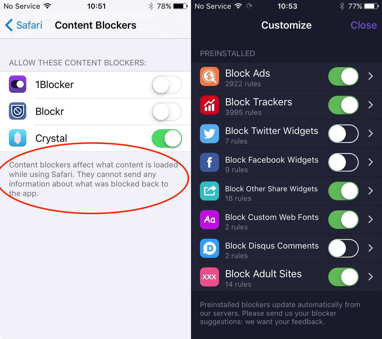
Remember how Apple introduced “Content Blockers” in Safari in iOS 9, and in parallel introduced “Safari Web View” for all apps – which meant simultaneously that you could install a mobile adblocker, and that that adblocker could be used in any app which opened web pages (such as Tweetbot, my weapon of choice for Twitter)?
The ad business had a collective fit over iOS adblocking, and it’s ready to have a second one now. Dean Murphy, who profited handsomely (and rightly so) from his Crystal adblocker, points out that with iOS 10, Apple is taking your ability to block targeted advertising one step further, even if you don’t want to install an adblocker.
On his blog, Murphy explains that “Apple is changing the way that the ‘Limit Ad Tracking’ setting works in Settings → Privacy → Advertising, and it seems to be causing a mini storm in a teacup among the adtech world.”
As he points out, while Apple got rid of the “UDID” (Unique Device IDentifier) for iPhones some time ago, in iOS 6 it provided the IDFA – ID For Advertisers. If you turned on “Limit Ad Tracking”, you’d be given a random new IDFA, plus a flag would be set telling advertisers you didn’t want to be tracked. But guess what! Advertisers don’t seem interested in saluting when that’s run up the flagpole.
So, says Murphy:
In iOS 10, when you enable “Limit Ad Tracking”, it now returns a string of zeroes. So for the estimated 15-20% of people who enable this feature, they will all have the same IDFA instead of unique ones. This makes the IDFA pretty much useless when “Limit Ad Tracking” is on, which is a bonus, as this is what users will expect when they enable the feature. These users will still be served ads, but its more likely they will not be targeted to them based on their behaviour.
This didn’t stop one guy over at Ad Exchanger wailing that Apple is “giving consumers a way to opt out of advertising altogether” (it’s not) and that people shouldn’t have the right to opt out of advertising. Which is quite a stretch. Murphy has some more figures on how much the adtech people aren’t losing by this move. But it’s still a good one by Apple, which fits well with its privacy story.
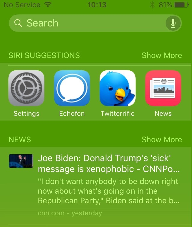
Open the camera, Hal
So you lift up your iPhone to wake it – did every other article mention it now has “lift to wake”? Yes they did (it’s triggered by the orientation sensors) – and now you have a screen with three little dots at the bottom. You’re in the middle; swipe right (that is, pull from left to right) and you get a ton of widgets.
But swipe left (pull right to left) from the home screen, and you now get the camera. This is such an obvious and timesaving move that it’s amazing it has taken four iterations of the “swipe” motif introduced with iOS 7 (7, 8, 9, 10 – that’s four) to get it right.
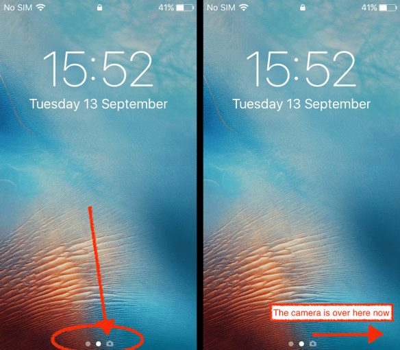
The Lock Screen in iOS 10 now shows you that the camera is off to the right (ie, swipe left). My arrows and text, obviously.
Having the camera a swipe left from the lock screen is quick, easy and a hell of a lot more convenient than having to swipe up, as has been the case since Apple introduced that route to the lockscreen camera in iOS 5.1 in March 2012.
You can understand why iOS 7 didn’t change that. People had had less than 18 months to get used to “swipe up” when iOS 7 was released in September 2013. Apple doesn’t do UI changes all at once. It taught people how to swipe, then a year later it introduced bigger screens where they’d need to swipe. So we’ve now had “swipe up for the camera” for just over four years. But it’s logical, and faster, to swipe left: it’s a shorter distance, it’s more natural for your thumb (I always found “swipe up” a struggle if I had the phone in one hand), and that screen on the right is unused virtual space.
So all hail the new way of getting to the camera. Though in iOS 10’s first few weeks you’re going to hear lots of people saying “how do you get the camera?” and probably swiping up to Control Centre – though the camera is there. But be the helpful one, and show them the side swipe.
Not quite better: Control Centre/r access
I don’t know about you, but if I’m typing something in Messages and need to bring up the Control Centre, it’s akin to an Olympic event to raise it first time. More often I hit a few random keys first, and have to retry.
Pulling up Control Centre is hit-and-miss if you have a keyboard running
This doesn’t seem any better in iOS 10; I think it needs some sort of border below the keyboard. It’s a difficulty that seems to have come in with iOS 7, so perhaps in a couple of years..
The other change in Control Centre (I’m going to use the British spelling dammit) is that it’s now split into two panes, which you swipe between as needed: non-audio stuff in the left, audio stuff (such as music playback and audio output direction) in the right.
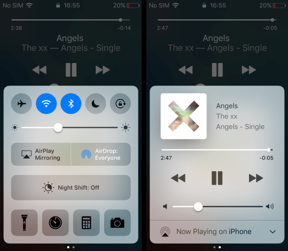
The new Control Centre in iOS 10 is split across two screens – swipe between them. It remembers which one you last accessed.
Update: I’m told by Ravi Hiranand that the Home app gets its own Control Centre screen, if you have it functioning. As I’ll explain below, I didn’t so I didn’t. (End update.)
This is another thing that will have lots of people saying “hunh?” as they try to get used to it; since iOS 7 (when it came in) it had been all in one place, but with the introduction of Night Shift on the iPhone 5S and above, it was all getting a bit crowded. One pleasing little touch: when you touch the volume slider to change it, the speaker buttons at either end light up. (Update: Marc Blank-Settle says this was already in iOS 9, and he’s right, it was. This is what makes software reviewing tough: you notice something for the first time just when it has always been there.)
Press to unlock
The most subtle change is that it’s no longer enough to rest your thumb (or other finger) on the TouchID button to unlock the phone/tablet. It certainly used to be the case that it was, but on the 6S range in particular this could mean that if you picked the device up to see what was on the notification lock screen, and particularly if you used a phone, chances were high you’d unlock the thing and miss what you actually wanted to see.
Now you have to actively press on the button to both identify yourself and to open the lockscreen. This also fits in with the new Taptic buttons on the iPhone 7 range, which don’t actually move, so that you have to tell them you’re there by actively pressing.
This seems like a trivial point, but in the first few weeks you’re going to hear lots of people whose muscle memory is built around resting their fingers on that button who don’t understand why doing that doesn’t unlock it. On such small things are perceptions of ease of use built.
However you can turn this off, at least on TouchID devices. You have to go to Settings ▶️ Accessibility ▶️ Home button, and there you’ll find “Rest Finger to Open” as an option. Lots of things are hidden down there in “Accessibility”.
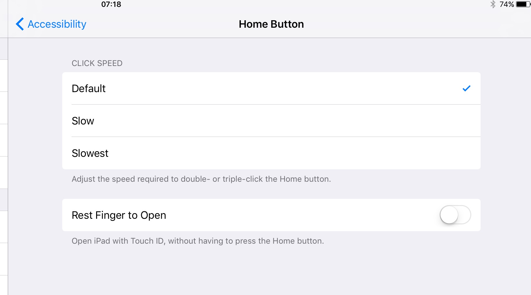
You can revert to the old TouchID behaviour via Accessibility.
Deleting apps
Sure, you can delete the stock apps. Don’t bother. You’re not really saving any space. And that app you downloaded to replace it? Takes up more room and doesn’t get system-wide benefits.
Mail, now with filters
Speaking of stock apps, iOS’s Mail is creeping towards a vague parity with what OSX’s Mail could do in about 2000, when the latter was still in beta. Though it is way easier to triage email with swipes on a touchscreen than a keyboard and mouse.
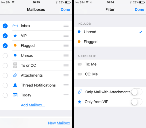
In iOS 10, you can filter email, via a little “filter” icon at the bottom of the screen: tap it to change between filter criteria.

You can filter mailboxes by Unread, Flagged and a few other criteria: tap the icon
We’re still stuck, though, with a very limited number of ongoing filter systems: you can’t set up a “smart mailbox” based on a phrase, for example, even though OSX has had that forever. Here are the options for filters:
This “what does that do?” thing about the filter icon is something most people will probably come across by accident. It’s helpful, but Mail is still some way from being a powerful app. It’s still only useful.
Maps: you can get there from here
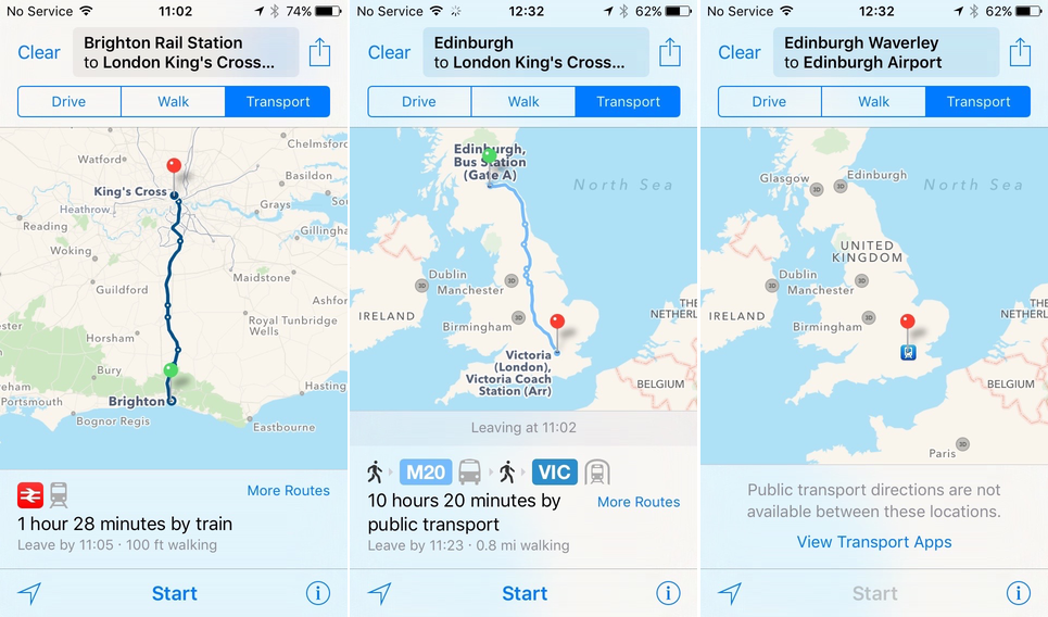
In iOS 9, Maps began getting public transport details, and that has quietly been enhanced over the past year. The key change is that it’s much more sensibly laid out: search is on the bottom, and location plus settings are in the top right.
Even better: search is coordinated among devices, so that if you do a search on your tablet, those searches will also be on your phone. (Finally.)
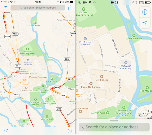
The Maps app is improved in iOS 10 (on right) over that on iOS 9 (left): it now puts search in a more accessible location at the bottom, remembers searches from other devices, and can offer ride-sharing app routes.
Notes, collaborate
Apple made something of collaborative editing coming to iWork at the iPhone introduction last week, but it’s offering exactly that in the new Notes: type up a note, and you can choose to share it with someone, who will see the changes that get made, and be able to edit it too.
Obvious use: shopping lists. As long as the person shopping (or suggesting shopping) doesn’t go out of range of data.
Under the hood: Siri and machine learning
The range of things that Siri can do hasn’t changed much in this update – at least, not visibly – but it is improving. And what’s really going to change is that it will be open to some developers, for a limited number of functions. I didn’t see any in the betas (you’ll have to see what developers do with it).
Photos are meant to get a tonne of machine learning. But it’s principally facial recognition, and the “Memories” function is – for me at least, having few photos with location tags – so-so. Yes, it’s nice to have photos collected together from particular days, but this isn’t Google Photos with its ability to find “photos of dogs” from an unlabelled corpus of pictures.
Update: Nick Heer points out that it does show you photos that match a keyword (singular is best). It hasn’t done this on the iPhone SE, but on checking my iPad and doing a search in the photos for “horse” I find that yes, he’s correct. iOS 10 calls them “categories”. You can discover what categories it has available by typing a single letter of the alphabet into the search box, and seeing what unravels. (Perhaps someone will make a list. What am I saying? For sure someone will make a list. And look – here it is.)
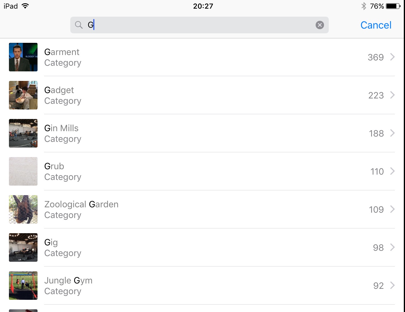
Type a letter, get a list of categories
[end update]
Then again, the pictures sit on your phone, so possibly over time the capability will be there. (We simply don’t know how much processing power per photo is needed for Google Photos’ identification system, nor how many examples it has to see to hit its training targets.)
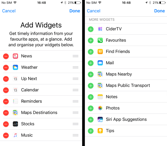
Finally: home screen widgets
Apple hasn’t gone as far as Google in Android, and nothing like as far Microsoft in Windows Phone, in terms of what widgets are able to do as a layer over the home screen. They don’t dynamically update while you’re not looking; they hurry to do it when you swipe across. Saves on background processing. But you can edit them, as before.
Yeah, that’s all
Sure, there’s a ton of other stuff. There’s:
• the update to Messages (annoy your iOS 10 friends by sending them “Happy Birthday” messages) which now means that it’s becoming something of a platform.
• Apple Pay on the web – possibly that should have been a feature above, but I never tried it out.
• Home. As an app. I couldn’t find any products that actually hooked into this, and I suspect it might be a while before I do. (Ravi Hiranand says Home found his Philips Hue light automatically, and “works better than the original app”.)
• Subtle thickening of fonts, so that text is easier to read. This is system-wide, and very noticeable in the re-thought Apple Music and in Maps.
Finally
So – should you upgrade to iOS 10? Don’t you love how this question is asked as if you might not? You’ve read a whole piece about it that you didn’t have to. You probably will. And yes, you should benefit. Some of the touches are clever, and some are overdue, and some are essential. But it’s all about getting the device out of the way.
The thing you’ll notice the most? Pressing the Home button. It’ll bug you gently for a couple of weeks. Then you’ll forget it. And after that, you’ll notice the Maps app’s improvements. And those you’ll probably forget; can you remember what it was like before? Hardly anyone can.
That’s the way with software: you change things wholesale, and within a few months nobody could draw what the old thing looked like. Believe me, though, if you came across a device running iOS 6 or earlier, you’d be amazed at how… primitive it looks. Pundits might have bitched about iOS 7, but it’s been a wholesale improvement in user interface.
One could wish for better, smarter AI, but that might have to wait a few years for more power on the device. Even so, the “Siripods” (aka AirPods) point towards Apple wanting us to have a closer verbal relationship with our devices.