The Apple Watch Series 3 ripoff: how carriers want to charge for zero data use


The Apple Watch Series 3 can take phone calls. But you’ll pay for that. Photo by portalgda on Flickr.

On first trying the Apple Watch, in 2015, my reaction was that it did a lot of things pretty well. I still wished that it had an always-on screen. But earlier this year I started taking exercise more seriously. At that point, it suddenly comes into its own: the workout apps, the heart monitoring, the calorie estimator. Add AirPods – I was quick enough to snag a pair when they went on sale in the UK last Christmas – and you have a terrific combo for running: store some music on your watch, connect AirPods, go running. No wires, no phones, and no, they don’t fall out.

When I’m out I see other runners with phones strapped to their wrists, with headphone wires all over the place. They give me odd looks. I give them an odd look right back. Exercising without wires is how it’s meant to be. (If you’ve got a Watch then I recommend the HeartWatch app, which gives you the granular detail of your heart rate, especially during workouts.)

Since you can add Apple Pay, the Watch becomes a device that can do everything while you’re out and about, even without a phone. Except.. if you don’t have a phone you can’t take phone calls, or receive and respond to text and other forms of messages, or get new data for Maps, or activate Siri, etc, etc.

Adding mobile (“cellular”) capability makes perfect sense there. Now you really can leave the phone at home, because you can receive calls anywhere you get coverage – with good LTE this means plenty of places, such as the middle of a lake, as in the Apple demo – and make them, because your contacts list is in the phone, and failing that there’s a Big Buttoned Virtual Keypad.

And generally in technology, if someone can, someone will. Samsung had already gone there, but its device was big and bulky, and it didn’t have the same phone number as your phone. Apple has solved that.

Zero data, zero incentive

What doesn’t make sense is the price that carriers are looking to charge for hooking your Watch to their network. In the US, the price is put at $10/month; in the UK, at £5 per month, on EE.

These are outrageous prices, on a par with the ludicrous data charges that carriers used to apply before the iPhone. In those days, up to mid-2007, to want data on the move marked you out as someone with money to burn, or else a raging desire for debt.

Why outrageous? Because Watch cellular data use is not additive; it’s substitutive. If you’re pulling in data on your cellular Watch, you must have left your phone behind. Ergo, you’re doing nothing with the phone, so it’s consuming (next to) no data. The data consumption has shifted to your Watch.

(Just to be clear: Apple says that your Watch uses the best available connection with your phone. If you’re in Bluetooth range, it uses that. If you’re on the same Wi-Fi network (or even, magically, a Wi-Fi network that your phone knows how to connect to, even somewhere distant) then it’ll use Wi-Fi. Now, if you’re not in range of either of those, the Watch will connect to the data network when it has to. But most of the time, and especially when you have your phone with you, it won’t be connecting to the mobile network.)

If anything, you’ll be consuming less data while you’re Watching solo – you won’t be loading Facebook pages, or giant email attachments, or scrolling through Twitter, or watching YouTube. Sure, you might be listening to music streamed from Apple Music. But you might well have been doing that anyway; if you like streaming music while you run, you’ve probably been doing that already, but with a phone around your arm. (And you can get music onto the Watch just by downloading it from the phone, rather like one used to with iPods. This is probably the biggest use case of music on the Watch even if you can stream, because runner like to create their own playlists, not rely on stuff in the cloud.)

Nor do the carriers have to send you a physical SIM; it’s done in software, in the Watch. Nor do they have to open a new account; you’re already a customer. There might be a mild bit of back-end administration to inform the cell network that two different IMEIs (mobile device IDs) have the same phone number. (Side note: the fact this can be done implies that spying on your phone calls may be easier than it seems?)

But there’s nothing in there which justifies $10/month or £5/month. And think of what that adds to the cost of the device: $120 or £60 per year. That’s a substantial chunk of the upfront price, and it never stops. On Twitter, Marine Engelvuori points out that EE ties you to a 24-month contract if you buy the watch from them, and that you have to add VAT; suddenly that device which costs £399 on its own has added £200-odd of costs over the contract lifetime.

If the cost were $1 or £1 per month, that would be tolerable; one can concede that carriers could charge for the tiny bit of administration cost that might be involved, and maybe eke a profit on the fact of this device’s new qualities. But more than that is just absurd, and it will stifle purchases by anyone who might be a marginal buyer of the service.

This is a real pity. The Series 3 is a remarkable piece of engineering: turning the screen into the aerial (I don’t even know how they do this) and maintaining the thin profile is just amazing. All the software functionality, such as heart rate monitoring and so on, is top class. People could benefit from cell-connected smartwatches, and not only the ones made by Apple. (It might encourage people to spend less time staring at screens, weirdly enough.)

But the price that the carriers are trying to charge is stupid.

Third-party like it’s 2006

It really is 2006 in wearable land; the time before carriers woke up to the broader benefit of offering services at prices which encourage people to use them. Wearables are, arguably, still at the same stage in their evolution as the smartphone was in 2006. This doesn’t mean though that the carriers couldn’t act as the midwives to help things along a little.

Remember, they’re trying to charge this amount for something which will use no extra data over you using your phone, and for which they don’t have to provide a physical item.

There is a precedent for doing this well: Amazon and the Kindle. The deal it cut for “Whispernet” meant you could download books anywhere and all you paid for was the extra 3G functionality in the upfront price. No ongoing fees. I can imagine that Apple’s board gulped a bit at the potential cost of doing that for the Watch, when people would no doubt eagerly take the chance to stream music all day and all night long forever for the extra £70. Kindle files are pretty small compared with music files, and Amazon had a monopoly on that market. So it was probably a non-starter for Apple to shoulder the cost. (This doesn’t mean there’s a cost to the carriers – as I said above, it’s substitutive. But it would be all new costs for Apple to pay for Watch data.)

Maybe the first carriers are just hoping to rake it in before competition opens up and drives prices down. Here’s hoping.

It took the iPhone, and Steve Jobs’s negotiating genius, to get carriers to adopt a flat rate model for data. It’s a disappointment that Apple hasn’t managed to push the future of connectivity forward in the other place where it matters – not on your wrist, because they’ve solved that; but in your wallet.

Fining Google: a slow train coming


“Slow Train Coming”, the artwork from the cover of Bob Dylan’s album. Photo by Logos: the Art of Photography on Flickr.

The cover of Bob Dylan’s album “Slow Train Coming” shows people literally laying a railway just ahead of a train which is, in theory, a-comin’. Just very slowly. The European Commission’s antitrust decision against Google is just such a train. A €2.42bn train. Big, but deathly slow.

(If you need any background about the EC and Google and why this all matters, I wrote about it in 2015. Slow train.)


TL;DR:
• Google has been squashing rival shopping sites since mid-2006;
• the EC was alerted in summer 2009 after many efforts by sites to get responses from Google failed;
• do we seriously think Google’s going to change its behaviour?
• why isn’t Foundem getting a slice of the fine?
• antitrust moves too slowly in the modern era


The European Commission’s fine of €2.42bn on Google has been just like that train: a damn long time coming. The original complainant, the “vertical search” site Foundem, first noticed something funny happening to its position in search results back in 2006: it was being penalised for no apparent reason.

The penalty (search) box

Foundem was the brainchild of Shivaun and Adam Raff (it really is like their child, and they are brainy; I’ve met them on several occasions as this antitrust case has inched its way through the system). By this time the site was only six months old, focussed on what it saw as a gap – or at least growing niche – in the market: “vertical search”, comparing one specific product, rather than “horizontal search” as practised by Google and Bing (and many also-rans). You can probably think of other “vertical search” sites: Kelkoo was very big at one point. There’s also one called Amazon, though at that time it did a lot of the fulfilment as well; Foundem would find results from other shopping sites, so that it was like a meta-search engine. Amazon, at the time, wasn’t, though as it has become more of a marketplace rather than a fulfilment company that description is increasingly accurate.

But for Foundem in June 2006, this was remote. It had been hit by an algorithmic search penalty which hit lots of vertical search companies. It filed “reconsideration requests” to Google, which it says the company ignored.

(See the timeline for yourself at Foundem’s site.)

In August 2006 it was hit by an “AdWords Penalty”: this suggested that “landing pages” people arrived at were such low quality that it would have to pay much more to be able to buy an AdWord (Google advertising position). How much more? It was raised, they say, from about 5p/click to £5/click.

It’s summer 2006, and as the Raffs put it in their timeline, “Foundem was excluded from Google’s natural and paid search results, both of which are essential channels to market for any internet-based business.” That would be near enough a death penalty for any consumer-facing business; fortunately they found other outlets, such as powering shopping searches on magazine websites for IPC, Bauer and others.

The Raffs kept lobbying Google for reconsideration, and kept being brushed off; meanwhile Google launched Universal Search (integrating Google Maps and Google News and YouTube results into a box at the top which favoured Google products and pushed rival services further down the search rankings).

In December 2008 a TV show named Foundem the UK’s best price comparison site. Google meanwhile didn’t relent on its penalty against Foundem’s position in search results.

Finally, in July 2009 Foundem had its first meeting with the EC’s DGComp – the arm of the European Commission which investigates antitrust cases.

Eight years and more of hurt

That’s almost exactly eight years ago. It’s taken absolutely ages for the EC to act on this, giving Google plenty of time to tighten its grip on the business, and even for the whole search landscape to shift – from one where the desktop has primacy to one where many searches begin on mobile, inside apps.

There’s lots of applause today from Europeans about the fact that Margethe Vestager didn’t give up on this case, and that a record fine has been imposed (and that if Google doesn’t alter its behaviour in 90 days, the daily fine will be eye-watering). “Better later than never, but seven years have been still an eternity for some market players, in particular European SMEs [small and medium enterprises],” to quote the MEPs Ramon Tremosa I Balcells and Andreas Schwab.

There’s the usual eye-rolling from a number of American observers, who say “which AMERICAN company will be next?”, and ignore the fact that the Federal Trade Commission’s investigation in 2011/12 discovered that Google’s own user testing found that people preferred seeing other vertical search engine results in the organic search results; and also ignore the fact that DGComp fines all sorts of European companies for antitrust and cartel actions of all flavours. (The decision before Google was fining three car lighting system producers over cartel behaviour.)

Also, for those eye-rolling American (and other) readers: European antitrust doctrine differs in one very significant way from the American flavour. In the US, if you use a monopoly in one space to take over another but consumers benefit overall, there’s no case to answer. This was why the FTC dropped its case (on a 4-0-1, ie one abstention, no opposition) decision. Scroll down in that FTC release to “search bias” where it says the introduction of Universal Search “could be plausibly justified as innovations that improved Google’s product and the experience of its users.” A bit milquetoast, that recommendation.

In the EU, however, the question is whether antitrust stifles competition, not what happens to consumers. This refusal to consider “consumer surplus” infuriates and astonishes a significant number of American observers, but it’s how it’s done here.

But, but, but. I very much expect that Google will appeal this before the 90-day deadline, and that this will mean it doesn’t yet have to change its behaviour, nor pay the fine. Do you think that this might be a long-drawn-out process which will grind interminably through the courts, during which Google won’t change how it displays results? I do.

Meanwhile Foundem and all the other vertical search companies which the EC is ostensibly protecting have been almost crushed. If there were any justice, they’d be getting a slice of the fine. After all, companies which report cartel action either get some payment, or (if they’re part of the cartel) let off some of the fine.

Slow train, now arriving

This is the reality of antitrust: in technology especially, the dominance of these companies and the power of their networks means that the decision comes too late to help those who were originally affected. It was certainly the case with Microsoft and Netscape; it’s clearly the case here. Who knows how big Foundem and Kelkoo and all the others might have been if Google hadn’t been able to use its dominance in straight search to annexe the vertical search space?

Some would really like the fine to have teeth. Tremosa i Ballcells commented: “When it comes down to the fine, I always said: first, you pay the fine and, then, you restore competition and the level playing field like it was the case with Microsoft. I believe that the fine should be retroactive for each year since the beginning of the wrongdoing by Google. This fine is far from the theoretical fine of 10% of Google annual revenues. The fine should be multiplied by the number of years since the start of the damage to competitors. Moreover, the behaviour of Google since the SO [Statement of Objections] and from today should be taken into account as well. Time helps monopolies, not SMEs.”

The argument of course is that antitrust actions serve to make the dominant company change its future behaviour: a fine of that size, and the threat of continuing fines, and particularly the tedious legality of it all, burdens the company’s decision-making process so that its executives all act as though someone suggested they play on the electrified railway when the idea of moving into “adjacent” business comes up. (It certainly worked with Microsoft.)

This will be the real acid test of the EC’s action: will it make Google’s internal culture change? We won’t know the answer to that for some time. Slow train coming.

In search of the early adopter (HomePod edition)


An Apple HomePod. If your home is this nice, wouldn’t it already have a Sonos Play:1 or similar there? Photo by portalgda (via Apple) on Flickr.

Ahead of Apple’s WWDC, research companies were falling over themselves to offer their forecasts about how the “smart speaker” market would grow over time.

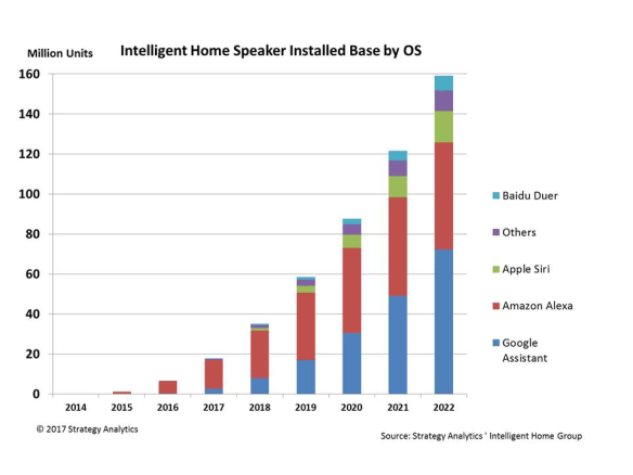
Here, for example, is what Strategy Analytics reckoned the world would look like – note that it’s using installed base, not sales – over time:

Smart speaker market - Strategy Analytics forecast to 2022

The way they see it, Amazon’s early lead with the Alexa is going to be eroded by Google, while Apple, “others” and Baidu (in China) will take the rest.

What I wonder about is: who’s left who wants to buy a HomePod? Who are the early adopters?

If you want a “smart speaker”, you’ve been served for quite some time in the US by Amazon’s Echo and Dot products, which are passably cheap. For Amazon, they’re the peace dividend of losing badly in the smartphone wars when the Fire Phone turned out to be a clunker.

More recently you’ve been able to buy Google Home – which managed to get a passing mention in a Modern Family episode in a recent series, so that is clearly reckoned to have reached far enough into the public consciousness not to merit special highlighting. (Sure, it could have been product placement, but there’s no point placing a product nobody’s heard of. Modern Family likes to play with modern tech obsessions: in 2010 one of the episodes was about Phil Dunphy’s mad desire to get an iPad on first-day release.)

And there’s even a (Microsoft) Cortana speaker from Harmon Kardon.

A recent survey of 1,000 people found that “smart speakers” are the most popular category of “smart home” device: about a quarter of US households have some smart home gizmo, and of those 56% reported that they “own and use” a smart speaker. And they really use it regularly. Half of respondents (we’re at about 12% of households) use it at least daily; another 39% use it several times per week.

Top five uses, in order: play music, ask for the weather, get news, get basic facts and trivia, get or set calendar and/or scheduling info.

Not mentioned in this, because it doesn’t do “smart” (so far, and probably not ever) is Sonos, which most people are probably familiar with: it provides single- or multi-room music and speech streaming for pretty much any service, with a range of high-quality audio speakers, as well as TV soundbars. It has been going since 2002, focussing just on multi-room music; I’ve liked the Sonos idea ever since I saw it in 2005, and I think that when it released the Play:1 speaker it found the sweet spot of price and audio quality. (I own a number of Sonos devices.)

Sonos, one should note, has hit some rough times, laying people off in March 2016. It isn’t clear how big its installed base is – it only talks about serving “millions of rooms” – but it’s very likely that it has users in multiple millions of homes. Update: this person says Sonos has annual sales of about $1bn, equating to 5m speakers per year. “Not mainstream,” they say. Though I’d say that 5m per year – more than a million a quarter – isn’t too bad.

And how does the install base look at present? According to CIRP, about 11m Amazon customers have an Echo, of which 52% (6.6m or so) have the cheap Dot. Amazon has about 70% of the market, says eMarketer – though others put the figure higher.

All this leaves one wondering: hasn’t the early adopter market, who might have been keen to buy a comparatively expensive smart speaker (and even slightly more expensive than Sonos) been tapped already? There are millions of those things out there already, playing music and telling people what they could figure out themselves by gazing out of the window.

After all, if you have a product which does something comparably new, then the general thesis is that you have to tap the innovator market (about 2.5% of the total who will buy it) and then the early adopter market (13.5%), and then spread the news to the “early majority” and “late majority” who each comprise 34%. Then finally you mop up the 16% of laggards. Note that even when your market is saturated, you don’t necessarily reach 100% of the population. Not everyone will want your gadget.

So at what stage are “smart speakers” – and multi-room speakers, since the HomePod does both?

We can probably be confident that multi-room speakers have breezed into their late majority by now. If Sonos is having trouble finding fresh buyers, that’s a sign of market resistance.

And if smart speakers are already in 12% of US households, then those are nudging well into the early adopter market.

This is different from the situation when Apple has launched previous products. The Macintosh, all those years ago, was entirely new in sporting a graphical user interface. The iPod came early in the MP3 player revolution – though many people had portable CD players, most people didn’t have an MP3 player, nor an MP3 library. The iPhone was out on its own in the smartphone category through its all-touch interface. The iPad defined an entire all-touch “slate” tablet market. (There had been tablets before, which had poor interfaces for touch.) Even the most recent new device, the Apple Watch, came when smartwatches had very small user penetration.

So in that sense the HomePod is coming at a very different time: three years (and some months) after the original Echo, and what’s more it’s coming in December, giving everyone else a chance to get their marketing in first.

How then is Apple intending to sell it? Apple is framing it as a really music speaker with a bit of intelligence thrown in. Here’s the quote:

“Apple reinvented portable music with iPod and now HomePod will reinvent how we enjoy music wirelessly throughout our homes,” said Philip Schiller, Apple’s senior vice president of Worldwide Marketing. “HomePod packs powerful speaker technology, Siri intelligence and wireless access to the entire Apple Music library into a beautiful speaker that is less than 7 inches tall, can rock most any room with distortion free music and be a helpful assistant around your home.”

This makes it sound like Sonos with benefits. It’s also saying: those things that Amazon and Google can do? We can do that, but sound better. It’s looking for the things that those can’t (yet?) do, and aiming for them. Early user tests (in very controlled environments) suggest that the HomePod sounds better than the Sonos Play:3 (which is comparably priced). Could be, though I’m not sure why a Sonos owner would give up the latter for the former. And we know from the triumph of MP3 over CD that in music, people prefer convenience over sound quality. Update: two points made to me after first publishing this post. First, Apple could find a market in China, where Amazon and Google are effectively excluded. Second, the privacy angle could be attractive; some people just don’t like the idea that Amazon and Google are going to try to sell them stuff. (Google Home has already started doing this, and will carry on; Amazon’s Echo/Dot/etc are intended to be mainlining for shopping lists.)

Overall, it feels as though Apple decided – as usual – that there was only one place it could thrive in this market: at the premium end. But again, if someone has the sort of money needed to buy a HomePod, why haven’t they already bought some Sonos kit? Or if they want a smart speaker, wouldn’t they just get an Echo/Dot/Home?

That’s what I’m puzzled by: how Apple is going to scoop up enough of the early majority market to make this work. Early majority buyers can be more price-sensitive than innovators and early adopters. Apple’s pitch seems to be for those who haven’t bought a Sonos, saying: look, you can control this with your voice. There’s surely a market there – Strategy Analytics thinks it’s tolerably big – but it’s noticeable that even there it’s a comparatively small slice of a sizeable market. Sometimes it’s good to let the early players sort the market out for you. But I think this might be one case where it isn’t.

The (fixable) problem with Steve Ballmer’s USAFacts site: its lack of transparency

Those of us who have been in or around the technology space since the 1990s when Microsoft used to bulldozer all in front of it (for those younger than that: like Google in the 00s, and Facebook now) are completely unused to Steve Ballmer doing things that we can uncomplicatedly see as good.

But his new site, USAFacts, is one of those things. Like Bill Gates pouring money into vaccinations for developing countries, it’s a good thing to have done.

USAFacts, in case you haven’t read the New York Times piece about it (where the site is described as a “fascinating data trove”), the precis is that Ballmer has spent $10m hiring economists and others to put all the spending and other data that the US government products – particularly its budget, where it spends $5.4 trillion and gets $5.2trn (it’s left as an exercise to the reader to figure out how one bridges that $0.2trn gap) – into a site which you can query, to find out just where your money goes, if you’re an American.

Neatly, it divides expenditure into the four “missions” of the US government, which apparently are “establish justice and ensure domestic tranquility; provide for the common defence; promote the general welfare; secure the blessings of liberty to ourselves and our posterity”.

There may be trouble ahead

The problem starts once you begin wandering into it and wondering: ok, how does that number come together? Take the “Crime and police” tab under the first mission: click through and you get some data showing how arrests, violent crime, and “public safety officer” numbers are moving. The prisoner data actually has a link to a set of slides – 291 PDFs – drawn from the Bureau of Justice Statistics and reproduced as PDFs by USAFacts, which sticks its own copyright onto them (down in the bottom right).

Screenshot 2017 04 19 17 54 04

(Come on. That’s crazy. Repurposing open-licensed data as PDFs and sticking your own copyright note on them? Is this the 1990s?) In general, you’re left having to trust the site to have got it right. Plus: in almost every situation, we don’t know where the data has actually come from. The prison data is an exception. There’s no transparency in a site which is trying to make government transparent.

Unless I’ve missed something staringly obvious, there are no places where you click on a link and it says “we got this from the Bureau of Labor Statistics, and this from the Treasury, and this from the Department of Defense”. The methodologies (here’s one – PDF) will give you a number of the methods and sources from which all the numbers are collated, but not how they’re balanced out against each other.

This is a huge omission. I can understand that $10m only goes so far, but if you compare it to a site like Our World In Data, which has been built on a budget probably comparable to one day of USAFacts’s, you see the contrast. Not only are the datasets open and downloadable, you get pointers back to the originals.

Coins: adding up to something

Nor is it as though trying to analyse government spending is a new thing. In the UK, HM Treasury made its COINS database into open data after pressure from newspapers – well, particularly the Guardian, where we championed free data.

From COINS you could generate visualisations like these:

And you could do all sorts of visualisations of what was going on.

This was back in 2010; it’s not as though this is some groundbreaking piece of work that has only just been released to the public and might not have crossed the radar of, say, a multibillionaire who has enlisted a lot of economists and statisticians and programmers to do some work analysing a country’s budget.

Action points

In conclusion: Steve Ballmer has made a start. It’s an adequate start, and given the size of what he’s trying to contend with, it’s laudable that he’s got this far. But there are many more things that remain to be done.

Just in case he’s vanity-searching, here is my list of suggestions for how to turn USAFacts into a truly useful site that will let people explore what the US government and its states are doing with their money:

• link back to the original data. People need to be able to trust it.
• offer inflation-adjusted views of the data. It’s not hard to find inflation figures for past years.
• add trade figures. Imports and exports are relevant data for understanding your country’s performance, and some part of government definitely collects them.
• add comparative figures with other countries. It means nothing to tell people how much they’re spending on health care if they don’t know how that compares to other countries.
• find ways to let people drill down to their state, country and district, and compare them with other states, counties and districts. It’s just data and databases, after all.
• let people see how employment and other elements have changed. Show them how racial factors have changed. Show them how things have changed with different politicians. Everyone wants to apply these prisms to these data, and while you might not want this data to become partisan, the reality is that these numbers will be used anyway by people of whatever tinge to prove whatever they want. You’re already in that battle, so give people more weapons to fight it.

It’s a good start, Steve. Please don’t make us wait for version 3 for it to become a must-use. (Yes, kids, that was a Microsoft joke. Ask your parents.)

You think it’s a Muslim laptop ban? This picture suggests it’s really a terrorist ban

Airside at Baghdad Airport
The photo is apparently taken airside at Baghdad Airport; the paper says “The Islamic State is right in your home”. Source: Twitter.

The decision by the US and UK to ban carry-on electronics of various sorts from a number of countries in the Middle East has brought out all sorts of unthinking reactions. Trump is driving a lot of people stupid, which is a pity.

An example of the unthought-through reaction is this article at PC Mag, where Sascha Segan says

The DHS notice doesn’t give any evidence of specific threats leading to this new ban, which will go on indefinitely. It doesn’t explain why a bomb can explode in the cabin but not the cargo hold, or why travelers but not airline employees are affected. While it has a 30-question FAQ about the ban, most of it is meaningless weasel words adding up to “trust us.” The more you think about any aspect of this ban, the less it makes sense from a security perspective.

Not to pick on Segan particularly; variations of this article, in hot-take form, were all over the web when the news broke on Monday (US ban) and Tuesday (UK ban).

However, it’s worth remembering – as if you hadn’t had plenty of reminders recently? – that the intelligence services have access to more information than you do.

Liquid memories

Remember the liquids ban of summer 2006? It was imposed out of the blue, and threw airports, airlines and security into near-chaos. Wikipedia has a good summary of why it was introduced: British police (perhaps helped by intelligence services) had uncovered a plot to blow up a plane in mid-air, using liquid explosives in soft drink bottles. In all, more than 20 people were arrested; nine were eventually tried, and seven found guilty of conspiracy to murder.

Now, with that in mind, when the governments of not one but two countries impose sudden bans on the transport of potentially explosive things, you might think that people would take it seriously. There was one occasion when a would-be mass murderer ignited a bomb on the passenger deck of a plane out of Somalia – after apparently being handed the explosives by a ground worker. In a fabulous demonstration of karma, he was sucked out of the hole he’d made in the fuselage, and the plane landed safely. Subsequently, 20 ground staff in Somalia were arrested.

There are suggestions that this latest ban has been under discussion for a couple of weeks, in fact. That’s how intelligence works: gather data, consider risks, act.

The number of people complaining that “it’s just another version of the [Trump] Muslim ban” can’t be thinking clearly. The original “Muslim ban”, as a reminder, included Syria, Yemen, Iran, Iraq, Sudan, Somalia and Yemen.

It didn’t include the ones in the US ban: UAE (which includes Dubai), Turkey, Egypt, Jordan, Saudi Arabia, Qatar, Kuwait, or Morocco. The UK ban includes Tunisia too.

It should be pretty obvious, even if you think Trump is a fool, that this isn’t his idea. It has come from intelligence agencies who are worried about the possibility of a mid-air explosion.

You can see why Islamic State and similar terror groups might want to do something now. IS is being gradually crushed in Mosul, which means that its fighting force is dwindling fast. Its revenues are dwindling too, because its sources – illicit oil sales, “taxes” on the populations it oppresses, and ransoms – are all being squeezed. Lower revenues means less money for weapons and less opportunity to control territory, and the caliphate suddenly looks a lot less attractive.

(None of this is Trump’s doing either. He doesn’t have a “30-day plan to get rid of Isis”. He has no plan, other than “ask someone else to do it and bluster”.)

IS’s oil income has been plummeting as Turkey in particular has cracked down on illicit sales, and the price of oil itself has fallen considerably since IS got its big break.)

Losing the fight

Which brings us to terror groups wanting to make a splash. Simple way: get airside, put a bomb on board. Or whatever. The photo at the top was sent to me by a source on Twitter who watches this stuff. It was originally tweeted by a Twitter account @poihhp – since suspended. I can’t find any data on the account (age or followers) though the lack of responses to it suggests it is pretty new. As the photo caption above says, the paper seems to say “The Islamic State is right in your home”, and claims to have been taken at Baghdad International Airport.

I’ll admit that my ability to read Arabic is nonexistent (I relied on Bing Translate and my source’s slightly better translation). But that looks like a form of the IS flag scribbled on the right-hand side of the paper. They’re holding it in their right hand. I can’t identify the airlines that the two aircraft are from – they don’t seem to be Turkish Airlines or Iraq Airlines. There’s a list of airlines which go through Baghdad International. I can’t identify them from that either.

It’s possible this is a fake, or a jape. But it feels like there’s something authentic there. And remember: you didn’t know why the liquids ban was introduced in 2006, and you probably thought that was stupid too. (The arrests weren’t announced.)

But it turned out not to be. The reasons behind the carry-on ban are likely to be the same.

How many Apple Music users are on Android?


Apple Music: also on Android. Photo by tualamac on Flickr.

Apple announced on Wednesday that it now has 20 million subscribers to Apple Music after just 18 months – which feels like pretty good progress. Apple Music is also the only meaningful Apple service that’s also available on Android, as Apple tries to spread itself cross-platform.

Why is Music on Android as well as iOS? Because it’s not a distinguishing feature. Unlike Apple’s iMessage or its App Store, both of which are exclusive to Apple, and whose features are unique to it, you can already get lots of music services on both iOS and Android – Spotify, Tidal, Deezer, Google Play Music, Amazon Music and so on. (Not many, if any, of them are making money, but leave that aside.)

For Apple, every additional subscriber to Music is a bonus; it’s all money. The ones on Android are potential converts to iOS, where there’s more money to be made selling them iPhones, iPads and Macs, but time spent on Music is time not spent on Spotify, its principal rival, so that’s a benefit to Apple. App development costs aside, which are comparatively small, Android is a benefit. Additionally, if someone with an iPhone gets a Family Plan (allowing five people to use the same account; a Family Plan only counts as one subscription in Apple’s total), those five could include Android users.

So how many of those 20m are on Android? I’ve been tracking the stats on Google’s Play store for Apple Music downloads since its launch, including the download range and the number of 1-, 2-, 3-, 4- and 5-star reviews.

There are two things we need to work out: how many downloads there have been, and how many of those have resulted in subscriptions.

Download power

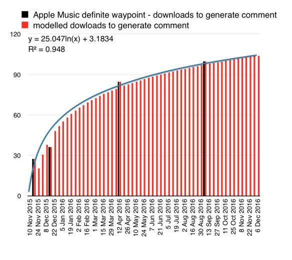
To estimate the number of downloads, I track the definite waypoints – when it passed 5,000, 50,000, 500,000, 1m, 5m – and the number of reviews against them.

Apple Music: how many downloads per comment?

The process is very standard across all apps: to begin with comments come quickly, so that almost every download prompts someone to review (about every 27 downloads, someone left a comment up to the 500,000 mark) which then tails off (only one in every 100 downloads prompted a comment by the 10m download mark). You can thus model how the number will change; and so even when you’re in the vague space between waypoints, you can estimate the number of downloads. (I’ve used this technique to calculate Android Wear downloads; it was accurate about when it would hit the 5m mark by a few weeks in a two-year timeframe.) The R-squared value is the correlation, which runs between 0 and 1: closer to 1 is nearer exact correlation.

Based on that, I calculate that this week Apple Music on Android hit 12.75m downloads. (It passed 10m around September 6.) It’s adding about 230,000 downloads per week, at a rate that seems to be holding pretty steady.

But downloads aren’t subscriptions. Apple Music offers a three-month trial period, after which you have to pony up. Clearly, some people will drop out. But what proportion of those who download it stay on and subscribe?

One subtlety here: the three-month trial means that strictly, we should ignore the downloads made in the past three months, since none of them will have qualified to become subscribers yet. (Downloads made to join a Family Plan don’t count as subscriptions.)

So the figure we’re looking at is from 6 September – which just happens to be when Apple Music hit the 10m download mark.

Star quality

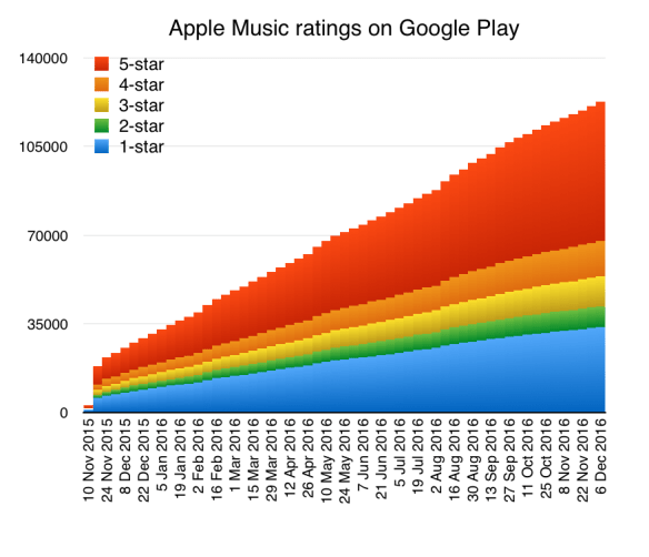
Here’s an obvious way to estimate that: look at the high-quality reviews. It seems logical (Captain) that five-star reviews indicate people who are really happy with the service. Four-star reviews are people who are pretty happy, but find some hassles with it.

Apple Music reviews on Android

By the time you’re down to three-star and below, I think you’re talking about people who aren’t impressed and won’t be staying.

Although people don’t become subscribers until three months have elapsed, I think you can include recent ratings, since those could come from people who have become subscribers. (We don’t know what prompts people to review an app.)

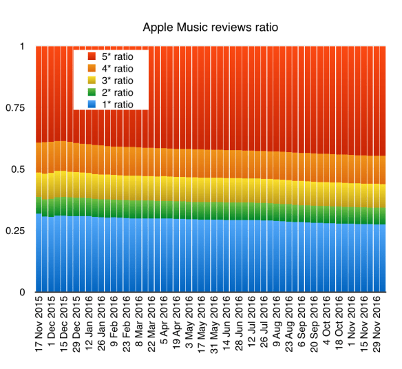
So what do the ratings show? At present, five-star reviews are about 44% of all reviews; four-star ones, 11%. That ratio has been pretty consistent; five-star reviews have been at least 38% of all, and average 42% over the life of the app. Four-star reviews go down to 10%, and average 11%. (I don’t know what the average is across all apps on Google Play.) In fact, the data shows a gradual improvement in how the app is perceived, according to the reviews.

Apple Music on Android reviews

Based on this information, we can get some useful minima and maxima.

10m downloads, five-star users subscribe: 4.4m Apple Music subscribers on Android

10m downloads, four- and five-star users subscribe: 5.5m subscribers

12.75m downloads, five-star users subscribe: 5.61m subscribers

12.75m downloads, four- and five-star users subscribe: 7m subscribers.

I’d suggest the useful range is probably the 4.4m-5.5m one.

(One confounding caveat: we don’t know how many of the eager reviews come from people who downloaded it because they’re part of a Family Plan. I can’t think of a simple way to evaluate this unknown.)

Phoning home

If we accept those numbers, it suggests there are 14.5m-15.6m Apple Music subscribers on iOS.

What does that mean in the context of how many phones are out there?

There are about 550m iPhones in use, according to Neil Cybart. And there are around 1.2bn Android phones in use. (Apple Music is available in China, so it can run on phones there.)

This implies quite low penetration for Apple Music: about 2.5% on iPhones, and about 0.3%-0.4% on Android.

Then again, given that Spotify’s last published figure (in September) is 40m subscribers, and it is also available on both platforms, it’s clear that it’s just difficult to get people to sign up to these services. Given how many people Spotify has been available to in multiple countries, it has only been able to convert about 1% of the total available internet population during its life. It seems like getting people to sign up to music streaming really isn’t easy at all. So if you’re an Apple Music or Spotify subscriber, you’re very much in the minority.

Even though Apple’s progress in a short time looks strong compared to Spotify’s over the same period, it’s an open question how big the total addressable market is here. Are we just crossing over from the early adopters to the broader audience who will jump on streaming? Or is it going to struggle to break through? These are still open questions.

Fear of a USB-C planet: why we’re going to miss Apple’s MagSafe


MagSafe 2: you’re gonna miss it. Photo by yum9me on Flickr.

Want to know my pick for the best technology Apple ever introduced? MagSafe. That’s the magnetic attachment system for power cords which it unveiled in January 2006 with the new MacBook Pro. Six years later, it followed that up with the MagSafe 2 connector.

From 2006 until the USB-C MacBook in mid-2015, every portable had a MagSafe connector of one sort or another. (The desktop machines didn’t.) As a technology, it’s so clever and so convenient, being reversible, and an inherent safety feature – you (or your dog/significant other) couldn’t destroy your laptop by accidentally walking into the power cord and pulling it off your desk, or destroying the power socket on the machine, either of which would be expensive to get fixed.

And now, I suspect Apple is going to get rid of MagSafe all across the laptop line, and replace it with USB-C. That’s what the “Hello again” launch looks like to me. (The MacBook Air might be kept on, unimproved and unadvertised, to anchor a lower price point.)

This is going to be a hell of a thing. From April 2006 to the end of December 2012, Apple sold 57m laptops, with – it’s a safe assumption – MagSafe adaptors on all of them. It used to split out the numbers, but stopped at the end of 2012, when the desktop:laptop ratio was running at 20:80.

Since then it has sold a total of 88.3m laptops and desktops; at that 20:80 ratio, one could reckon it has sold another 70.6m laptops.

That means that since the first MagSafe was introduced, Apple has sold a total of more than 120m laptops with MagSafe chargers.

And now it’s dumping them for USB-C.

Oh man. This is going to be a hell of a thing. If you’re like me and my family, then you have a ton of MagSafe chargers, possibly of different generations with the little magnetic doohickey which converts a MagSafe 1 to a MagSafe 2, distributed around your home and office. It’s so convenient not to have to take your charger from home to work and vice-versa; no forgetting. If you upgraded your laptop during the past ten years, you didn’t have to worry about getting a different charger; you could use the same one, or upgrade it. MagSafe is great.

Now? USB-C is coming. But you can’t make it compatible with MagSafe. No doohickey is going to make it right.

I can see that while a lot of people have been waiting for the new Mac laptops, this is going to be a real wrench. It’s as bad as the original iMac in 1998, which ripped up peoples’ investments in ADB plugs and forced them to USB. Except that at least then you could make converters which would get ADB to talk to USB; you won’t be able to get your old MagSafe charger to work with USB-C. (If you could, Apple would have done that with the new USB-C MacBook.)

There’s no doubt Apple is going to go all-out on USB-C with the new models; it wouldn’t surprise me if it revises the entire desktop and laptop line to introduce the new ports. When it does this stuff, it does it for keeps.

I’d love to be wrong on this; I’d love for Apple to have realised how wonderful MagSafe is, and determined to implement it on USB-C. But as noted above, if it could, then it would have done this on the MacBook.

Man, you’re going to miss those chargers. It’s going to take a long time for 10 years’ worth of chargers to go away. And a little part of me hates USB-C that tiny bit more; even though I’m in no hurry to upgrade, I know that when it happens all those chargers will be useless to me. Damn.

(On Twitter, Ken Tindell points out that Griffin – which picked up on the gap left when the first iMac introduced USB – has done a magnetic USB-C connector. Looks nifty.)

Adieu Note 7, advantage Huawei, maybe Apple, maybe not so much Google Pixel


The Note 7 is toast. Photo by strategeme on Flickr.

So the Galaxy Note 7 is no more. Samsung has, belatedly, said that it has halted manufacturing of the device, and that anyone who has one should power it down and return it for an exchange.

Huawei’s going to be an obvious winner; the Google Pixel not so much, because of its limited volumes (I’ve got an estimate below). It’s very hard to see whether Apple will really benefit.

This is fine

US carriers had over the weekend all decided to stop selling it after multiple replacement devices began overheating and catching fire. Having initially moved somewhat slowly to a recall when 2.5m of the devices had already gone out to carriers and end users, Samsung seemed bamboozled by the second stage; for a couple of days it was a deer in the headlights, when it seemed clear to everyone else (independent brand advisors, analysts, etc) that the simplest move was the Tylenol solution – get every damn one off the shelves.

The case study is enlightening:

By withdrawing all Tylenol, even though there was little chance of discovering more cyanide laced tablets, Johnson & Johnson showed that they were not willing to take a risk with the public’s safety, even if it cost the company millions of dollars. The end result was the public viewing Tylenol as the unfortunate victim of a malicious crime (Broom, 1994).

The difference here of course being that Samsung wasn’t the victim of a malicious crime; the fault seems to lie in the combination of the phone and the battery – perhaps there’s something about the fast charging via USB-C plus tiny variations in battery manufacture which makes some batteries prone to thermal runaway.

Ben Thompson points out in his Stratechery newsletter that the US consumer regulator suggested that the battery compartment is too small, which pinches some batteries. That’s probably enough to spark a runaway:

“The dimensions of the materials they put into the pouch were a little bigger than the pouch itself,” [Consumer Product Safety Council chairman Elliot] Kaye said. “By putting that all together and squeezing it into the compartment, it caused some pinching.”

(There’s a clue in the subtly different dimensions: Note 7 dimensions: 153.5 x 73.9 x 7.9 mm, v the
Note 5 (the 2015 precedessor): 153.2 x 76.1 x 7.6 mm. Very slightly narrower, yet with a 3,500mAh battery compared to the 3,000mAh of the Note 5. Bump it about a bit, perhaps a microscopic part of the battery begins thermal runaway, that spreads slowly to another part, pretty soon the whole thing is getting hot… and blam.

Bad karma

The Note 7 will go down in history as the phone which Samsung tried to rush out ahead of the similarly-numbered iPhone (and bizarrely abandoned its own numbering, following 2015’s Note 5 with 2016’s Note 7.). It was announced in August, part of Samsung’s effort in 2016 to get ahead of everyone else by announcing its flagship much earlier than rivals, rather like glossy magazines publishing their Christmas issue some time around October.

Even though no smartphone is truly designed in a hurry, the Note 7 seems to have been the victim of a rush to market. That tiny bit less QA (quality assurance) testing, that insistence on a form factor… while the engineers succeeded in making it waterproof, they failed to make it fireproof.

So now it’s gone, and Samsung’s reputation is effectively being trashed all over the world by the fact of news reports about the end of production, the details of the fires, and so on.

Estimates vary on the damage in terms of lost sales. There were 2.5m already out there, but some reports suggest analysts thought it could have sold up to 19m units over its lifetime. Reset that to zero now.

Lost sales?

Who wins? Or, to put it another way, where will those sales go?

I don’t think any of those initial buyers will go anywhere but Samsung. These are people who wanted the Note 7, and it offers them something (a stylus, split screen, the Samsung name) that they really wanted. It was exceedingly well received by reviewers, though of course that’s barely half the battle; getting it into peoples’ hands is a far more difficult task.

But for the rest? One of the “replacement in flames” people said he was getting an iPhone instead, but he seems like an outlier (he’s American, after all). Far more likely that someone who’s looking to buy a premium Samsung phone is embedded in the Android ecosystem, and so will be looking for something similar – big, perhaps a little flashy, premium.

Their first port of call is likely to be Samsung, but after this mishap it’s going to be tricky. These are people who have clearly chosen not to buy the S7 or S7 Edge, since those have been available for months.

In which case they could be looking for something quite different. Apple can tempt (the iPhone 7 Plus does have that New Phone look, sorta – especially if you get it in Unobtainable Black). But there’s a switching cost in moving from Android to iOS, in time spent finding equivalent apps if not in pure cost. (Though the latter may also apply.)

So who or what else might they choose?

Advantage Huawei

Huawei is the third biggest phone maker in the world, and it is very ambitious indeed. It is going to seek to take advantage of this everywhere outside the US – where it is weak – by pushing its budget. That’s certainly what I’d do if I were them, and they’re a deal more capable at this than me.

Huawei also has attractive hardware at the high end which will certainly appeal to Chinese and Asian customers, and it has been stepping up its efforts in Europe with some success too. It’s just possible that we’ll look back in a few years on this moment and realise that this was when Huawei took the chance to overtake Samsung at the top of the phone tree.

It could happen: if the reputational hit on Samsung is bad enough (and it is already sunk in China, the world’s biggest smartphone market) then it could be a long decline.

Hey, what about the Pixel?

But what about the Google Pixel? The search company launched two new phones recently. Couldn’t they take advantage of this new hole in the market, especially in the US where Huawei is weak (partly because of Google) and Google is strong?

Well, not on the numbers. The Pixel is built for Google by HTC. Thus HTC’s revenues are going to fluctuate partly through the number of Pixels that it has been asked to make. A number of those would have been made ahead of the launch.

Can we estimate how many? Sure we can.

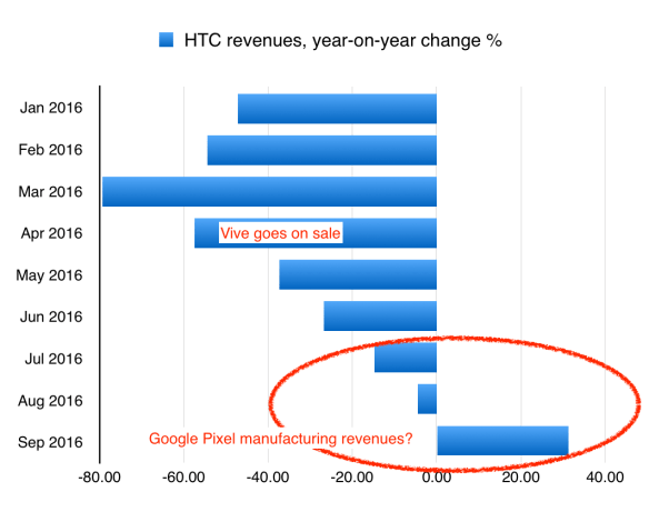
In the first six months of 2016, from January to June, HTC’s revenue drifted downwards compared to 2015 by an average of 50% year-on-year.

Then in July, the drift reversed; it fell only 14%. In August, 4.5%. In September, it was actually up compared to 2015 by 31.3%.

Given that the HTC Vive VR headset hasn’t set the world aflame, I’m going to hypothesise that all the extra revenue (ie everything above a 50% decline y-o-y) in July-September comes from making Pixel handsets for Google.

HTC revenues changes year-on-year by month

(Yes, you could argue that the revenues seem to suggest a rebound after February – but the Vive went on sale in April, with preorders opening in February, which would explain that too.)

On that basis, HTC has received NT$11.5bn, or about $363m, from Google to make the HTC Pixel – sorry, the Google Pixel.

How many handsets does that translate to? It depends on how much you think it costs to make them. If you take the IHS estimate for the manufacturing cost of the iPhone 7, of $220, then HTC has made 363m/220 = 1.65m Pixels.

However, that seems like an absurdly high manufacturing cost. So let’s try $110 instead – given that Google is selling them for the same price as an iPhone, that would certainly help profits.

At $110, our $363m translates into 3.3m handsets already made and filtering into sales channels as you read this. I’d expect the true figure lies somewhere between these two – I could have overestimated the money put into this manufacturing effort, and if Google really is charging $600+ for a $110 handset, it’s bringing chutzpah to a whole new level.

So let’s say it might have around 2m to 3m handsets available over the next few months. Is that going to sate those seeking an alternative to the Note 7? Probably not – as a handset it’s OK, but it’s not YUGE like the Note 7, and it doesn’t have a cool stylus or all those other things.

Also, 2-3m handsets (built over three months) isn’t going to be enough to fulfil all those would-be Note 7 buyers, who are reckoned to number 19m over the next 12 months, remember. Google can keep the HTC factories working, churning out a million or so a month, but it would be very surprising if all of the 17m or so Note 7 buyers go for the Pixel instead.Google may well get a good slice of those buyers – more, in fact, than it was ever expecting, given the market it thought it was going to be launching into – but I don’t think it’ll capture all of them by any means.

(In passing, notice that that $363m only gets you to first base in this project: having some phones built. It doesn’t cover the R+D, sales, marketing or administration. You’re easily talking half a billion dollars here to do this thoroughly. And that’s for a phone which is only going to make a marginal impact on this quarter’s sales.)

And back to Samsung

In the end, most of those early Note 7 buyers are probably going to buy another Samsung. But that’s not what its management should worry about – nor the $2bn exceptional item that’s going to be sitting on the balance sheet for the next quarter.

It’s this: what happens when it announces the Galaxy S8 next January or February? People are going to ask whether it explodes, and Samsung will say of course not, and then inevitably there will be a case where it does, because manufacturing defects are inevitable. Hell, there’s even been a claimed instance with an iPhone 7, and Apple doesn’t use fast charging or USB-C and doesn’t squeeze high-capacity batteries into small spaces. It’s pretty much certain that a Galaxy S8 will go off. Then what?

And this is even before the media has gotten onto other flaming Samsung appliances, such as its washing machines in Australia. (Dedicated Overspill readers knew about this a while back.)

The reason why this is a particular problem now is that the smartphone market has pretty much peaked; in the premium market, replacement cycles are lengthening and sales are shrinking, so anyone that Samsung doesn’t capture now might be lost (as a potential sale) for another two or three years. That’s a substantial amount of foregone profit

The upside for Huawei looks big. The upside for Google (Pixel) looks like hitting sales targets. The upside for Apple looks like some more iPhone 7 sales, though I wouldn’t hang your hat on it.

The downside for Samsung, though, looks big. Events like this can make and break a company, and this is going to be its more serious test ever.

How to recover when Apple Numbers says a file “can’t be opened for some reason”

Do not use this as an error message
Ever wondered what the worst error message you could encounter might be? This ranks pretty highly.

Prologue: backup

First of all, remember how people always told you to take backups, rather as you were advised to wear sunscreen? Well, they were right. Bear that in mind as I take you through on a journey of mild technology pain.

The high: Sierra

Having not seen any reports of gigantic showstopping bugs in the upgrade to Mac OS Sierra, I took the plunge the other day. Things were going fine. Everything worked. Nothing had crashed. Then I updated Numbers from 3.6.2 to 4.0, whose “new” features are apparently collaboration – and nothing much else.

Having done that, I tried to open one of my most-used spreadsheets, into which I have poured years of experience and hours of analysis. I’d had it open before the update, but (I think) had closed it before updating. (Whether it was open or not is immaterial; some other spreadsheets were open before the update and opened fine afterwards; some were closed before the update and opened fine afterwards; some were closed before and wouldn’t open afterwards.)

I was met with this response:

Screenshot 2016 09 26 15 06 13

The low: Numbers

The spreadsheet can’t be opened “for some reason”?? What sort of error message is that??

But at least it offers the option to “Browse all versions”, which should be stored in iCloud, where the spreadsheet itself is stored. You then go into a Time Machine interface, and get this:

Screenshot 2016 09 26 15 07 23

It’s “unable to open version”. This happens no matter how far back you want to go. You can try with lots of “versions”. Or you can realise you’re onto a lost cause and give up. At which point the “Time Machine” interface resolves itself into a rectangle, in which you find this message:

Screenshot 2016 09 24 20 57 46

Well, thanks a lot. “For some reason.” How this ever got past any sort of quality assurance I cannot imagine. Did the engineer/s assign an out-of-bounds error code to the problem, and the operating system can’t decide what to say and so falls back to “for some reason”?

This is a giant screwup

Whichever; it’s a terrible, terrible experience for the user. You’re left unable to open the file, with no idea what has gone wrong, and no clues how to progress. If you had really valuable stuff in here, and no means of rolling back, you would be absolutely furious – justifiably so – with Apple.

Tracing the error

What has gone wrong here? You can dig into iWork files (Numbers, Pages, Keynote). They’re “packages”, which means that they’re folders disguised to look like files. Control-click on the file and you can “view package contents”, which in the case of this spreadsheet looks like this:

Screenshot 2016 09 26 15 34 49

Turns out that all the meat is in “index.zip”. I made a copy on my Desktop and unzipped it:
Screenshot 2016 09 26 15 36 43

That’s only a few files; the “Tables” folder contains 523 items. Which of these hundreds of items is at fault? One? Two? Two hundred? There’s no way of knowing. Given that none of the previous versions will load under this version of Numbers, it doesn’t matter how many of the files are screwed. You can’t get there from here.

Why you love your backups

I did try to get around this. Believe me. On an iPad (which hadn’t updated to the equivalent newer version of Numbers) I tried opening the original spreadsheet.

Opened fine.

Oh. So I tried AirDrop to send the can-be-opened-from-iCloud spreadsheet from the iPad to the Mac. The AirDrop worked, but the Mac wouldn’t open it – same message as before. On the iPad, you can also export the file: your options are Numbers, Excel, PDF, or CSV.

Export in Numbers and AirDrop? Didn’t work.
Export in Excel and AirDrop? Worked – except that the various tables that had been on a single sheet were split out into separate sheets. Non-ideal.

So the iPad route wasn’t quite right.

But I wasn’t finished yet. Did you notice how I mentioned backups? Before upgrading, I had made a backup of my hard drive using SuperDuper! (highly recommended).

So I plugged in my backup drive – I’m always careful not to overwrite it until I’m confident a big OS update hasn’t screwed anything – and dug around for the old version of Numbers (v 3.6.2), and put that back in.

Open Numbers 362, try to open spreadsheet.

It opens. No muss, no fuss.

Worse than error messages: no error messages

In many ways, this is even worse. What’s the situation here? We have a newer version of Numbers on the Mac which cannot open an untouched version of a spreadsheet that the older version can open.

Together with the colossal stupidity of “for some reason” as an error message, a new version that randomly can’t open an old spreadsheet (but is fine with many others), even while the old one can, makes one think that whoever is in charge of Numbers, or iWork, isn’t getting it right.

A lot of it is down to the error message. If it said “because two of the files are corrupt” you might begin to understand. But of course it can’t be that, because the old version can read it. “Some reason” sounds vague – is vague – but in a sense, it’s accurate. Whatever the reason for being unable to open this file is, it’s quite elusive. I had initially thought that it was something to do with picture embeds, but the problem persisted when I got rid of those. (There’s nothing in the Console app about it, so Numbers clearly doesn’t want to share whatever its discomfort is with the file/s.)

Anyway. Having got the old version of Numbers installed, I could now open the old spreadsheet. Fine. I’ll stick with that, I thought.

The morning after the night before

Problem over, you think? Not at all. On returning to the iPad the next day, I found it had updated to the newer version of Numbers – the one with collaboration.

Guess what? That’s right: the iPad version no longer opened the old spreadsheet.

Computing often has these moments – when you feel as though you’re standing on a very rickety rope ladder across a gigantic chasm, halfway from each side, with little prospect of reaching either side safely, yet obliged to go in one direction or the other. The previous day I could open the spreadsheet on the iPad, but I couldn’t get it safely back to the Mac. Now I could open it fine on the Mac, but I couldn’t get the iPad to read it. Not really the world of device-independent operation that one dreams of.

But but but! There is a solution on the Mac. You can load the file on the old version of Numbers, and then in the File menu there’s the option to export it to a Numbers ’09 format. (No idea what’s so great/terrible about that.) Notice that that export option wasn’t available on the iPad.

Here’s what it looks like:

Screenshot 2016 09 26 16 14 52

Worth a try, I thought. And indeed it was. I named the files created that way with an “09” suffix, and suddenly they opened on the iPad – with all the tables and charts intact.

Update: another tactic which I didn’t try, but which might work (I haven’t had the same problem again) is to log in to icloud.com and try to open or upload or similarly wrangle the file there. Make sure FIRST you have a backup of it, on a USB key or other cloud service; the greatest mistake is working on the only copy of an essential file.

Teachable moments

This is one of the biggest WTF moments in an episode replete with them. I’ve reinstalled an older version of Numbers, and exported to an even older file version, in order to open the file on the newest version. It’s beyond bizarre.

Thankfully, it seems that there aren’t too many people having this problem; my own searches on the phrase “can’t be opened for some reason” turned up pretty much nothing. If we’re all lucky, then nobody will land on this page via a web search; you’ll all just be reading it for abstract interest, wondering how an operating system and a QA team can ever let “can’t be opened for some reason” be signed off as “OK for public consumption”. Apple puts a premium on its products and prides itself on its user interface; this, though, is one that got away, badly.

But what if you haven’t kept that backup of the Numbers app? In that case, I’m not able to offer any help. Perhaps you can find a friend who has a copy of the older version. Perhaps there’s a trustworthy download site. Perhaps you can get one by finding a Mac that hasn’t been updated and sending the version there. Perhaps you can rummage around in your Time Machine backup and reanimate the old version. Maybe you have a CD in your house with an older version. (Clutching at straws here, but I recognise that spreadsheets carry a lot of our lives nowadays.)

The simplest solution is not to update Numbers, which of course always feels like admitting defeat. The pragmatic solution is to export all your spreadsheets to the 09 format. The belt-and-braces solution (since this might be an iCloud problem) is to duplicate your spreadsheets on your hard drive, and export each into the 09 format – then you have three copies of them.

Whichever – I hope it goes well. And I hope never ever to run into “some reason” as the explanation for why an essential piece of content can’t be accessed. Fix it, Apple.

Is Android Wear going to make Google create the next Zune?


This isn’t an Android Wear watch, but there are similarities. Photo by David Lee King on Flickr.

Once upon a time there was a Big Software Company, and it wrote some Software for a Task, and that Software could run on Devices made by Other Companies. However, the Big Software Company didn’t want to get into the Devices business in any serious way; it much preferred to let the Other Companies deal with the (low-margin) hardware side of business, and stay principally on the high-earning Software side. (The Big Software Company did make some hardware, but it really didn’t make much money on it. In fact it even made a loss at times.)

Meanwhile Apple also began offering a thing for the Task, competing with both the Big Software Company and the Other Companies’ Devices. Except that Apple wrote its own software and built its own devices, which meant that it could extract profit from whichever part of the value chain it could, and subsidise the bits that weren’t profitable by its end pricing. If writing Software was a cost (which it is), it could make up for that by screwing down suppliers by buying up in volume, or raising prices subtly. The relationship between the Big Software Company and the Other Companies didn’t allow for that dynamic.

Pretty soon, Apple dominated sales of devices dedicated to the Task. This didn’t please the Big Software Company, which decided that the Other Companies needed someone to show them how to do it properly, and set about building its own Devices using its own Software to do the Task.

At this, the Other Companies looked askance at the Big Software Company, and essentially told it to go screw itself.

Not a moment too Zune

Reading this, you may – if your memory is long enough – have thought “oh, it’s the story of Microsoft, the MP3 makers, the iPod and the Zune.” And that story certainly fits. Microsoft wrote the Windows Media Player and controller software, which then had to synchronise with the music stores and with the music players made by OEMs, all with the intention of giving the customer the most delightful experience.

The reality was rather different – it was so hard to keep all the software and hardware synchronised that you never knew who to blame. Did your player not work because the OEM had been lazy in implementing Microsoft’s software, or because Microsoft had somehow screwed things up?

There was also the problem of marketing and advertising: despite having a powerful brand, Microsoft couldn’t really favour one OEM over all the others, so they all had to fight for themselves. You got different devices, different sizes, and no clear story about what to do.

Apple, meanwhile, came through the middle, launching into the MP3 player market just as it was ready to expand (in 2001, when MP3 was big on the desktop but not in the pocket) with a clearly identifiable design and really easy-to-use software. (Yeah, yeah, I know, you hate iTunes. Believe me, there was a time when it wasn’t overloaded.)

The rise of the iPod left other MP3 makers floundering; they just couldn’t get traction, because they couldn’t have a single message (they needed to differentiate themselves from each other) and they often didn’t update in sync. Apple, meanwhile, ruthlessly exploited advertising gaps, celebrity endorsement and an interested media (which ran endless “iPod killer” stories, the first in October 2002 – it was attached to a Creative Technologies player).

This went on from 2001-2006, by which time Microsoft decided that it had had enough of these messups – Steve Ballmer, then CEO, was particularly annoyed by Apple’s dominance – and so it made its own, the Zune. The project started in March 2006 and launched in November that year. You can guess that the timing wasn’t fortuitous; the Zune arrived as the MP3 player market was going into decline. It’s often overlooked that in the same January 2007 video where Steve Ballmer dissed the iPhone, he also talked up the prospects of the Zune:


(Jump to 1’00” for the iPod discussion)

(You can read more about the whole Microsoft/Windows Media/iPod/Zune debacle in my book Digital Wars. Also has chapters about search, smartphones, tablets and China. UK Amazon paperback, UK Amazon Kindle, US Amazon paperback, US Amazon Kindle, iBooks.)

Not only but also: Android Wear

However, you could read the above story and replace “Microsoft” with “Google”, the Task with “smartwatches”, and all the OEMs with… the OEMs who have struggled to sell Android Wear watches.

And it is a struggle. Last week, Android Wear finally passed 5m downloads on Google Play. As I understand it (from sources), each download is an activation of an Android Wear device.

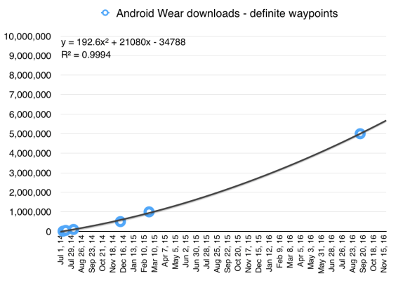
Here’s how the download figure, using the waypoints on Play, has progressed since the release at Google I/O 2014, when all the attendees got one:

Android Wear downloads/activations by week
Android Wear downloads, definite waypoints; the polynomial fit is pretty good, according to the correlation coefficient (R-squared: 1 = perfect correlation, 0 = none).

That’s actually quite encouraging: it seems to suggest that after a slow start, sales are just beginning to take off.

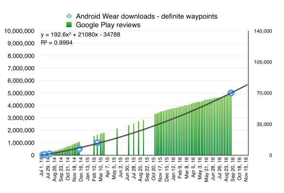
And now here’s how it looks if you also include the number of reviews for the app on Google Play. The trend there suggests that reviews led downloads – that is, the ratio of reviews to downloads wasn’t steady, and has shifted down, so that over time fewer people who download the app leave a review. (I use that approach in my modelling to estimate download growth.)

Android Wear downloads v reviews
Android Wear downloads, and reviews left on the app page. (Some data for reviews missing.)

So, 5m sold in 115 weeks (just under 30 months). Here’s the problem, though: those 5m have been divided up between LG, Motorola, Huawei, Asus, Acer and the various other bit players in the Android Wear space.

Enter the Watch

But that’s before we consider Apple’s offering here. Apple doesn’t release official figures for individual sales of the Watch (“competitive reasons” is the line, and they’re sticking to it). According to Canalys though in its first two quarters of availability – April-October 2015 – it sold 7m. That was probably split 4m + 3m, given the estimates for a 4m first quarter.

And for the Christmas quarter, estimates (again, necessarily) put sales at 5.1m. And then for the first quarter of 2016 they were estimated (again) at 1.5m – a long way down, for certain, but not surprising for something which isn’t a necessity (like, say, a phone in the modern age) but more of a gift. A bit like iPods used to be, in fact.

So that takes us to 13.6m by March. Since then there have been two more quarters – well, we’re nearly through September. In the second, Apple was reckoned to have sold another 1.6m amid a widespread decline in smartwatch sales. Probably sales during this current about-to-end quarter have been similar, or even lower.

That’s a total so far of around 16.5m in five quarters. Those aren’t iPad-style numbers – that achieved 28.7m sales in its first five quarters – though it’s better than the iPhone (6.1m) over the same time from launch. (The iPod did 0.6m in its first five quarters, but they were different times.)

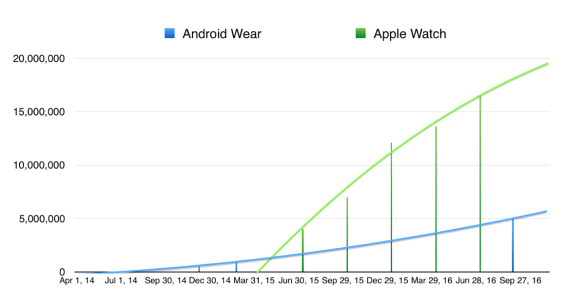
Here though is where Apple Watch/Android Wear starts to look like iPod/MP3 players. Apple gets all the revenue from the Watch, and it controls the software, and it decides how it’s going to move the business along. That’s why Apple’s trajectory looks a lot stronger at present:

Apple Watch sales v Android Wear activations
On cumulative sales, Apple Watch is outpacing Android Wear by a substantial margin.

By contrast the Android Wear OEMS don’t even get to personalise Android Wear; they just make the product, and still have the software support costs (those driver updates don’t write themselves) without getting any sort of side benefit. It’s not even as if using one model ties people to that brand of phone; interchangeability is the model with Android, unlike Apple. For the consumer who wants to pick and mix, it’s fine, but as a business model it brings some pain.

That’s clearly why, as Roger Cheng found out at CNet (by the shocking tactic of Asking People), the big Android Wear OEMs are going to hold fire for now:

LG, Huawei and Lenovo’s Motorola unit will not release a smartwatch in the waning months of the year, the companies confirmed to CNET. While LG launched a watch in the first half, it’ll have been more than a year since Huawei and Motorola offered an update on their wearables.

That marks a reversal from last year, when all three companies launched Android Wear smartwatches at the early September IFA trade show in Berlin in what was supposed to be a resurgence of the platform. At this year’s show, Chinese maker Asus was the only major tech company to return with a new Android Wear watch.

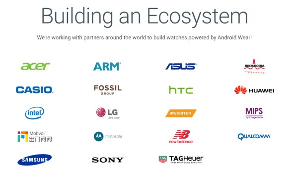
That’s perhaps a bit discouraging, since aside from chip companies, you’d struggle to see other OEMs in the big list on the Android Wear site:

Android Wear partners
Not many of these are selling Android Wear watches as their primary business. Or even secondary business.

According to Wareable, there are somewhere between 10 and 21, perhaps 24, Android Wear watches to choose from. (Its guide is pretty handy.) You can also get an idea of pricing, which tends to be around £200; again, that’s quite a bit less than Apple’s Watch used to be, though since the introduction of the new version the price for last year’s model has fallen to £269.

Altogether, Android Wear vendors have taken in a total of 5m x £200 = £1bn ($1.3bn). That’s spread across multiple vendors – let’s assume four of them – over 30 months. It’s not a great return on investment; it’s about $10m per month each, or $120m per year. Apple, in the meantime, has probably taken in $350 x 16.5m = $5.7bn.

(Sanity check: Tim Cook said Apple was second only to Rolex in watch revenues for 2015, and Rolex did $4.5bn in sales in 2015, and the sales estimate above is 12.1m; at $350 each that’s $4.2bn. That’s also ahead of Fossil, which did $3.2bn. So this all fits with what we know.)

This is the inherent weakness, for a device that needs to be personal, in the modular business model: OEMs can’t control enough of the story around it. Samsung’s decision to go its own way with Tizen looks sensible; its use of the watch bezel for a control is an inspired little bit of UX.

See you zune?

In the face of indifference by the OEMs, though, what’s a Big Software Company to do? Well, perhaps what Big Software Companies do: roll its own. Google is said to be working on not one but two Android Wear watches of its own, set for release very soon. One is big and one is smaller, and it’s reported (by Android Police) that the larger one will have LTE connectivity as well as GPS and a heart rate sensor, and be a “do-all device that will allow Google to demonstrate Wear’s most robust capabilities, including the announcement at Google I/O that Android Wear 2.0 will support standalone apps”.

The smaller one, meanwhile, won’t have LTE or GPS and maybe not even a heartrate sensor. Price unknown.

If they’re going to happen, then they’ll come with the October 4 announcement of the new Pixel phones. Google has already indicated that it’s going to try to move beyond the Nexus line (something which has occasionally annoyed its Android OEMs; that’s part of why the Nexus phone line has never been big in sales terms). Perhaps it has decided the same for smartwatches. I guess we’ll find out zune enough.