Android Wear downloads: a more nuanced (and slightly higher) estimate


Android Wear doesn’t seem to have set consumers’ hearts racing. Photo by pestoverde on Flickr.

In my estimate last week of the number of Android Wear downloads, and hence actual “sell-through” (as it’s called), I used the number of reviews left on the Android Wear app page and drew a straight-line extrapolation from that, and from various known waypoints, to get my estimate for the number in use – which was about 1.9m, up from 0.7m in February 2015.

Among the provisos, though, was this one:

My previous estimate worked on the basis that the number of comments was proportional to the number of downloads. I don’t see any reason to change that assumption.

Oh, behave

Having said that, I’ve thought a bit more about likely consumer behaviour, as well as what the data actually shows us.

We know that as more people get to use something, the number who actually comment on/review it falls – it’s just human nature that early adopters are the most likely to be vociferous, whereas those who follow are less troubled about it. After all, who wants to be the 1,900th commenter below an article?

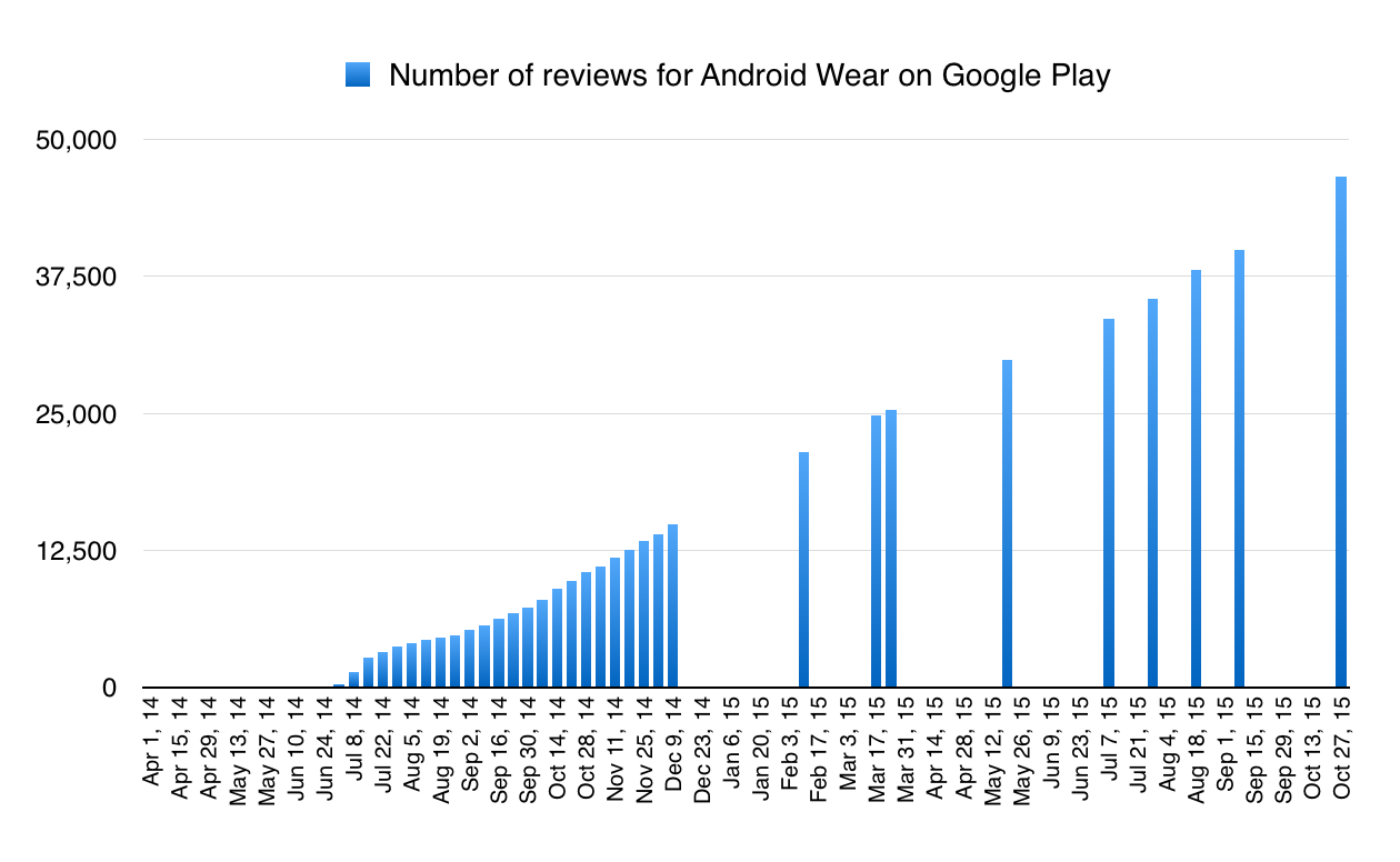
So I took a look at the number of comments* per download, for the waypoints where we know the number of downloads for sure. We know those waypoints because the Google Play figure abruptly goes from saying, for example, “number of downloads: between 10,000 and 50,000” to “between 50,000 and 100,000”. Obviously the 50,000 download point has been crossed between those two points. (* “comments” not “reviews” because they’re not necessarily reviews; you can make them without having downloaded the app.)

So I marked those points, and the number of comments at those points, and tried to find the best fit curve. I get this:

Android Wear: downloads per comment (est)

The data seem to suggest that the number of downloads required to generate a new comment grows over time; currently we’re at the black mark.

(That’s an R-squared of 0.89, using a logarithmic fit; it’s the best value of R-squared I could get out of trying a linear, logarithmic, polynomial, power and exponential fit.)

What this is telling us is that to begin with, you get lots of reviews/comments for every download. Right at the start, there was a comment for more than one in every seven downloads. By 100,000 downloads there are 4,032 comments, which means by then, on average, every 24.8 downloads someone had left a comment.

But by the time you get to 500,000 downloads, there are 14,981 comments – so on average it has taken 33 downloads to get each comment. By the time you get to a million downloads, the average has fallen to 44 downloads per comment.

A certain ratio

This is the sort of behaviour we’d expect: early on, lots of people are mad keen to give feedback on their experience; and then it tails off, until we’re dealing with a gradually falling ratio as the numbers of downloads head into the multiple millions.

Fitting this to that curve (which is the only data we’ve got, absent sales figures or numbers from Google) tells us that we’re currently at about 57.5 downloads per comment overall – that is, over the whole time Android Wear has been going, on average you get a comment every 57.5 downloads.

And how many comments are there? Currently, 47,620 (with the average review score just dipping under 4.0). How many downloads is that, and hence how many sell-throughs? Pretty simple:

47,620 comments * 57.5 downloads per comment = 2.74m Android Wear downloads.

This is quite a bit bigger – 44% more – than my previous estimate of 1.9m Android Wear users. There are (as always) potentially confounding factors, which would tend to reduce the actual number:

1) some people may have left more than one comment/review.
2) you can leave a comment/review without having actually downloaded the app
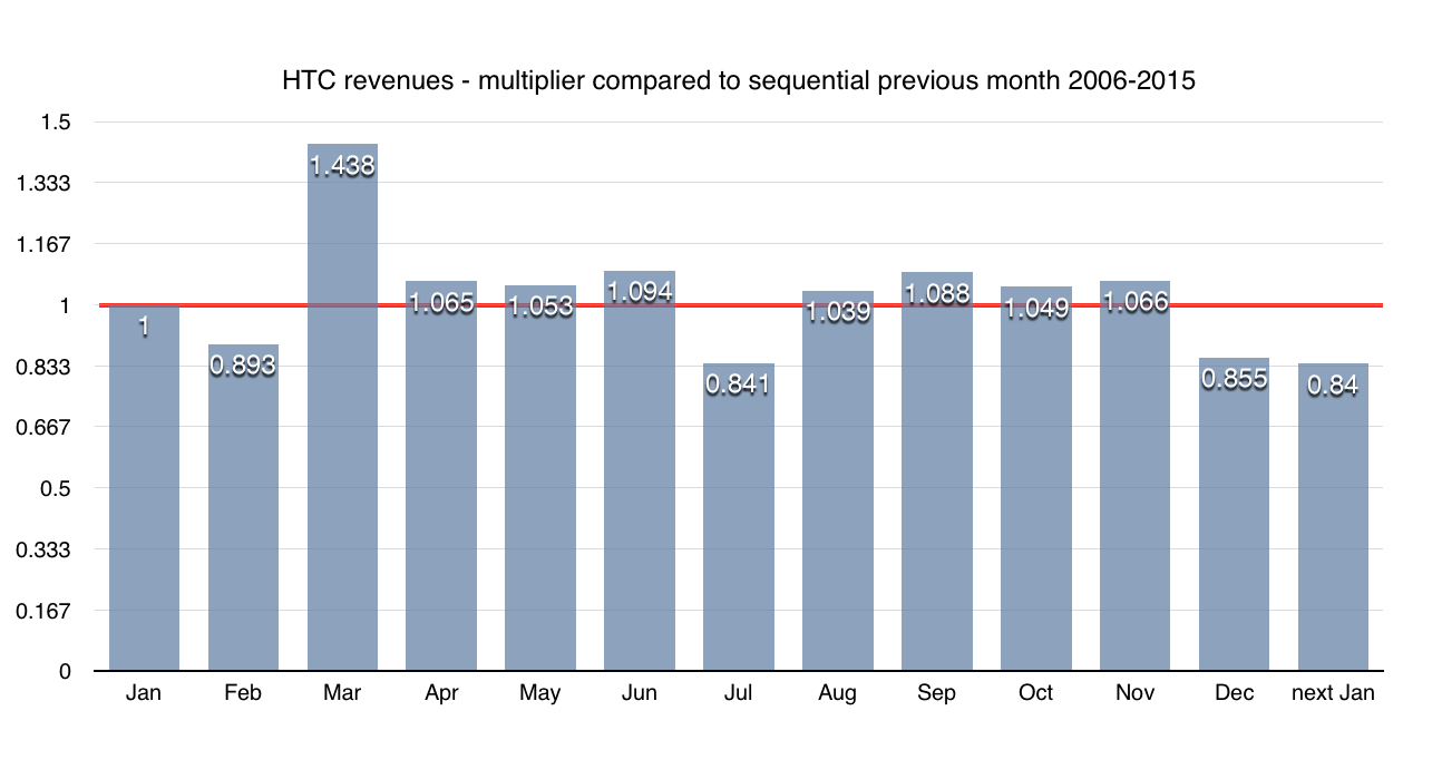
3) the number of comments added per week is quite variable – as below:

Rate of addition of comments varies, a lot

Sometimes you get a lot of comments on Android Wear – and sometimes you don’t. Does that match downloads? Hard to say.

This is possibly prompted by the release of new versions: a number of people commented on 9/10 November about the new version and its removal of battery stats. That’s going to bump up the apparent number of “downloads” while the actual number in use is no different.

On the whole, I feel comfortable suggesting that the correct number probably lies somewhere between these two – the straight-line extrapolation and the “reducing comment” number. In other words, somewhere between 1.9m and 2.74m. (The midpoint is 2.32m.)

Quite probably the only way to be sure will be to watch the Android Wear page and spot when it crosses the 5m download mark. Is it going to be before the end of this year, though?

Only maybe, at least if we go by IDC’s forecast for how many Android Wear devices will be shipped this year. In a press release in September, IDC reckoned that there would be 4.1m shipments of Android Wear devices in 2015. That would take the total activations by the end of 2015 to 4.7m, as at the start of the year it was around 0.6m (it passed 1m activated in late February, by my data). As long, that is, as those shipments are actually bought by people, rather than sitting on shelves.

Comparing that to my estimates for the number activated so far this year – a low of 1.3m (1.9m – 0.6m), and high of 2.1m (2.74 – 0.6m) – we’re left with somewhere between 2.8m (4.7m – 1.9m) and 1.96m (4.7m – 2.74m) to be shipped, sold and activated in the next couple of months around Christmas if IDC’s target is to be met (and if my estimates are correct). So, the week following Boxing Day could be fun.

Low, high, in between

There are some other numbers: Strategy Analytics says that in the second quarter, Android Wear shipments were just 0.6m units; for the third quarter, it says that Samsung shipped 0.6m and “Others” (including Pebble) 1.0m. We don’t know how many of the Samsung ones were running Tizen, and how many Android Wear; nor how many Pebbles were shipped. If we ignore that, we get 1.6m Android Wear shipped in the third quarter; 2.2m since March (when the 1m download point was passed). If they’re all in use, there might be 3.2m running.

Even with the high estimate, it begins to look like maybe this is going to be one of those spaces where Apple shows how the category should look, and grabs the majority of sales and profit – as it did with the iPod and iPad. Because Strategy Analytics reckons that in the third quarter alone, Apple shipped 4.5m units – more than Android Wear has all year.

If you think the Apple Watch is a ‘flop’, try this estimate for Android Wear device sales


Got an LG Watch Urbane? Congratulations – you’re part of a pretty exclusive club. Photo by Janitors on Flickr.

Back in February I tried to estimate how many Android Wear devices were activated in 2014, following Canalys saying that 720,000 had shipped that year.

The figure I got, based on the page on Google Play, where one can track not just downloads but also comments and average rating for the Android Wear app (which you need to control your shiny new Android Wear device), was 700,000.

Android Wear: all the numbers

Put it together, and we have about 560,000 Android Wear activations by the end of 2014, and 700,000 to mid-February.

Progress, or the lack of it

OK. So what about progress since then? I’ve kept noting the progress of the number of downloads, and the number of comments, on the Google Play page, helped from time to time by the Internet Archive (it’s wonderful. Donate).

My previous estimate worked on the basis that the number of comments was proportional to the number of downloads. I don’t see any reason to change that assumption.

So how does it look now? The number of comments keeps going up:

Android Wear: number of reviews

Steady growth suggests steady download, and hence sales, figures

(One point to note: the average review score has been trending down steadily. You would expect this for a new technology: the keen people who forgive anything are first in, and are followed by those who got it as a gift, or an experiment, or whatever. Notably, some of the recent low ratings come from people complaining about updates; that would suggest that the installs/comments ratio is actually falling.)

Whichever, the precise value of the average review has fallen from a comfortable 4.83 (out of 5) to dip to 3.98 at the end of October, recovering to 4.00 last week.

And now we try to fit the number of installs – using the points that we have, which isn’t a lot – to that graph, assuming downloads are directly proportional to comments.

According to Google’s stats, Android Wear is now past the 1m download point, but not the 5m download point.

So I’ve tried to fit the graph as best I can. And this is what I get:

Android Wear sales estimate: 1.9m in November

Fitting known waypoints to the number of comments suggests that 1.9m Android Wear devices have been sold

That’s the figure I get: 1.9m downloads in total, suggesting that since February there have been a total of 1.2m more installations of Android Wear.

So again we ask: is that bad or good? There are now 1.4bn Android devices in use, according to Sundar Pichai. Only those running Android 4.3 upwards can use Android Wear, which means we’re potentially talking about 67.8% of devices according to the very latest figures from the Android Dashboard. (That’s up substantially from 47.6% back in February.)

The penetrant question

Back in February, I guessed at 1.2bn Android devices in use (which seems close enough – 1bn announced at Google I/O in 2014, 1.4bn this time). So back then the potential market was
1.2bn * 0.476 = 571.2m devices, of which 700,000 had Android Wear: that was a penetration of 0.12%.

Now we have a potential addressable market for Android Wear of
1.4bn * 0.678 = 949.2m devices. Of which it seems 1.9m, or 0.2%, have bought. (This doesn’t allow for people owning multiple devices, but the incidence will be very low compared to the 949m devices available.)

Conclusions and thoughts

• The absolute number of Android Wear devices in use is still really low.
• A total of 1.2m have been sold since February
• It’s tiny compared to any estimate of the number of Apple Watches sold since the launch in April, which varies by analyst; Canalys estimates that it has shipped 7m in two quarters, which compares to 1.2m Android Wear sold
• These may be the lull before the storm of purchases on Black Friday/Christmas, but abandonment could be a problem
• Android Wear, despite being first to market, suffers from a lack of brand visibility, and visibility overall. Kantar ComTech released a survey in October based on a study from August which found that in the US,

Among panelists who knew what a smartwatch or smartband was, 92% connected Apple to the category, far more than any other brand. This was followed by Fitbit in second place with 47%, with Google (34%) edging out Samsung (33%) for third place.

That doesn’t leave a lot of room for others, at least in the US buyer’s mind.

I’ll keep tabs on Android Wear, absent Google releasing any figures. But for now, this is starting to look like an interesting question: can a device category succeed if it doesn’t have a successful Android version?

HTC won’t forecast this quarter’s revenues. But don’t worry, we can. (They’re bad.)


Too much of this, not enough selling phones: that’s HTC’s problem. Photo by caribb on Flickr.

HTC, in its Q3 earnings call, declined to give any forecasts for its revenues or profits in the current quarter: “it’s our intention that we will not be providing financial forecast in the coming quarters,” said Chialin Chang, CFO and president, global sales, complaining that the guidance they used to give was far too detailed – gross margin, earnings per share, revenue. But he would offer this: “I will say the following. We are expecting – I’d like to expect Q4 result as compared to Q3 result to see the incremental improvement on revenue and the net income.”

(Actually, I challenge anyone to read that transcript and get any sense out of it. Sure, English isn’t Chang’s first language – it might not be his second language – but he seems competent enough to talk a lot in it. He just doesn’t actually explain anything. And what a sad little call; only two analysts on it, based on the questions.)

Law of averages

Still, even if HTC isn’t going to predict its revenues, we can. That’s because the Taiwan Stock Exchange makes listed companies report monthly revenues. And there’s a pattern to companies’ sales, especially those which are quite seasonal and predictable, like HTC. February is smaller than January; March is bigger than February; April’s about the same; and so on.

Using the monthly data from the past nine years, I’ve generated the “average” forecast for HTC’s revenues by month over the year. And we’ll use this to forecast this quarter’s revenues (and maybe profits).

Here’s how HTC’s year goes, from month to month, on average over the past nine years:

HTC average monthly revenue

Past financial data lets us see how HTC revenues change by month, on average

You’ll notice that the “next January” mark is lower than the previous one – which is just one of those things; on average, the revenue has grown by 3% over the year, then fallen by 17% the next January. Shrinking, in other words, which it has been doing since 2010.

But this is a pretty simple model. How good is it at predicting? How does it fare when we compare it with HTC’s revenue this year?

Here is the comparison, where we only use the data up to 2014 for the forward guidance:

HTC monthly revenues forecast

There’s an error, but it’s not gigantic; around 10%

So the aggregate error in revenue from forecast over the year is 10% – the highest value being around 12%. (I’ve used absolute values for the error, rather than averaging the plus and minus.)

But what if we feed in the results from 2015 too? It improves the graph a little:

HTC monthly data forecast for 2015

If we go up to the September-October data point, the aggregate error reduces further

I’ve changed the colour for the aggregate error: 8.7% for total revenues over the year so far. Not so bad.

Given this, what can we say about HTC’s revenue to the end of this year in two months? We’ve just had the October revenues, so we can look forward to the rest of the year. On the adjusted basis, using the new data, my forecast comes in at NT$26.64bn (about US$830m). That’s down from $47.9bn in the same period a year ago – a forecast decline of 45%.

Bear in mind there’s a likely error either way of 10% – so I’m forecasting NT$29bn-$23.9bn. (The midpoint figure would satisfy Chang’s wish for incremental improvement in revenue.)

And profit? Pretty hard to say, but assuming that things continue as they have at HTC, its gross margin will be 18%, so about NT$4.79bn; that’s NT$1bn more than the previous quarter, so the loss will be about that much less – so probably NT$4bn (around US$125m), which would also satisfy Chang’s vague wishes.

Obviously these are forecasts, based on single chunks of data, though they have been pretty accurate so far this year. If the HTC A9 takes off, or if the Vive VR set is a hit, I’d be completely wrong. I don’t see any obvious signs of that though.

The inventory squeeze

More generally, HTC is a company in crisis, with no obvious reason to exist and little to differentiate it from any other Android OEM. You can see the incredible pressure on it in its inventory/revenue numbers, which measure how much stuff it has sitting in the backroom compared to how much stuff it has sold. This ratio has now hit a historic high of nearly 100%, as of the end of the third quarter:

HTC's inventory ratio is at a historic high

Revenue is low but inventory is high: the signs of a company in stress

High inventory/revenue levels tend to mark out a company in severe stress. It can mean that it has lots of wonderful new finished products in the warehouse just waiting to be sprung on the world, which will fall on it with delight. But usually it doesn’t because you have to distribute those things to wholesalers who will sell them. And historically, HTC hasn’t been a rabbit-from-hat sort of company, as the graph suggests.

Clearly this isn’t a situation that can go on indefinitely. HTC says that it has things coming down the chute – there’s the HTC Vive, its virtual reality offering. Much handwaving from Chang in the earnings call, but nothing concrete. And if HTC really thinks that VR is going to bring its business back into profit in 2016, well, I don’t see it; these are high-priced devices with an uncertain market, regardless of the quality of HTC’s offering.

Of course that could have been said back when HTC was preparing its first Android smartphone. But the difference was that HTC had already been making smartphones (for Windows Mobile) for some years.

Overall, the best summing up of this came from The Verge, where Vlad Savov’s story had the deathless headline: “HTC will no longer give guidance for the future it doesn’t have”. Quietly brilliant, that one.

Google’s growing problem: 50% of people do zero searches per day on mobile


Amit Singhal in 2011 showing a comparison of search volumes from mobile and “early desktop years”. Photo by Niall Kennedy on Flickr.

Amit Singhal, Google’s head of search, let slip a couple of interesting statistics at the Re/Code conference – none more so than that more than half of all searches incoming to Google each month are from mobile. (That excludes tablets.)

This averages out to less than one search per smartphone per day. We’ll see why in a bit.

First let’s throw in some more publicly available numbers.
• more than 100bn searches made per month to Google (total of desktop/ tablet/ mobile).
• about 1.4bn monthly active Google Android devices. (Source: Sundar Pichai, Nexus launch.)
• about 1 billion monthly active Google Play users. (Source: Sundar Pichai, Nexus launch.)
• about 1.5bn PCs in use worldwide.
• about 400m iPhones in use worldwide. Probably about 100m of those are in China. (Analyst estimates.)
• about 100m other smartphones in use (70m Windows Phones, 30m BlackBerrys)
• the mobile search market only generates a third as much revenue as the desktop. (Source: Rob Leathern, via the IAB 2014 report.)

Singhal had already said in July that mobile was larger than desktop in 10 countries; now it’s for the whole world. Google’s numbers effectively exclude China, of course, since Google doesn’t have any presence there. (Android phones and iPhones both use Baidu, the local search engine, as the default there; Google is banned from the mainland, and though people can use it, they overwhelmingly don’t.)

So let’s put these numbers together.
• In all, there are 1400 Google Android + 400 iPhones – 100 iPhones inside China + 100 other = 1.8bn smartphones in use outside China.
• 50bn mobile searches per month = 50bn per 30-day period

Today’s not the day to search

Calculate! 50bn / (1.8bn * 30) = 0.925 mobile searches per day. (Even if you exclude the Windows Phones and BlackBerrys, you still get 0.98 mobile searches per day.)

That’s right – the average (“mean”) person does less than one Google search on mobile per day. The mode (most common number) will be below that too. Over a 30-day period, the mean number of mobile Google searches is 27.8.

For desktop+tablet search, you get roughly the same figure – assume 1.5bn PCs and 300m tablets. But not all of those devices are available to make searches: many PCs are sitting in corporate environments where they aren’t connected to the internet, or can’t be used to make Google searches: think of all the machines in call centres, or functioning to run shop tills, or in factories. They reduce the potential base that can be used to make queries, and so ramp up the real average of per-active-PC/tablet monthly queries.

On the basis that
• the world PC installed base is split roughly 60-40 between corporate and personal users, so 900m and 600m
• guessing that 50% of those corporate machines, ie 450m, can’t make Google searches

then the total number of PCs/tablets available to make Google queries is 600m personal PCs + 450m corporate PCs + 300m tablets, or 1,350m devices.

Do the maths on 50bn searches per 30-day month across 1,350m devices and you get 37 searches per month, or 1.23 searches per day on average. The mode (most common figure) is likely to be 1, but the median (point where you have half as many behind as in front) will be higher. Probably not much higher – this will be an asymmetric distribution, where most of the (in)action is on the low end, so it may look like a Poisson or Pareto function.

Desktop: steady as she goes

This is my rough model of how search distribution might look, generated by plugging figures we know into a Pareto generator and then doing a distribution function for N = integer number of searches per day.

Here’s how it looks for the desktop, using a mode (most common) of 0.9 searches per day and mean of 1.23:

Per-user searches on desktop on Google

Estimated profile of number of searches per day per person on Google on desktop.

What this is saying is that on any given day you get about 55% of people doing just one search, a bit less than 15% doing two searches, just under 5% doing four searches, and so on. Small proportions, but big absolute numbers. And who does what searches isn’t fixed; so someone who did zero searches yesterday might do 10 tomorrow. But equally, the 10-searcher yesterday does none or one or four today. And so on.

(It took some experimentation to get this shape; using a higher mode meant that the number doing zero searches was itself zero, which doesn’t make sense: there must be some people who by accident or design don’t ever hit Google during a day. Here, the proportion of users doing zero searches per day is 6.5%, which seems reasonable.)

Here’s how it breaks out when you look at cumulative percentages:

Google searches on desktop

My model suggests that most people don’t do much searching, but nearly everyone does some.

Note that lots of people don’t do many searches, but huge numbers of people do some searching. Further confirmation: the data release from AOL in 2006, which was just for desktop users, was “~20m records from ~650,000 users over three months” which translates to an average of 31 records per person over that 90-day period, or one-third of a query per day. AOL users in 2006 might not be directly comparable to Google users today, but it’s a useful check that the numbers here are probably broadly correct.

Incidentally, a lot of those present-day searches will be very low complexity. Watch people use a desktop. The most common Google query is “Facebook”. Probably the next most common? “Yahoo”, “Gmail” and “Hotmail”. People literally type those into the Google search box, or their browser search bar, to get to those sites. To a technical audience that’s stunning – why would someone do that? – but it’s observable behaviour. Remember the AOL data leak in 2006? Data there showed that some people used to just hit “Search” when the text box was empty which in turn meant that some advertisers got AdWords hits on the phrase “search terms” (which used to be the text in the box).

Mobile: all change

However on mobile, things are different. People do not, in general, type “Facebook” or “Gmail” into their mobile browser’s search bar. They go to the relevant app – Facebook or email. This behaviour is surely a big reason why mobile searches have been behind desktop for a long time, even though smartphones’ use has rocketed, and time spent on them is greater than for PCs, and they’ve been nudging a comparable installed base for some time.

Thus where someone using a desktop/laptop might fulfil their “average” one or two searches per day by typing “Facebook” when they open their browser, on mobile that doesn’t happen because it doesn’t need to happen; they just open the app.

For Google, that means it’s losing out, even though Google search is front and centre on every Android phone (as per Google’s instructions as part of its Mobile Application Device Agreement, MADA). People don’t, on average, search very much on mobile. The miracle of Google, in retrospect, is building a multi-billion dollar business by accreting millions of rare actions – people doing searches and then clicking on ads. Of course, Google has helped that latter activity by filling the top of its search results page with ads, and making them harder to distinguish from search results. But it’s still a hell of an achievement.

I tried modelling what search activity probably looks like on mobile: I used a mean = 0.925 (as per Singhal) and mode = 0.5. The mode must be below the mean because of the long tail of higher values; 0.5 is a guess, but moving it around doesn’t have a large effect. This gives a median of 0.94, close to the mean, which you’d also expect.

Google mobile search modelled

If mobile searching follows a power law, it might look like this.

You can see that (if we allow these assumptions, which I think are reasonable – remember that they’re based on Google’s own data) then only 5% of users do more than seven searches per day on average. That’s very like the desktop scenario.

Mobile search percentage

As on desktop most people don’t do more than 7 searches – but most people also don’t do one search.

But here’s where things are suddenly very different from the desktop: although the proportion doing more than seven searches per day is about the same (5% or so), you have a far greater number who don’t ever get beyond zero.

Incidentally, this echoes Horace Dediu’s analysis from April 2014, when he noted how the internet population was growing rapidly, but Google’s revenues from non US/UK sources weren’t: US/UK users seemed to generate about $86/yr, while those outside that space generated only $12/yr. (This picture might be distorted by Google’s tax arrangements, of course.)

So there is the problem for Google: the PC base is static or even falling, while the number of people holding smartphones is growing. But the latter group tends not to use search, and so doesn’t see its most profitable ads. (There are in-app ads, but it’s never been very clear how much revenue they generate compared to other search ads. One suspects if they were very lucrative for Google it would be touting its “run rate” from them.)

Hence Google pushes people to use the mobile web more; and also, notably, to expand beyond simple search into services such as Google Now, Now On Tap, and pretty much anything. Seen through that lens, the reorganisation of Google into Alphabet makes sense: it’s seeking to get as many potentially moneymaking new ideas fired off as soon as possible, while search and search revenues are still growing, and before the growth of mobile really pulls the averages down. Dediu, in the link above, notes that 2016 will probably mark the point where internet population growth begins levelling off. And most of the new additions will be mobile-only.

You can see that effect most clearly in data from Google’s financials, where it discusses the number of paid clicks it gets, and the cost-per-click. It doesn’t take much effort to combine the two together to get the “total payments per click”.

Google paid clicks, cost-per-click and product

Paid clicks up, CPC down. Source: Google financials.

What’s clear is that
(a) the number of paid clicks has zoomed up – increased nearly ninefold since the end of 2005 (where the graph starts)
(b) CPC is on a steady downward slope, despite Google’s best (and successful) efforts in mid-2011 to shore it up
(c) combining the two shows that revenue hasn’t increased nearly as fast as paid clicks. In other words, the new users and new platforms on which Google is available aren’t as valuable as the old ones.

In conclusion

So what do we conclude? Mobile search is a real problem for Google: people don’t do it nearly as much as you suspect it would like. But there’s no obvious way of changing that behaviour while users are so addicted to apps on their phones – and there’s no sign of that changing any time soon, no matter whether news organisations wish people would use mobile sites instead (clue: most people get their news via Facebook online).

This is a structural reality of how mobile is now. Buying Android and make it freely available was a defensive move to stop Microsoft being the gatekeeper to the mobile web (more in my book..).

But it turns out that search wasn’t actually the gatekeeper to mobile; having a well-stocked app store is. That’s where the searching really happens. Now Google faces the second stage of the mobile web. What will its answer be?

How big (and bad) adblocking could get – and why news sites should sell adblockers

Diffusion of innovations: segmentation

Stages of adoption of innovations. Source: Wikipedia

“I’ve got something to show you,” I told Horace Dediu as we chatted the other day. “I think it’s a logistic curve.”

Dediu’s face lit up. He of course is the one who has predicted smartphone adoption in the US with remarkable accuracy by using the straightforward maths of the “diffusion curve”, or “logistic curve” as it’s also known. That’s one up there at the top in yellow.

The logistic curve can be used to model all sorts of things: disease, populations, growth. It’s the integral of the bell curve (in blue at the top), and so it’s about “normal” populations.

Dediu has built a terrific series of presentations around data he has collated about the adoption of various technologies – refrigerators, cars, PCs, tablets, microwave ovens, smartphones. Pretty much all of them follow a logistic curve. There’s a slow uptake at first as only those in the know find out. Then there’s a sudden takeoff, and a rush that then leads rapidly upwards, until you come to the laggards who are the last to hear, or the least willing to adopt. (Don’t hassle me with your science oven.)

The graphic I wanted to show him? Adoption of adblocking. The picture below, taken from the Wall Street Journal’s writeup of the Pagefair report, shows the classic inflexion point of adoption: the rapid upward sweep that keeps building.

The growth of adblocking to 200m

Pagefair data suggests there were about 200m people blocking ads by mid-2015. Graphic: Wall Street Journal

Question is, how big is it going to get? You can fit the diffusion curve to this data in lots of ways.

The optimistic view takes the sheer number, and gives it a straight-ahead fit.

Adblocking: the optimistic forecast

On this measure, we’re about halfway through the diffusion of this technology.

This looks quite encouraging for those worried about the adpocalypse. The current number of adblock users is 200m, and it looks to be about halfway up the curve, so that’s 400m total once it saturates. OK, not great, but tolerable.

Dediu himself wrote a commentary this week, wondering about what has taken adblocking so long to take off:

What we never know is how quickly diffusion happens. I’ve observed “no-brainer” technologies or ideas lie unadopted for decades, languishing in perpetual indifference and suddenly, with no apparent cause, flip into ubiquity and inevitability at a vicious rate of adoption.

He argues that for takeoff, you need both a “push” and a “pull”. The push has now happened with the availability of adblockers easily installed via the App Store; now he wonders how fast the “pull” from users will be.

(I think, actually, that the key push happened before that, in mid-2013: that’s where that Pagefair curve suddenly moves upward. What happened in mid-2013? The Snowden revelations about tracking by governments. I don’t think the rise of adblocking after that point is a coincidence.)

That graph above might say “well, quite soon we’ll be done, and it’s not going to be that bad.” Ah, but we’re not done. When I showed the WSJ graphic to Dediu, he said “OK, but you have to adjust for internet population.”

While the number of adblocker users has been growing, so has the total internet population. Adblocking as a percentage of total users hasn’t grown quite so fast. Arguably, people in countries such as China and India who are on mobile more than PC have a greater incentive to adblock than people on unmetered desktop systems.

Here’s how that growth chart looks like when you present it as a percentage of the internet population (data sourced from internetworldstats.com):

Adblocking as a percentage of intenet users

Data from Pagefair shows adblocking as a minority sport – so far

And now with the diffusion curve roughly fitted to it:

Adblocking: the less rosy view

If you compare adblocking penetration to the internet population, it looks like it’s got a lot of potential to grow

On this graph, 200m users adblocking is perhaps 10% of those who will eventually use it. So yes, we’re saying that 2bn people could be adblocking eventually. Which would leave us wondering, as Dediu puts it, “how quickly will ads disappear from the internet?” (The current internet population is about 3bn users.)

Put it another way:
the data suggests there are going to be between 400m and 2bn adblocking users within a few years.

OK. How much is that going to lose? Or put it another way, using data we can adduce: how much are visitors to ad-funded websites worth at present?

The value of a reader

Below, I’m going to use data from The Guardian, because it’s easily available (not because I’m a contributing writer). I’d welcome figures from another other news site such as the New York Times or Washington Post.

In March 2014, the Guardian hit 100m browsers for the month. In July 2014 it managed 137m. (“Browsers” aren’t the same as “views”, nor the same as “users”. A single browser could do multiple page views; a single user might use multiple browsers, such as a mobile one and a desktop one at different times of the day. If you’re feeling wonkish, the Audit Bureau of Circulation has more data at appendix 2.1 of its measurement requirements: “This metric measures each browser on a given device; it does not measure a person.”)

There’s a spreadsheet with the past year’s figures for browsers for the main UK national papers.

According to that spreadsheet of ABC-audited browser figures, in the ten months from June 2014 to March 2015, the Guardian’s average monthly browser figure was 111m.

So how does that compare to its digital revenues (which are broken out separately from print)? I’ve chosen the Guardian because its browser stats are available, and there isn’t any confusion caused by a paywall. But there are a couple of confounding elements:
• its “membership” scheme. I’m assuming there’s no significant income from that compared to the number of visitors. This is a gloss; the income from “membership events” is definitely non-zero.
• there’s a Guardian app for iOS and Android, which offers in-app purchases (IAPs) ranging from £3.99 to £11.99, including six- and 12-month subscriptions (£3.99 and £4.99 respectively). We don’t know how many of those have been downloaded, nor what the average payment is. Obviously it’s non-zero, and might materially affect our assumptions.
• the Guardian has “sponsored content”, which again is definitely non-zero in revenue terms – it has signed at least one deal worth a million pounds. This will reduce the contribution from plain advertising.

From the Guardian’s statement for the year to the end of March 2015:

GNM [Guardian News and Media, the publishing arm] total revenue grew by 2.6% to £214,600,000 (2014: £209,000,000) with increases in digital and new product revenue more than offsetting declines in print revenue. GNM divisional digital revenue for the year increased by 20.1% to £82,100,000 (2014: £68,300,000).

If you assume every month was equal, that’s £6.84m per month in digital revenue. If you assume 111m browsers per month on average, that’s 6.16p for each “browser” visit (which isn’t, remind yourself, necessarily a user or page view; a browser might be part of a user, and might do multiple page views. So if you view it on your desktop, and then on your mobile, that’s two “browsers”; the Guardian gets 12.32p from you).

My impression, not knowing much about monetisation, is that the Guardian is monetising its visitors pretty well. Others who know the ad business better can update me.

Spread across a year, that’s 73.95p per browser. In other words, £0.74, or $1.14 per browser per year.

Note that there’s going to be gigantic variation in the actual value to the Guardian of those “browsers”. If it’s the same 111m browsers visiting each month then that might be as few as 55 million people (“few”, huh) around the world, or even fewer if they’re showing up as more than two browsers – perhaps they view the site from a work PC, then their mobile on the train, and then their tablet and their home PC at the end of the day.

Or it might be 111m different browsers, each run by a different person, each month – so 1.330 billion people. As that latter figure is pretty much half the internet population, we can say with certainty it’s not true.

Given that £0.74 per year average figure, it’s pretty clear that anyone who subscribes to the Guardian app is way more valuable than the average. Anyone who accesses by more than one method (mobile plus desktop) is more valuable than the average.

But the average is really pretty low in sheer monetary terms, and that’s with the best that the advertising business has to throw at people – and that’s before we subtract the income from the app, the membership scheme, and the sponsored content, which probably come to a few millions.

All in all, you’d have to say that the per-browser value of you, as an individual who doesn’t have the app, isn’t a member and isn’t reading sponsored content (actually you don’t care about the latter – the Guardian gets paid for it anyhow), is probably pretty low; maybe in the 5p per browser range, or 60p per year.

Take that spread

Spread that figure across the 400m people in our optimistic take on adblocking, and you have £240m taken out of the online advertising business. That’s doesn’t sound very much – except each of those people is abstracting their per-site payment at every site. So you have to multiply that impact across every site that those 400m people go to. How many ad-supported sites is that? Well, 400m is about 12.5% of the internet population. Basically, slice 12.5% off the ad income. For some, that might make the difference between positive and negative.

It’s trickier if you take the pessimistic outlook and assume 2bn people take up adblocking, because that’s two-thirds of the current internet population. It would have become such a mainstream pursuit that the online ad business would have been destroyed.

For a news site getting 60p per year on average from users, but seeing that inevitably being eroded by adblocking, the obvious path is – since you can’t beat ’em – to join them from the front by making an adblocker and selling it. Disrupt yourself before others do. A one-off price of £1.29, say, would yield 90p after Apple’s 30% cut; that’s 18 months of your “lost” ad-supplied visitor paid for. (Yeah, yeah, you have to support the app too. Perhaps IAPs? Easily switchable settings to allow the ads on your site? Ways for people to vote on ads they do and don’t like which gets fed back to you, the publisher, rather than invisibly back to the ad networks which will ignore it?)

In that 18 months, you might be able to figure out a better business model, because there’s no reason this should get smaller. iOS is a key platform, and adblocking apps are already taking the food out of news sites’ mouths – to the tune of probably a million pounds in less than a week.

Again, that might not sound like much; but every single time those users visit those sites in future, they’ll not be making themselves available for monetisation. An adblocker is a one-off purchase, but its effects are repetitive.

Who’s to blame? Make no mistake: using an adblocker is a natural reaction to the intrusive, annoying, and even dangerous ad-tech industry. Concerns about tracking have amplified it, and created a perfect storm. It’s the ad industry’s own fault.

Sure, you can argue that people shouldn’t use adblockers on your site if they love you. But lots of people might love your site, but consider the ads an unacceptable intrusion, because you didn’t choose them. They just got inserted, often by a real-time bidding process choosing from inventory matched against the tracking profile of you (which could have your age, gender and interests completely wrong).

So the diffusion has begun. Quite where it ends, we don’t know. I do know though that I’m very much looking forward to Pagefair’s next report on the size of the adblocking market.