
On Tuesday Apple’s holding a big event in New York – 10am EST, 2pm GMT (which we’re now on in the UK). And then on Thursday it announces its financial results for the quarter to the end of September, which marks the end of its financial year.
(OK, Apple held its event. And Engadget wrote an item about it, and linked to this! Welcome, Engadget clickers-through, and clickers-through from sites which rip off Engadget’s content. This isn’t all there is to the site: You can sign up to receive each day’s Start Up post, a collection about 10 links on tech, science, and who knows what else, by email at about 0800 GMT. You’ll need to click a confirmation link, so no spam. Or just come back here each day after 0700 GMT. OK, on with the show.)
With many thanks to Dr Drang, I’ve been shuffling Python for the past, oh, a while, using Pythonista and its included matplotlib, plus of course Apple’s financials, to put together some graphs showing what the story so far – that is, ahead of its financials – are. When we have those, I’ve also got a Python script that will scrape the PDF (yes it will! Unless they’ve changed something and begun to break out Wearables revenue or Apple Watch sales, which would be both good and bad) and update the graphs. So we get two bites of this particular charticular cherry.
So here are the graphs, in an order that I think makes a vague kind of sense. Every one tells its own little story, I think.
Graph 1: ASPs for hardware. The little blobs are – if the legend isn’t clear enough – the data point for the year-before quarter, so when we’re looking at the end of the financial 3rd quarter (FQ3, as here) then it shows FQ3 for previous financial years. In all these graphs I’ve gone back 40 quarters – 10 years – unless there isn’t the data to support it. I figure 10 years is enough to get a view.
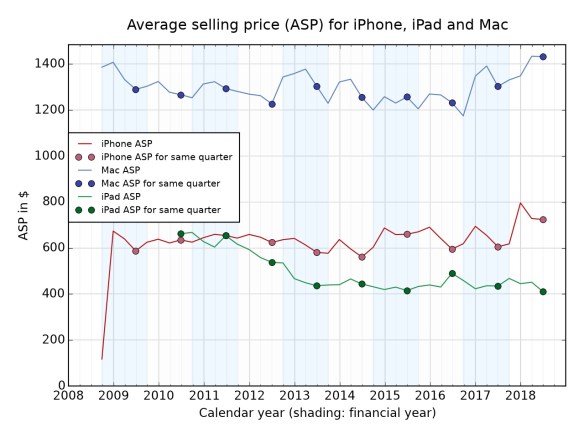
Of course we don’t know what the ASP for the Apple Watch or various doodads such as Beats headphones are, but these are the big-ticket items that Apple sells. The general story? Look at how the iPad ASP keeps getting beaten down. And look at how the iPhone ASP has looked perky in the past four quarters. Ditto for the Mac, though it’s only at the level it used to be after some years when it fell regularly. You can’t see any effect from $5,000 Mac Pros in there, can you?
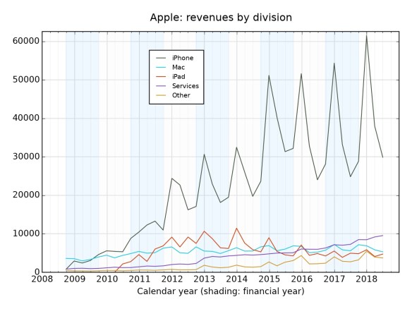
This shows how the iPhone dominates everything, of course. But look too at Services – which began outstripping all other hardware back in FQ2 of 2016 (ie early in 2016) and apart from a brief attempt by the Mac around Christmas 2017, hasn’t looked back. More people subscribing to Apple Music, more people paying a little bit for iCloud; it adds up.
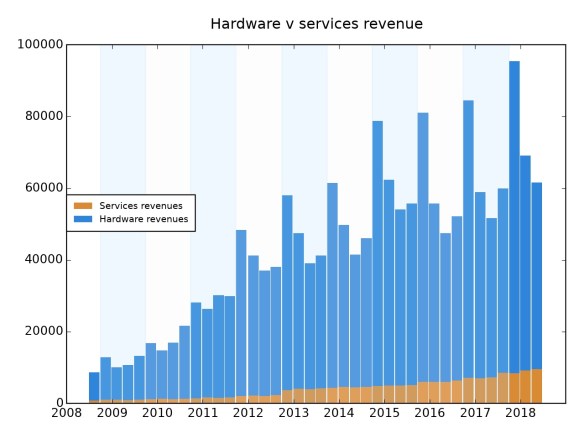
This is the same story, but showing you how little (if you like) services are. I think it also shows that bar graphs are bad at illustrating data, especially when you compare it to the one above and the one below. At the suggestion of Kevin Marks, I’ve redrawn it so that Services are on the bottom – which I think shows its rise and relative size well.
But how fast is it rising compared to hardware sales? Let’s see…
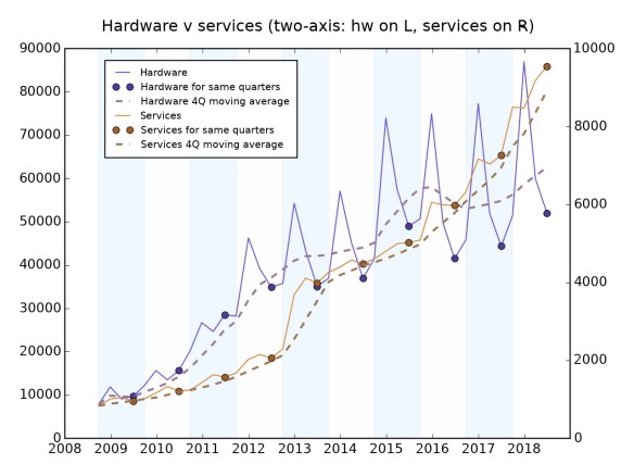
Note that this is a two-axis graph – hardware (iPhone, Mac, iPad, ‘Other’) on the left, Services on the right, figures in $m. They have different scales: Hardware is getting on for 5-10x the size of Services. But Services is growing faster – look how its slope is steeper than the moving average for hardware. (The moving average is for the past four quarters, also known as the “trailing twelve-month” average. This is good for ironing out blips like you see from the very seasonal hardware business.)
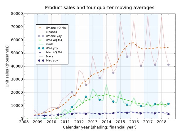
Another view of the main hardware lines that we know. It was a form of this graph by Dr Drang that got me interested in plotting all this stuff. Notice that big bump in the iPhone moving average in 2015, caused by the huge sales of the iPhone 6 (with the large screen) at the end of 2014. Ben Thompson makes the point that the introduction of the big screens pulled forward a ton of purchases, but since then it seems to have settled into a steady state, albeit yo-yoing hugely by a factor of nearly 2.
The iPad meanwhile had its day of glory but is now settling into a sort of respectable middle age. Unless, of course, Apple comes up with something dramatic on Tuesday. An iPad Pro that can appeal to would-be Mac buyers? Except it gets more money from Mac buyers. (See the ASP graph at the top.) Or are iPads better for Apple because they create more services revenue? Hmm. Macs, meanwhile, chug along, not varying much on this view.
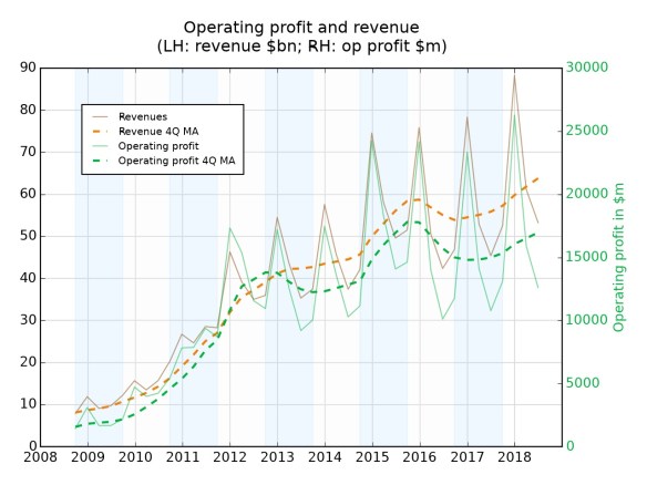
Another twin-axis graph, where the aim is to show trends in overall profitability. You might expect that if there’s more Services business, Apple would make more money – that’s usually the trend in services – but the widening gap between the two lines (Revenue, in orange, is going up faster than Operating profit, in green) suggests otherwise. Maybe it really is better to sell stuff you can drop on your foot. Based on this, the best profitability was from late in 2011 to the end of 2013, when the Op Profit line is “above” (relatively) the revenue line. That’s the iPhone 4S/5/5S era.
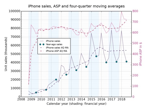
Putting both sales and ASP onto a single graph reveals something: although average sales are steady, the ASP is going up, quite sharply. (Neil Cybart has also pointed to this recently, and thinks it’s due to aftermarket iPhone use – people sell their on, or give to a relative, and then go out and buy a shiny new expensive one.) Again, is this going to continue? There’s no obvious reason why it shouldn’t – though Apple might need to worry about people deciding not to upgrade at all.
As for the strange low iPhone ASP at the 2008 mark – Apple used to have a strange accounting method which depressed the figure. It’ll disappear with the next set of results.
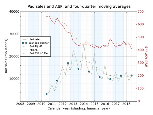
Ah, the iPad – the reason (or part of it) we’re talking today. From those lofty ASPs at the start, it has all gone a bit downhill. Obvious reason: the iPad mini, introduced in October 2012. (The led to the left-hand of the three peak years there.) Since then the price has mostly stabilised, but the introduction earlier this year of a cheaper low-end full-size iPad (which is actually cheaper than the mini) seems to have depressed the ASP even more. One expects Apple will want to reverse this with pricier iPads on Tuesday. (Since you’re wondering: I think that the Smart Keyboard and other appendages for the iPad count as “Other” in revenue terms; the Pencil isn’t part of the iPad line directly.)
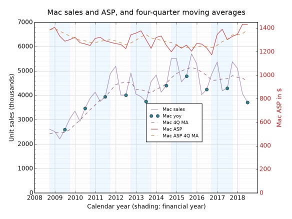
So now, the Mac. What’s Apple going to do about the MacBook Air? And the MacBook? The data here show contrasting stories: ASP is going up (yay!) but sales are trending down (boo!). What is the product that will get those people who have been sitting on their hands to come out and buy? Clearly, the iMac Pro hasn’t had a big effect on sales (though maybe it juiced the ASP). For the same reason, don’t expect the Mac Pro to make a big impact on this graph when it appears in a few quarters: laptops are more than 80% of Mac sales.
To me the answer seems to be: come up with an even more attractive MacBook Air. Price it about the same. Give it a retina screen. That’s about all you need. Oh, and a “professional” Mac mini of course. Who could forget that?
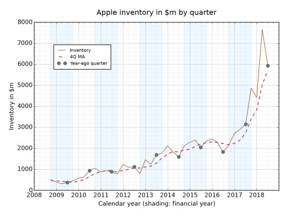
Starting to dig in to the weeds a little now. Inventory is “stuff you’ve got sitting in warehouses and haven’t sold to carriers or other middlemen”. You can see how it jumps each year, but it *really* jumped by the end of the first (calendar) quarter of 2018. In general, the more stuff (especially different items) you have to sell, the bigger the inventory figure. So let’s get a clearer idea of what’s going on: what if you look at inventory as a percentage of hardware revenue?
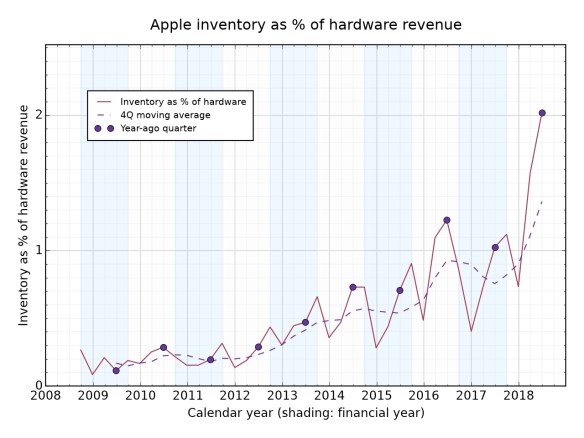
Hmm, so for years Apple was really good at handling this: inventory was less than 1 PER CENT of hardware revenue. Then in 2016 – Apple Watch/band time? – it bumped up. And though it keeps going down beneath that 1% number, the trend seems to be up. Tim Cook hates inventory: he likens it to milk, which can go off. There probably aren’t many MacBook Airs and old iPad Pros in that inventory number (we’ll have a clearer idea of how well it planned after Thursday’s financials).
So why is it so big? Well, one possibility is that some of this inventory isn’t stuff that will get sold any time soon. “Inventory” isn’t a block; you have “finished goods inventory”, “work-in-progress inventory” (ie it’s being put together) and “raw goods inventory” (just parts on the floor). I think Apple does break this out in at least some of its SEC filings, so might have a closer look separately. The balance of finished-v-WIP-v-raw can tell you a lot.
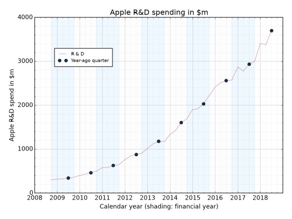
Research and development! It’s going up! This is probably not a surprise. Heading towards $4bn per quarter, which strikes me as a lot of money.
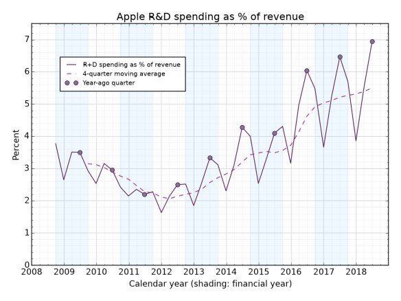
What if we try the same thing as with inventory, to look at how R&D has shifted with revenue? This obviously jumps around somewhat; the line to look at is the moving average, The dip in 2011-13 is interesting (and unexplained by anything I know about). And now? It’s zooming up – self-driving cars and augmented reality glasses, right?
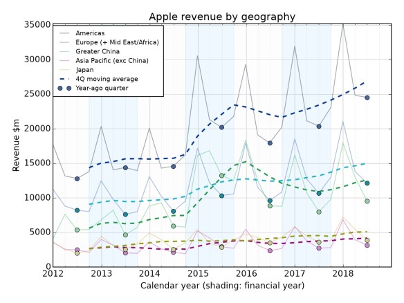
Finally: by geographies. Again, look at the moving average more than the individual numbers. Apple only started breaking out geographies with retail included in 2012, which is why the graph starts there. (Before that it had retail as a separate “area”. It also used to give you operating income for each geography, which is a hell of a data point.)
What do we see here? The Americas (principally US and Canada) zooming off into the distance. But the really notable one to me is China, which is the line that if you start on the left is third down (Americas, Europe, China, AsiaPac, Japan.)
China zooms up in 2015 – there’s the iPhone 6 effect again – but then falls back quite dramatically, so that Europe has now overtaken it again for the past couple of years. It’s possible that all the expectations around China were misplaced. It’s big, but its growth is only as strong as Europe unless something dramatic happens next quarter. But even that would only be a quarter, not a trend.
The Americas, meanwhile, are zooming ahead. That’s where the strong growth seems to be.
But let’s check back in a few days!
One note about the graphs: you’ll notice (now I mention it) that I haven’t used any “percentage change” graphs. I tried a few experimentally, but it turns out they just look a mess. Using the TTM/4Q moving average (same thing) gives you a clearer idea of what’s happening, and picking out the corresponding quarter does the job of telling growth or shrinkage pretty well. Percent growth has its place, but I didn’t find it to be on any of these graphs.

Interesting, thank you.
I back-of-the-envelope’d some time ago that it didn’t take outlandish assumptions for the air buds to generate more profit than Macs. Something around 70 vs 30% net margin, and 30% attach rate IIRC. Kind of explains why Macs seem to be getting little serious love.
The Machiavellian part of me is also wondering if Apple isn’t letting some rot set in on purpose to make sure ARM Macs in 2-3 years look darn sexy and fresh.
Pingback: Start Up No.941: why beacons died, tech giants face new UK tax, how Night Sight works, XR portraits for everything!, comments go sour (again), and more | The Overspill: when there's more that I want to say
Pingback: Apple’s laptop line is more of a mess than ever - MrPolitic.com
Pingback: GREENGROUND IT - Apple’s laptop line is more of a mess than ever
Graph lines too dim, and difficult to distinguish.
Pingback: The Coolest Features in the 2018 iPhone line up | Gadget Rumors